Over the last few days I have been inspired, but I am not quite ready to reveal the whole of my thoughts. I was just too excited not to capture a rough glimpse of what is to come!
Interesting Pinteresting: Jessica Senti
I recently came across this lovely blog, Serendipitous Things, by Jessica Senti as I was looking for a new background for my desktop. A sweet space created for her creative endeavors, Jessica's style is whimsical and colorful - and it is reflected in her collection of Pinterest boards.
Check out her beautiful desktop backgrounds here.
Sketches and Suprises: With All My Heart
Earlier this year, I created this sketch entitled "With All My Heart, Love" and found it recently among my piles of sketches. Look out for an updated version of this little guy soon!
Color Companions: Black and Orange
I have never loved Halloween as a holiday, but I do love that season and colors that surround it. In lieu of the spooky holiday coming upon us in a few days, I couldn't help but post these color companion. I have a sweet spot for orange in my life - but not the orange cone or hunting orange. Rather, I like oranges on the extremes of the spectrum, the muted and almost peach looking oranges and then the rustic burnt oranges.
Orange was the base color in my wedding, and I have been pleased with the variations of this color that have been popping up in not only fashion, but home goods, and prints more and more. With the fall and Halloween season going on, I love seeing the bold color combo of black and orange, and the variations with the shades these two color lend.
Clockwise: Wedges, Hand-Lettering, Pattern, Pumpkins
Creative Quotes
Sketches and Suprises: B is for Beauty
I have the amazing privileged to work along side a talented group of designers at my full time job. They constantly are introducing trends, smarter design solutions, pushing one another to create stunning design solutions.
One of those instances is what the team calls Infused Inspiration Fridays: Challenges.Started by a small pool of our design team, about a handful of us on the team gather and execute a predetermined design challenge once a month on Friday afternoon. Someone on the team creates a "challenge", in which we are given a set of guide lines, and a set time limit. The challenges have ranged so far from creating a pattern inspired by fall decor to creating a music album cover with only a set of words and images.
This past week our challenge was to use one image and the word "beauty" to create something that we believed represented beauty.
My interpretation of our teams Infused Inspiration Friday Challenge - read below to see the guidelines!
1. Download assets. Link sent in email.
2. Create your interpretation of “beauty” only using:
—the word “beauty” — this image
3.
You have the one image and one word. In addition you can use any color,
any font, any size, any medium (on or off the computer), and anything
you can create using the word “beauty” and this image.
4. You CANNOT add any other images or textures.
5. Your final piece must use this image and have the word “beauty” written somewhere on it.
6. You have 25 minutes to design and print your piece.
7. Present your piece to the team at the round table.
8. Have fun!
Each time it is incredible to see not only what myself and my teammates produced in a short time, but how wide of a range of thoughts and talents are represented in this fun exercise.
Artist Admiration: Dear Hancock
My humor has always had two strong hitting points: 1. Literal takes of a phrase and 2. animals being personified in prints and drawings. The artists behind Dear Hancock nail both of these on the head for me. Among their stationary you find whimsical and quirky interpretations of the world around them. My favorites of their work include the literal desk calendar for 2013, big happy birthday truck card, and their bunny cards (seen above). You can find this fabulous chubby bunny feature on almost a dozen different of their greeting cards. Among my favorite : Ski Bunny, Dad Bunny, and my all time favorite, Love Bunny. Doesn't he just steal your heart?
I admire Dear Hancock for the variety of simple and whimsical stationary products they offer, while continuing to update and adding to popular concepts. To me, each piece tells a loving and somewhat goofy story of these two talented artists behind the brand, and the way they see the world.
Go take a look at their new look book or follow their blog !
Image by Dear Hancock, Lookbook 2013
Creative Quote
Kyle Steed is a recent find for me and quickly becoming an artist I admire. Reading through his blog posts have certainly inspired me to continue to work hard at what I do, as well as continue to place the Lord at the center of my work - regardless of what it is.
You can find his work here kylesteed.com and then go check out his blog post here .
Portfolio: Voss Wedding Program
Front Cover to Matt and Corrie's program.
A sweet friend of mine, Corrie, asked me this past summer if I could help her out with the programs for her wedding. Although I didn't design her (very cute) invites, I had the opportunity to help her continue the theme and design in her programs.
It was fun to find the perfect way to display this sweet and loving couple's personality and gratitude through a tri-fold, square program that features the bridal party at the heart of the inside. Their wedding colors of corral and navy blue as well as the mix of script and serif font were a strong theme that Corrie had planned through out the rest of the wedding and the reception.
See more details of this fun program here
Inside fold of Matt and Corrie's program
Color Companions: Brown & Red
The richness of the mid-fall changing of the leaves doesn't come every year, but when it does it stops you in your tracks. All those leaves creating a blaze with the mix of oranges, yellows, and reds. Makes you want to grab a sweater!
That is definitely a top reason I love the transition from summer to fall - chunky sweaters to wrap you up in front of bonfires, and that great deep, red wine color you can add to deepen and soften your fall decore of pumpkin orange and mum yellow.
Clockwise: Sweater , Type Poster, Berries, and Rug
Creative Quotes
Portfolio: Noah's Ark Coloring Page
I recently worked on a fun project for work that I had a chance to use my illustration skills. The coloring page will be used for a Mothers of Preschoolers (MOPS) Conference, and will be a feature handout for the company promoting a new sticker line.
Below you can see the multiple sketches I created to complete the simple line drawing. The requirement was to have windows that would fit two square stickers of Noah's ark animals - and after figuring out what that layout looked like, the boat started to take shape. It was a fun to take a break from the strictly on-screen work and implement both hand done work with computer finessing - even playing around with handwritten type as an idea for the title.
Artist Admiration : Rifle Paper Co
Since I first saw her illustrated wedding invitations floating around magazines and blogs alike, I have been attracted to Anna Bonds work and her company Rifle Paper Co.
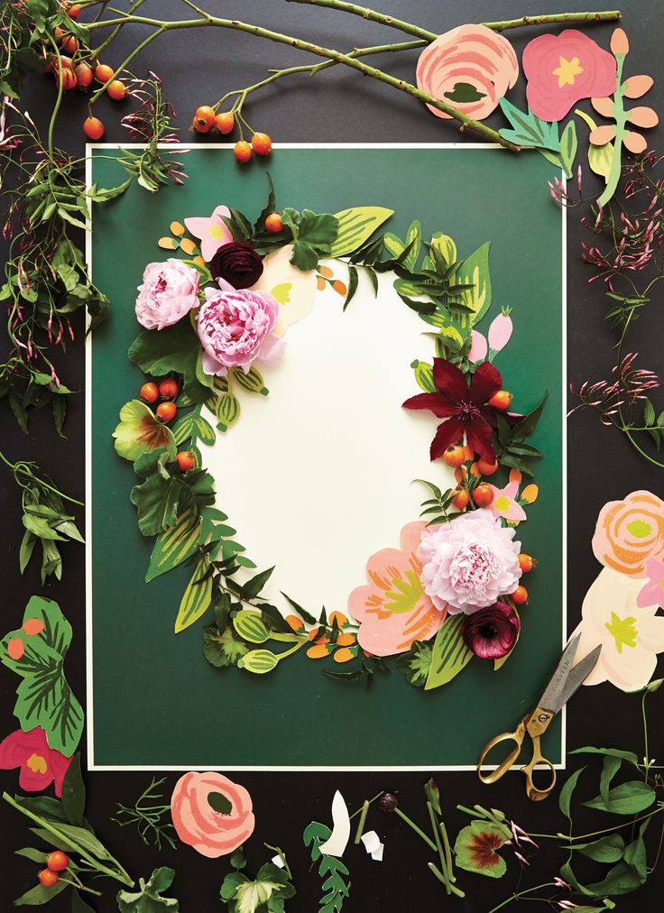
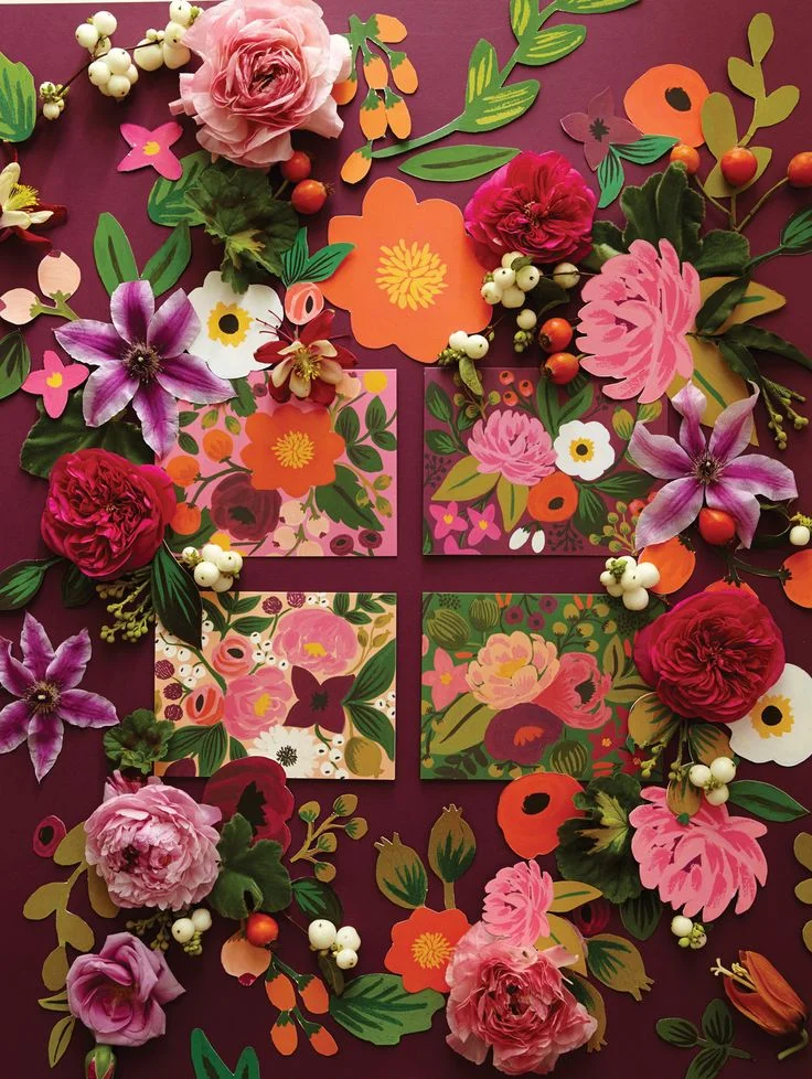
The palette of mixed muted colors with pops of fun colors have always inspired my own love and work with floral motifs. Their latest look book is stunning with their product displayed mixed among sweet paper cut out flowers, and gorgeous fresh flowers that make each page truly pop off the page.
Look Book 2013, Rifle Paper Co.
Rifle Paper Co. Look Book, 2013
Portfolio: Aagaard Wedding | Moodboard
I wanted to share a little on a fun project I did a few months ago. The first part to any project is capturing the clients look and feel, i.e. mood, for what they have in mind for the end result. Some clients will have their entire vision already set and just need a designer to put together the details. For Carly, she had a great aesthetic eye, but needed a designer to create that finished product. She was fun to work with as she wanted a traditional invite, but with a unique twist. This allowed me to think outside the standard box, but keeping a classic touch.
Other details she sought out were looking for a muted palette featuring jewel tones, and a vintage but classic feel to the suit to match the rustic wedding she was planning. The moodboard above was just a small collection to help set the tone of the suite, and I can't wait to share what we ended up creating!
Color Companions: Blue & Green
With the changing of summer into fall, and the mixed weather we have been having in the Midwest, I've been inspired by the bold swatches of summer's fresh green that is clinging on to the leaves and grass under the cool grey blue that is the fall early evening sky.
Makes for a lovely combo.
Clockwise: Quote by Zyanya Lorenzo ; Japanese Paper ( JAGAT ) ; Photo Inspired by Farm Wedding, Once Wed ; Chuncky Necklace ( LE CATCH BLOG )
Creative Quotes
Portfolio: Verse Poster
Color Companions: Black & White
I have decide to dedicate this space as both a function for showcasing projects I've finished, ideas that I am working on, and mix in things and people that inspire me.
Clockwise: Pop Fiz Dress from Mod Cloth ; Lotta Agaton Shop (Picture from DESIGNLOVEFEST) ; Paul Kilsby Gorgeous Photograph ; "Finley & Alice" from Kevin Davis Young
Creative Quotes
This article, Unsolicited Thoughts on Unsolicited Design, by designer Matt Stevens was passed onto me by a co-worker and it struck a great nerve in me. With being fresh out of college, designing outside of work was not a common practice for the first 6-8 months from a classroom environment. Freed from classes, same student projects, and homework - I came home at night from working a creative job for 8 hours, and all I desired was to eat dinner and stay far from my computer. As the months went on, I noticed something different from the few times I would pick up my sketchbook and doodle outside my job versus those nights I would hardly do anything in the pursuit of "relaxing". I noticed those nights I was creative for my own sake, I felt more energized to go back to work and begin the next work day more excited to work on my "mandatory" design projects.
Overall the words rang through my ears as I read through Mr. Stevens article. Like anything one does, you make time for the things you love. Why not continue to remind ourselves as creatives why we chose design as a career path and continue to make time for creative things.


