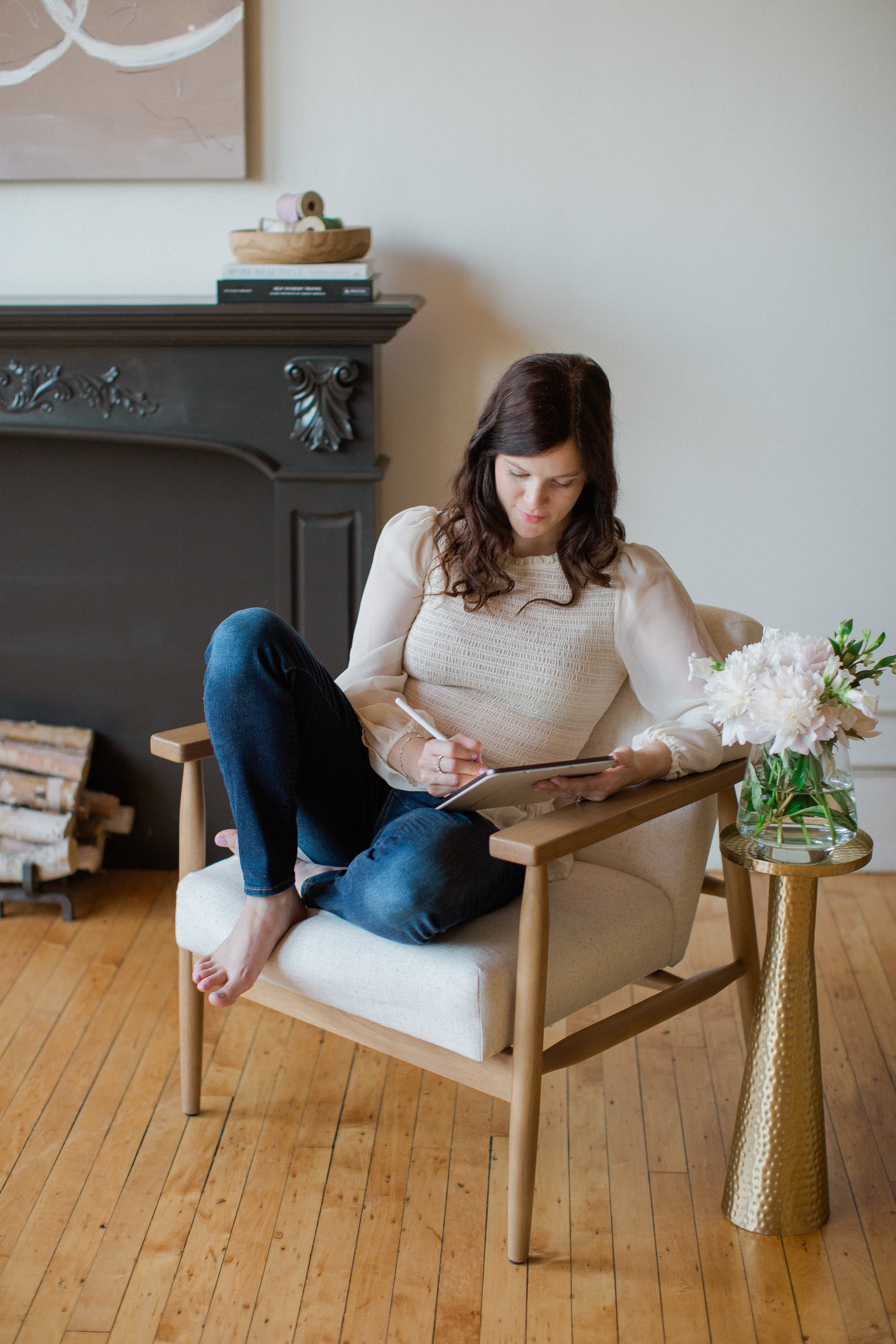
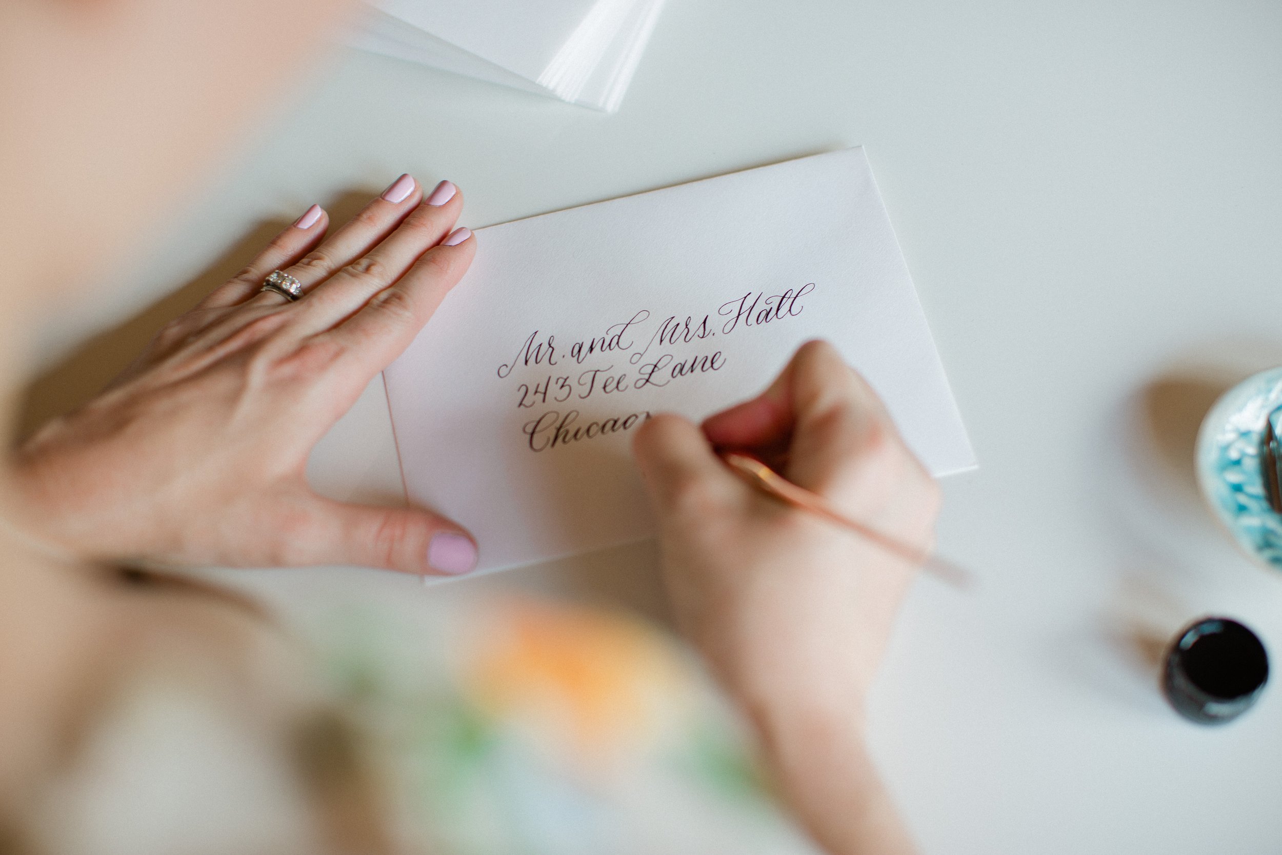
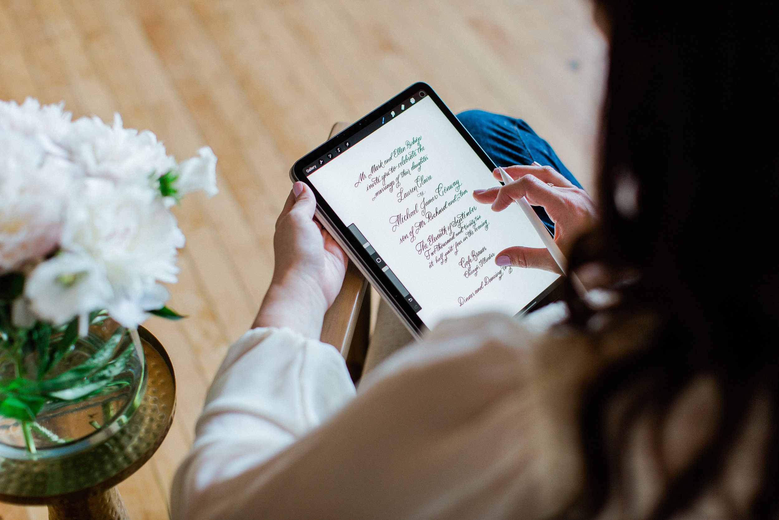
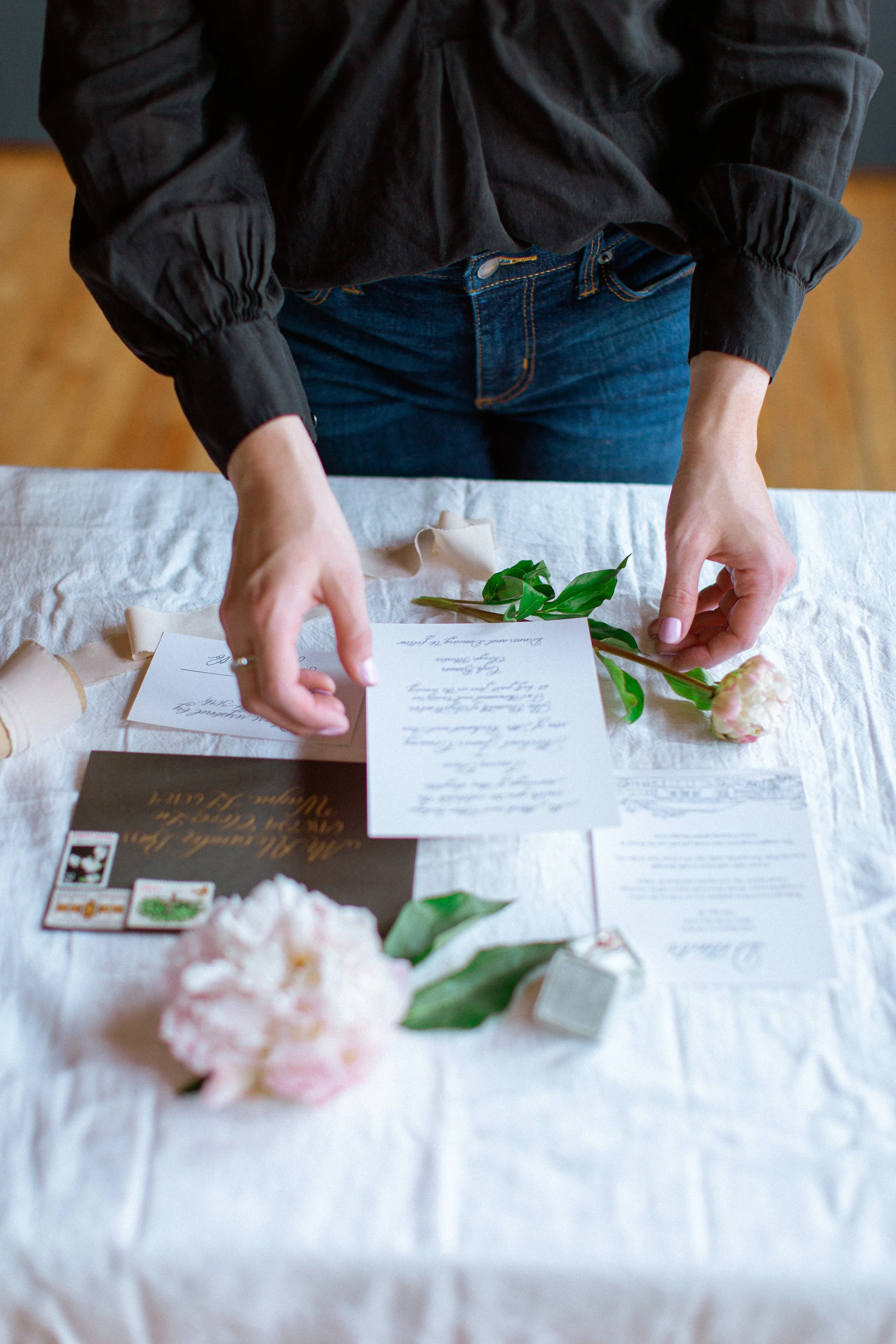
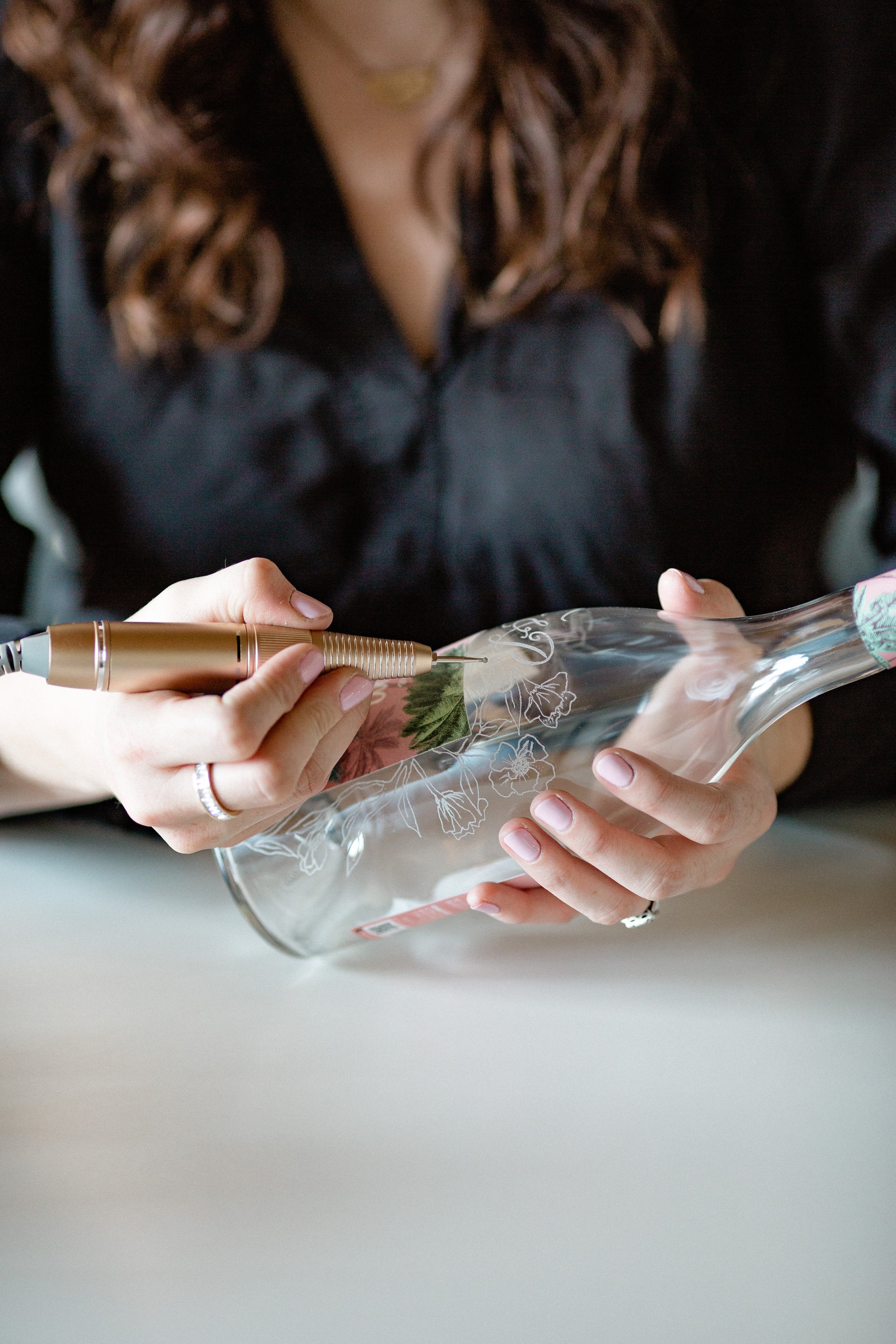
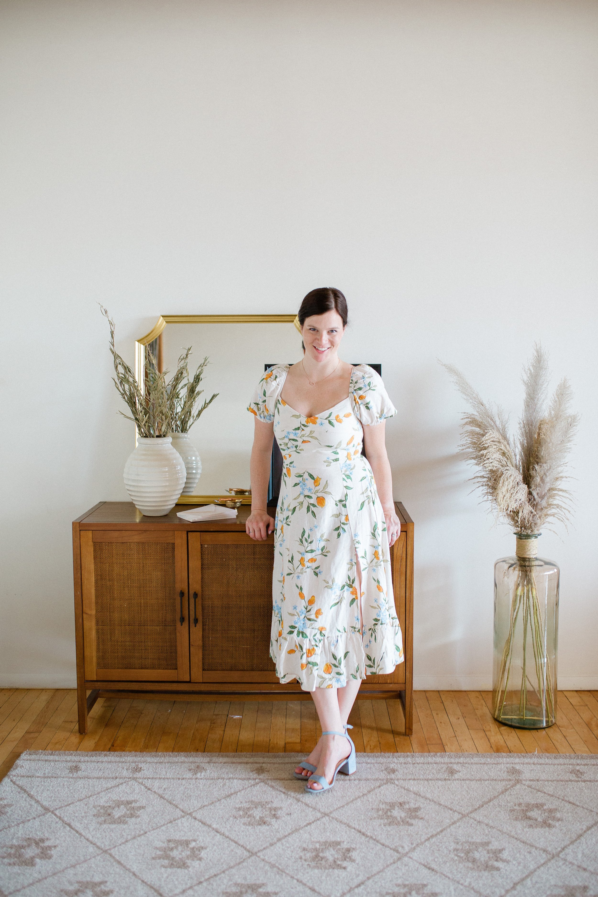
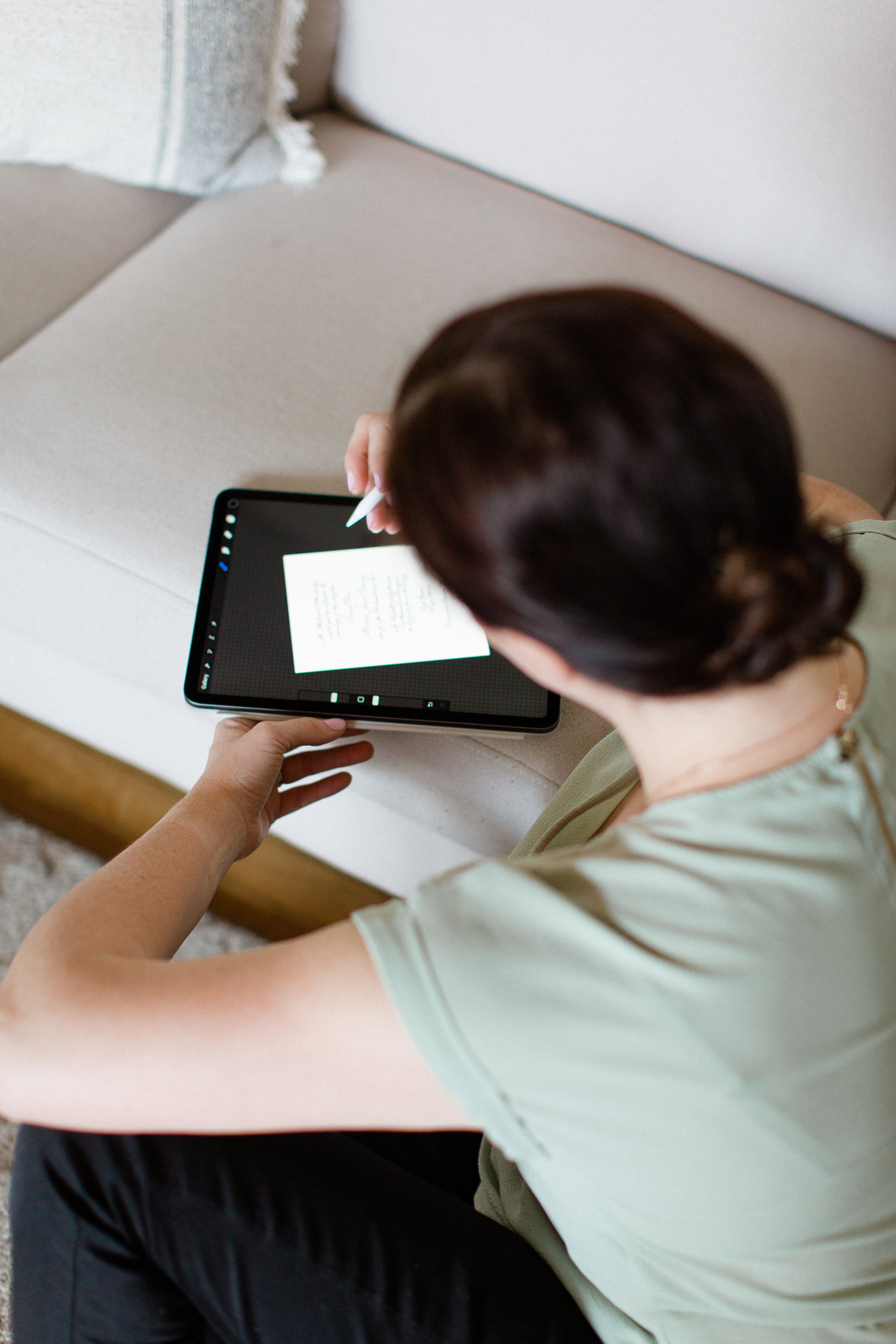
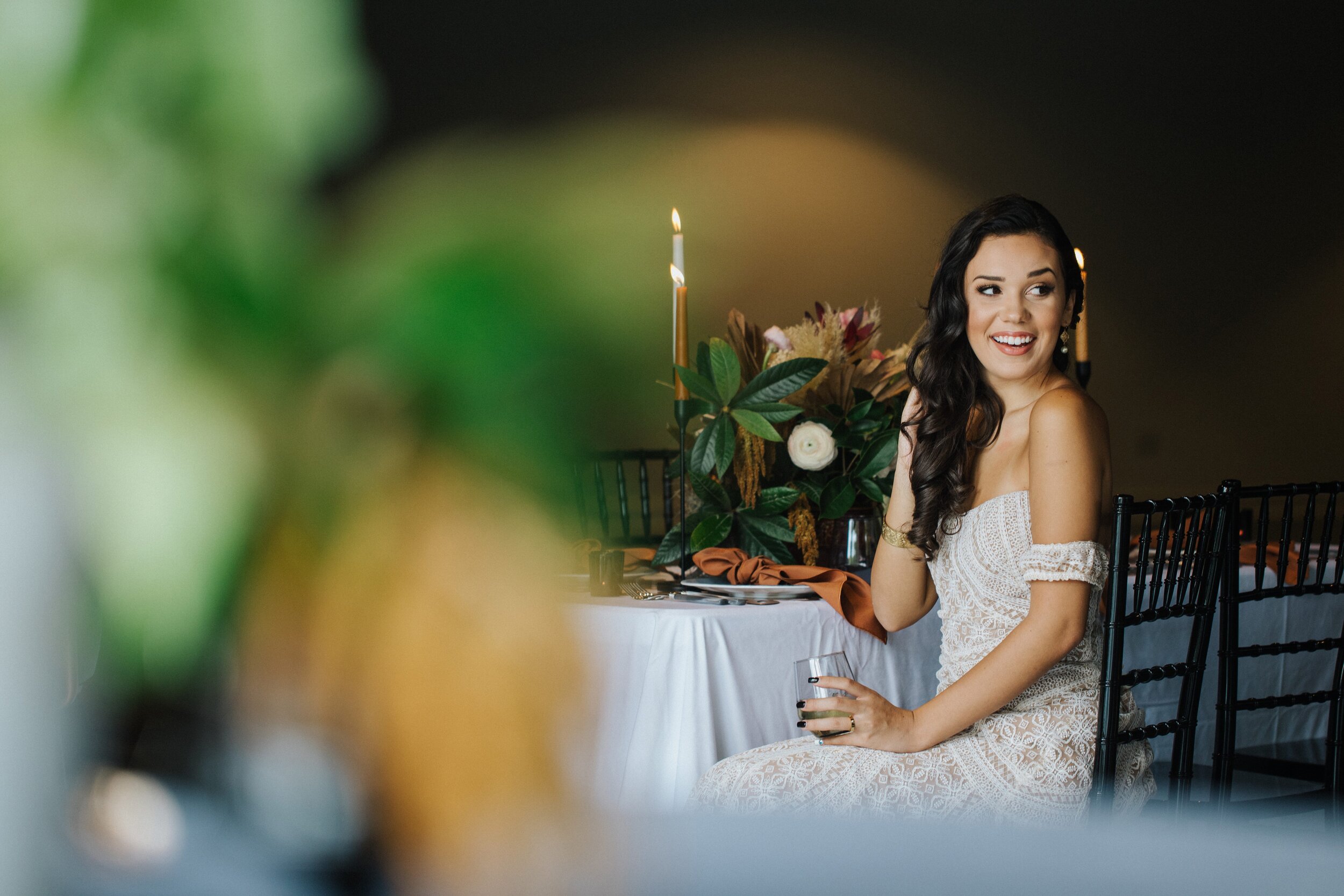
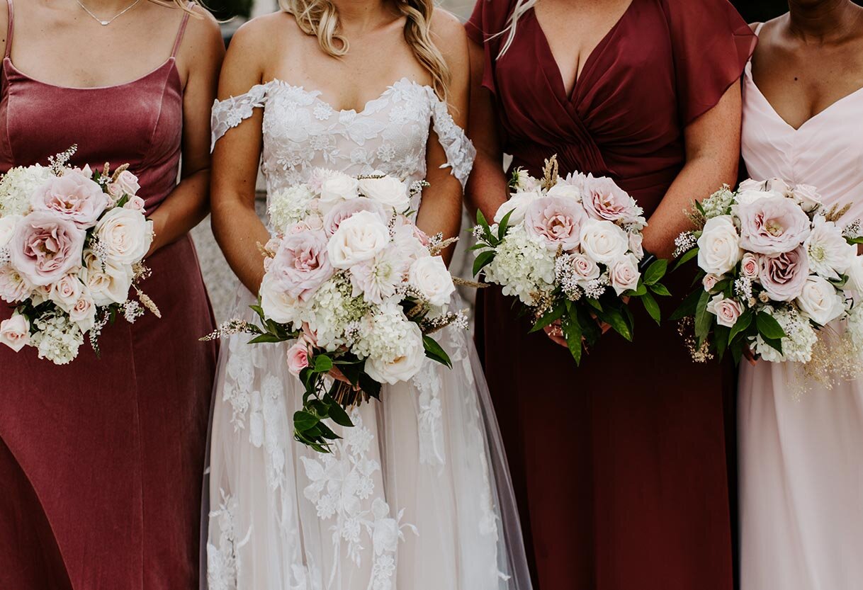
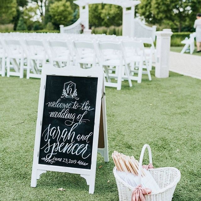
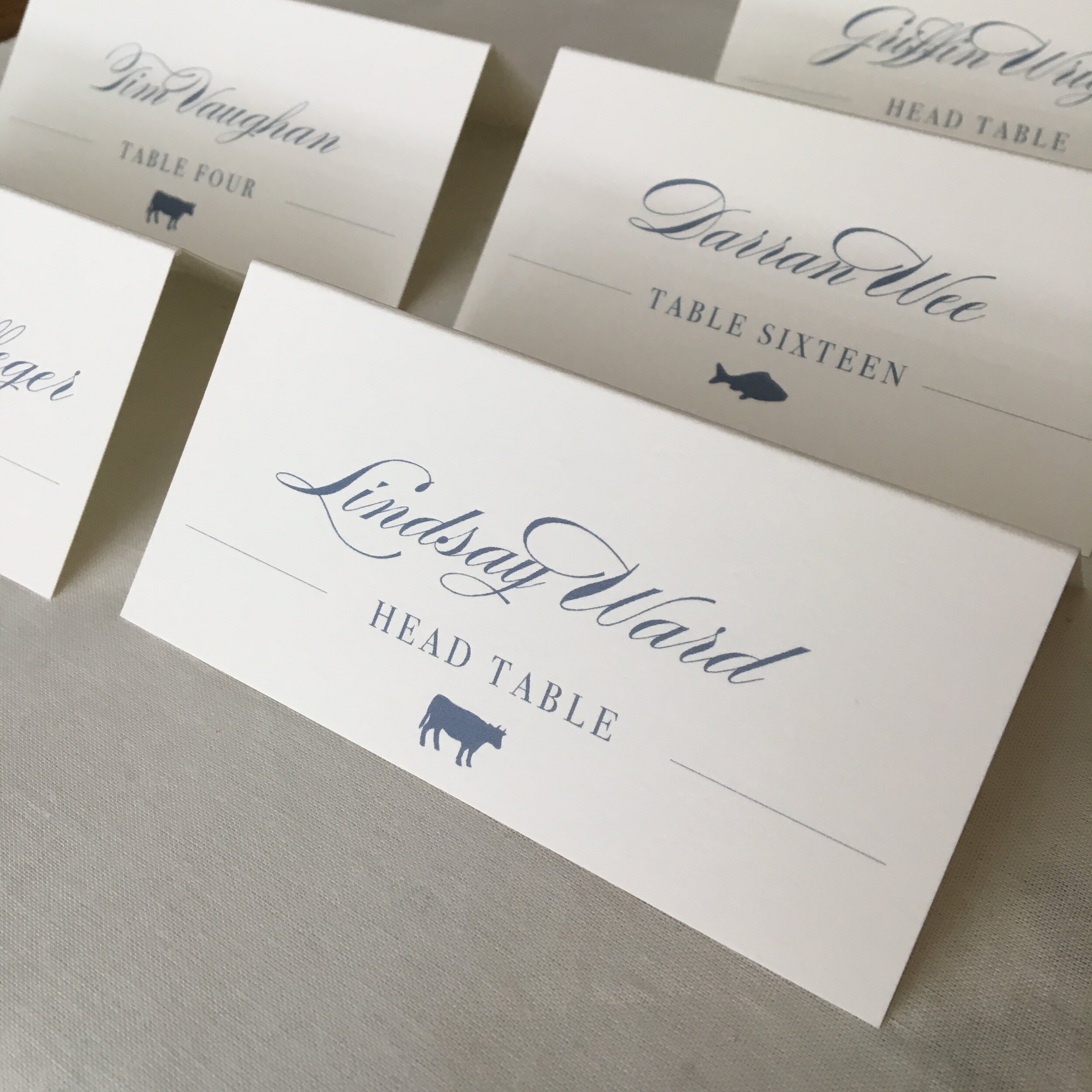
What is harder than choosing a new logo? Being a graphic designer who chooses to design and update their own logo! You may have noticed the updated LLP logo on the header of the website. Along with a brand and color refresh. I updated my headshots with a fun brand shoot with the wonderful Ness McCormick Photography this past Summer, and love how they turned out!
The Big Fake Wedding, Chicago: Inspired By Morocco
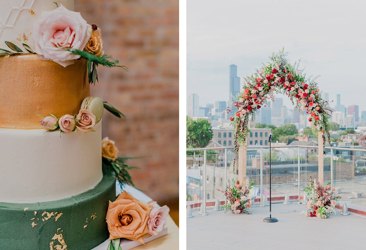
On a warm August night, a handful of vendors came together for a gorgeous vow renewal on the rooftop of Lacuna Lofts under a gorgeous floral arch.
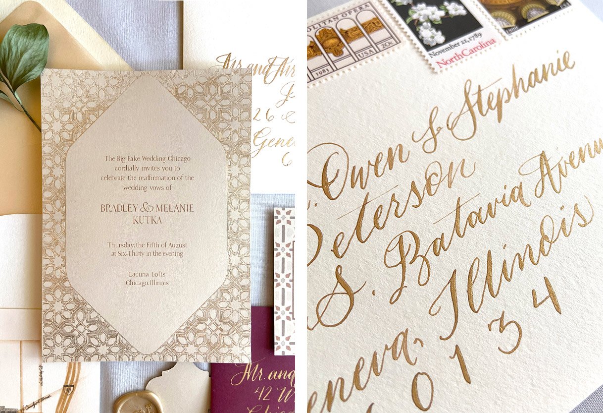
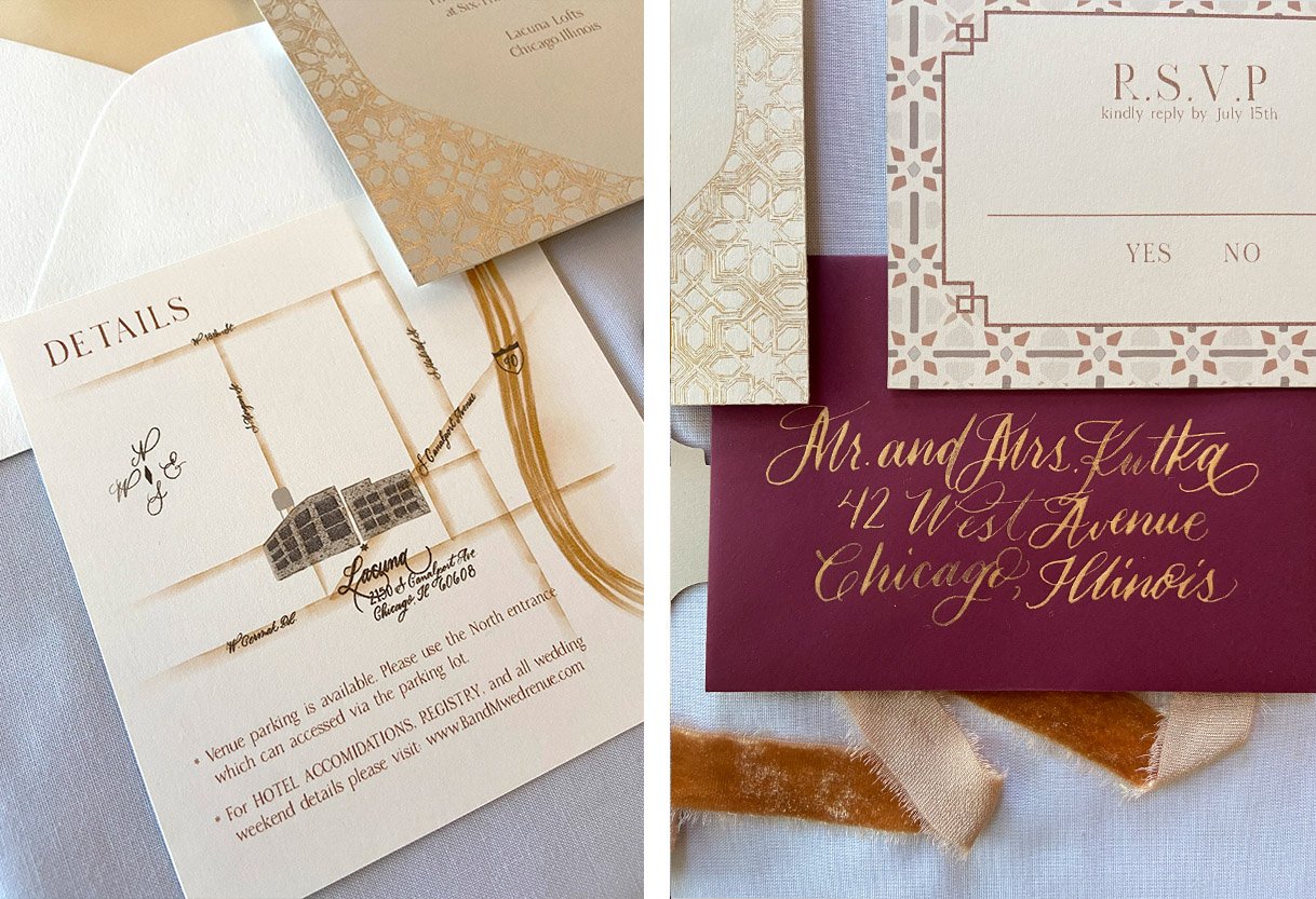
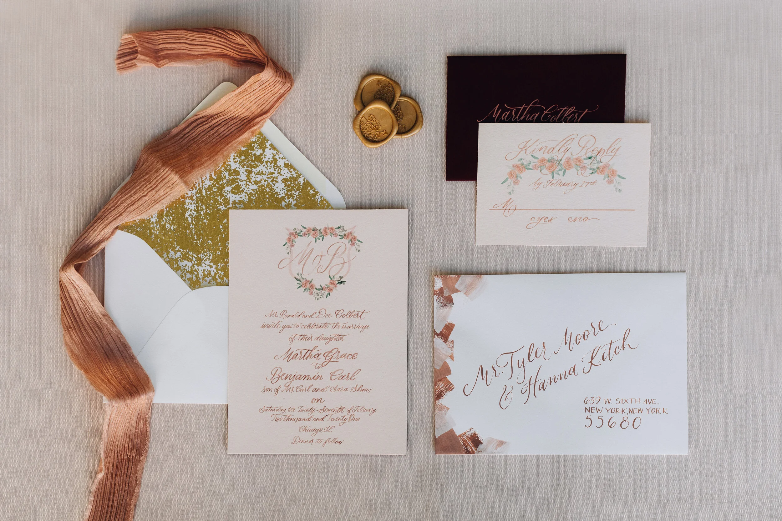
The invitations and paper good were inspired by traditional Moroccan patterns and colors as well as the lush colors of the florals. I loved getting to pull in warm tones to a lighter palette with the contrast of a deep wine color as the RSVP envelope. To add a hint of glamor and a little more elegance, the calligraphy is done in a metallic gold with the invitation foiled in a warm gold.
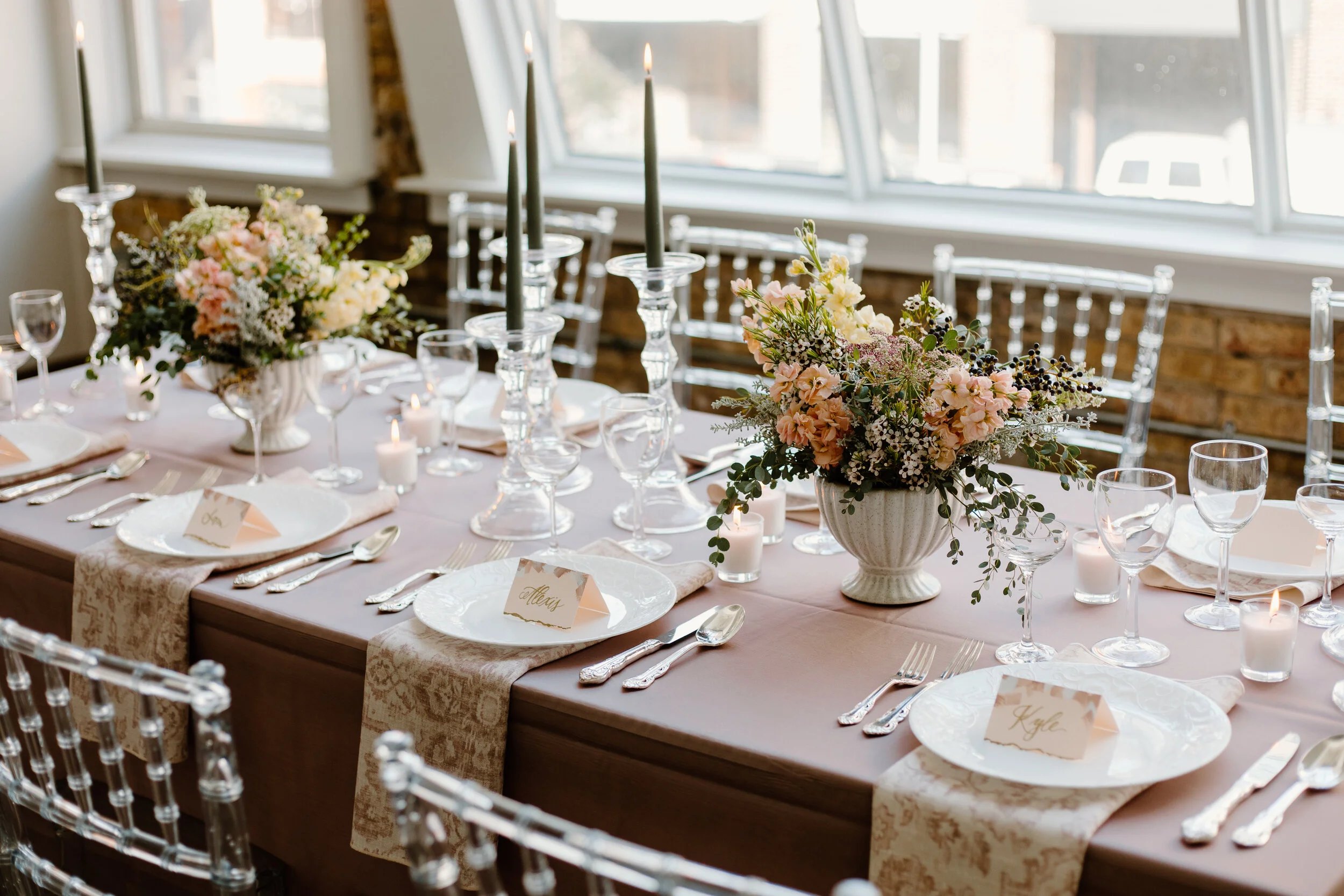
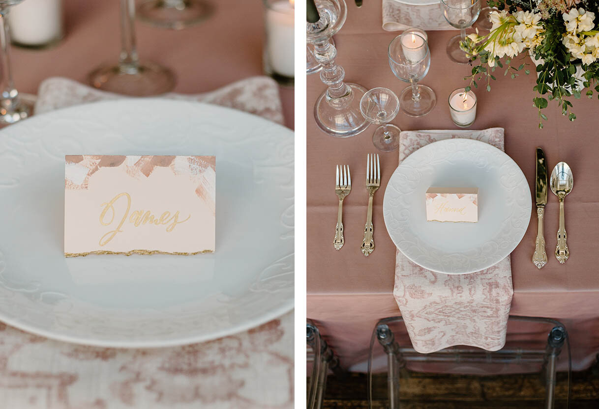
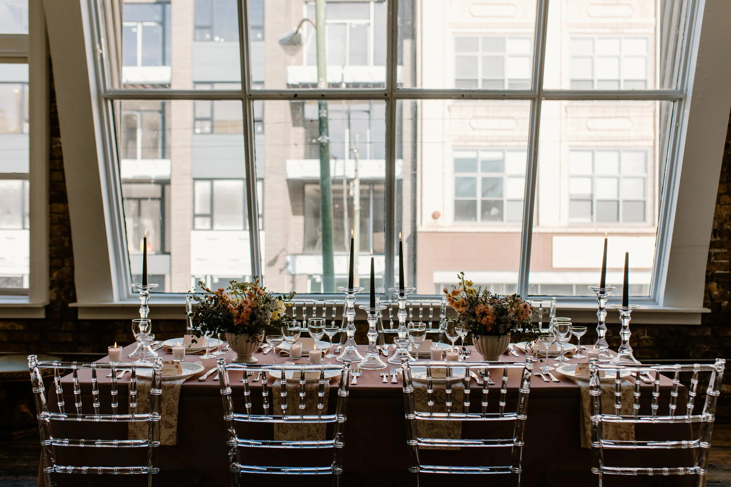
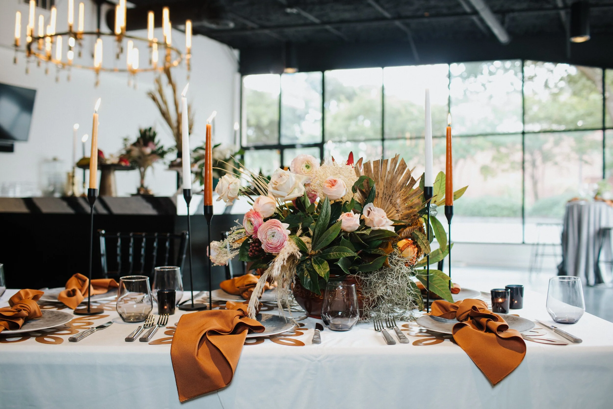
The theme continued on the beautiful table scapes with arched menus in the same sand color pulled from the invite palette with mimicked arched acrylic placards, bringing in a pop of green to this already stunning table.
CAKES & CATERING:
CEREMONY MUSICIANS:
FAVORS & GIFTS:
FLORAL, DESIGN, & DAY OF COORDINATOR, TABLES 1 & 2:
FLORALS & DESIGN- CEREMONY BACKDROP, TABLES 4 & 5:
FLORALS & DESIGN- TABLE 3 & BOUQUETS:
GROOM & HIS MEN:
HAIR, MAKEUP & BEAUTY:
LIGHTING, ENTERTAINMENT & PHOTO BOOTH:
FEMPRESS Fit | @fempressfit
Hitched Wedding Bands | @tryhitched
Lavish Exposure Photobooth | @lavish_exposure
OFFICIANTS:
PAPER GOODS & CALLIGRAPHY:
SIGNAGE:
VENUES:
VIRTUAL VENDOR:
WEDDING DJ:
WEDDING DRESSES:
WEDDING FILMS:
WEDDING PHOTOGRAPHERS:
Wedding Inspiration: Neutral, Boho Style
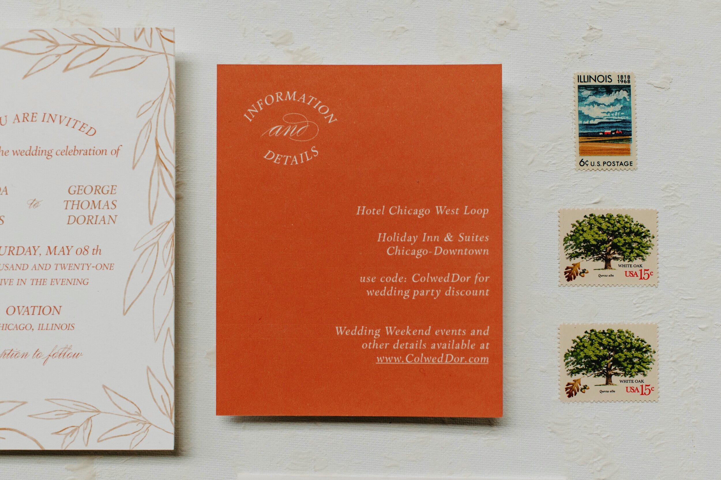
This mix of neutrals used for this vibey city wedding is the ideal mix of urban and nature. I chose to use only hand-drawn eucalyptus branches in both the invite and the complimentary wax seal matching the vibe of the organic color palette. By adding a more traditional calligraphy style, this invite became a beautiful mix of traditional and organic.
I loved seeing the mix of natural and more urban elements with the pops of colors in the decor and florals. The perfect inspiration for a city, boho wedding.
Venue: @ovationchicago
Dress: @bhldn
Earrings: @bhldn
Prop & Event Hire: @poshstudiorentals
Florist: @cityscentschicago
Hair Stylist: @emilyraebridalhair
Makeup Artist: @alyssadianamakeup
Invitation Suite: @linalulupaperie
Cake: @thesweetreservebakery
Models: @emfoertsch, @poukenik
Wedding Inspiration: Romantic Spring Hues
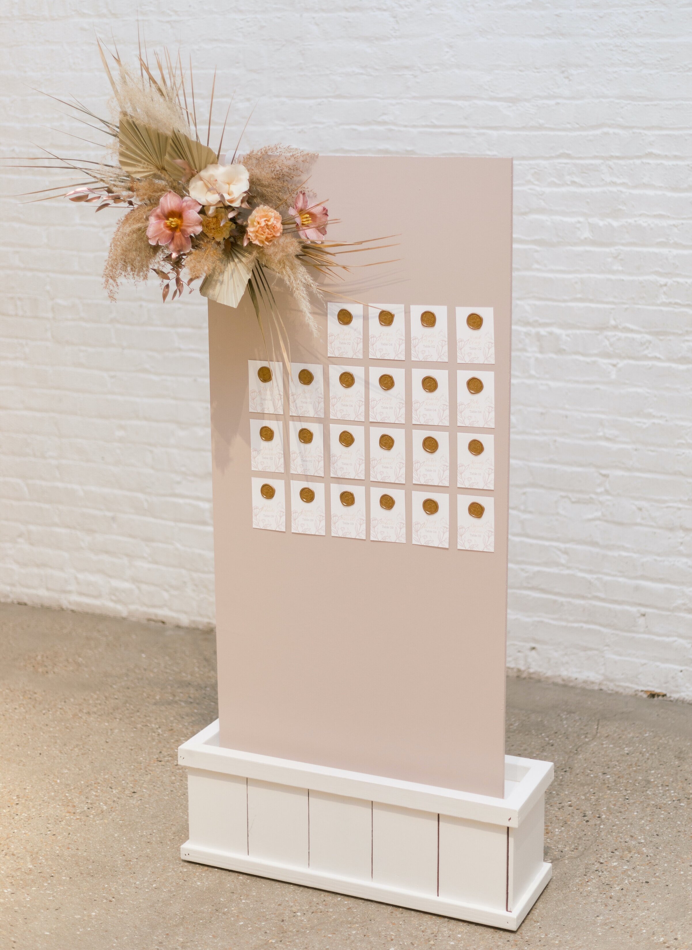
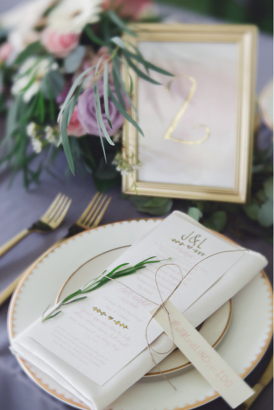
Early Spring weddings are filled with soft, pastels—and this styled shoot from K and K Celebrates is the perfect inspiration for a dreamy pink and gold inspired casual wedding. Staying in line with this dreamy decoré, I chose minimum design elements and brushed, watercolor florals to accent the paper goods both on the invite and escort cards, Each was topped off with antique gold wax seals to add texture.
Planning + Styling: @kandkcelebrates
Photography: @ashlynhenry__
Stationery: @linalulupaperie
Floral: @michaelamantarian
Rentals: @hallsrental
Venue: @chezweddingvenue
Linens: @bbjlinen
Cake: @tonipatisseriecafe
Wise Wedding: Menus
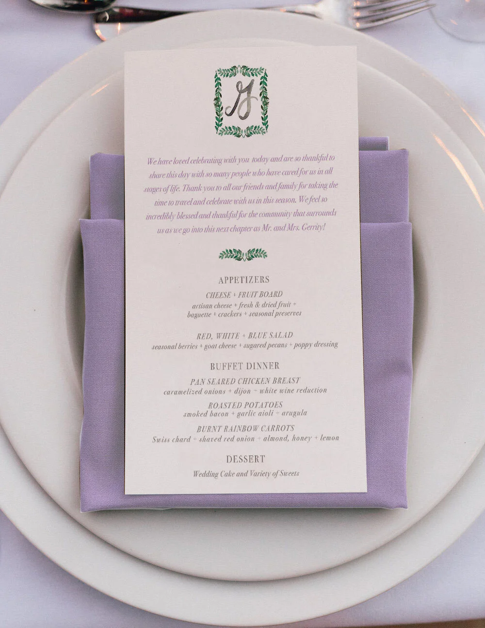
Menus, should you have them or not? When it comes to weddings, the esthic and design of your reception is the largest portion of time people will focus on, and rightfully so! Though I will always say the ceremony is THE most important aspect of the wedding, your reception is where your personality and the design of the day really gets to shine. The small details add up to big impact and that includes menus!
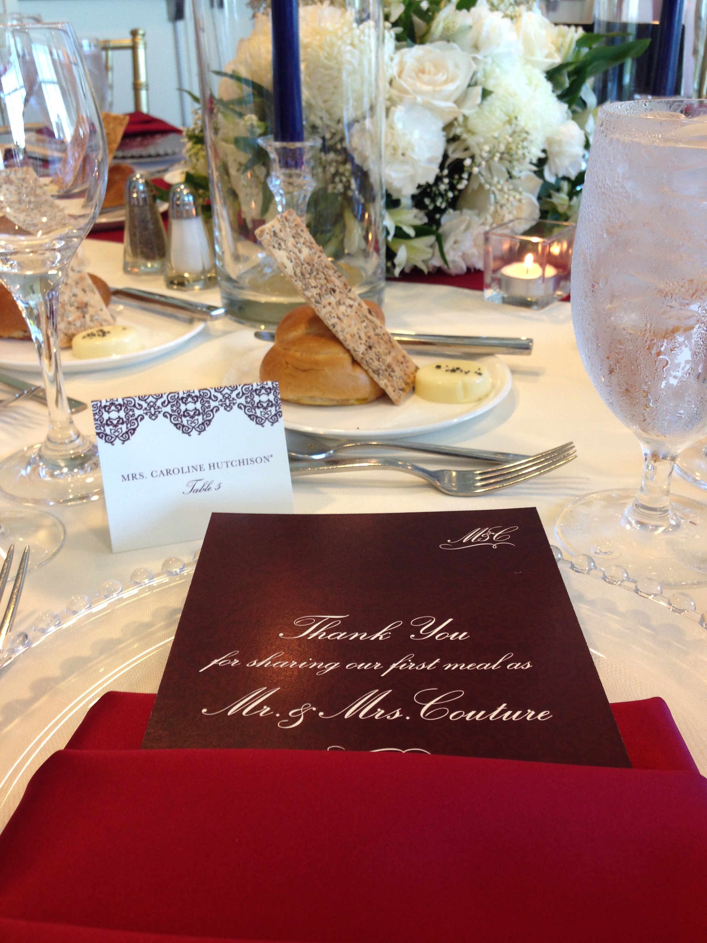
These informational pieces do not have to be boring! Consider them to pull double duty and use them to include:
Guests place cards
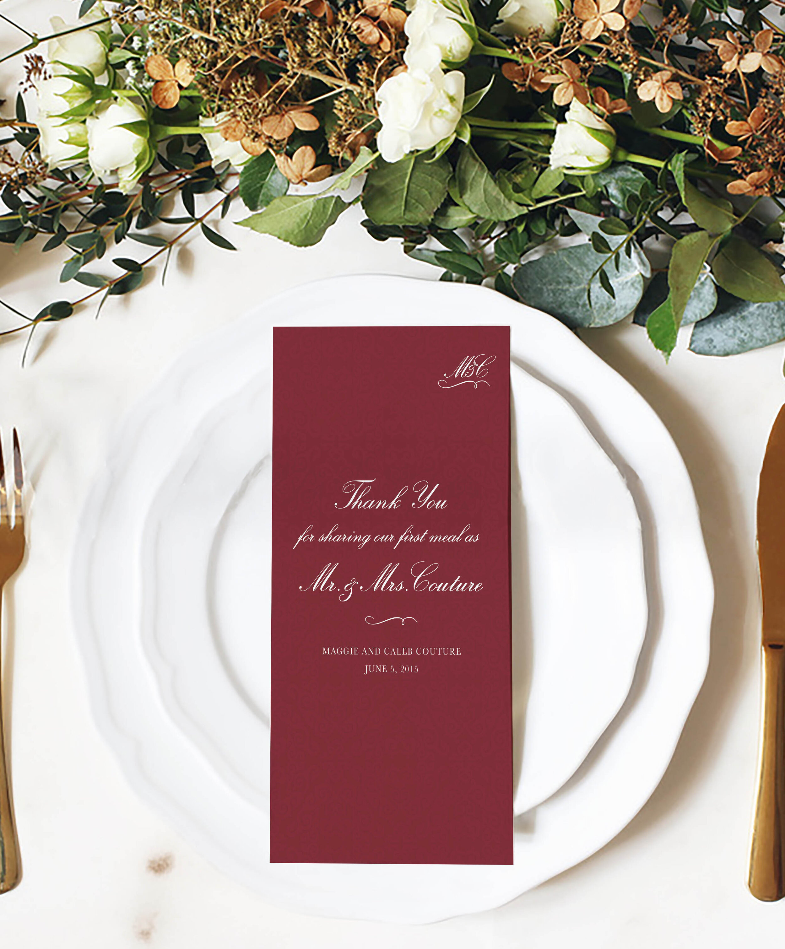
Thank you note from you as the couple
A place to request a card and hand it in to the DJ
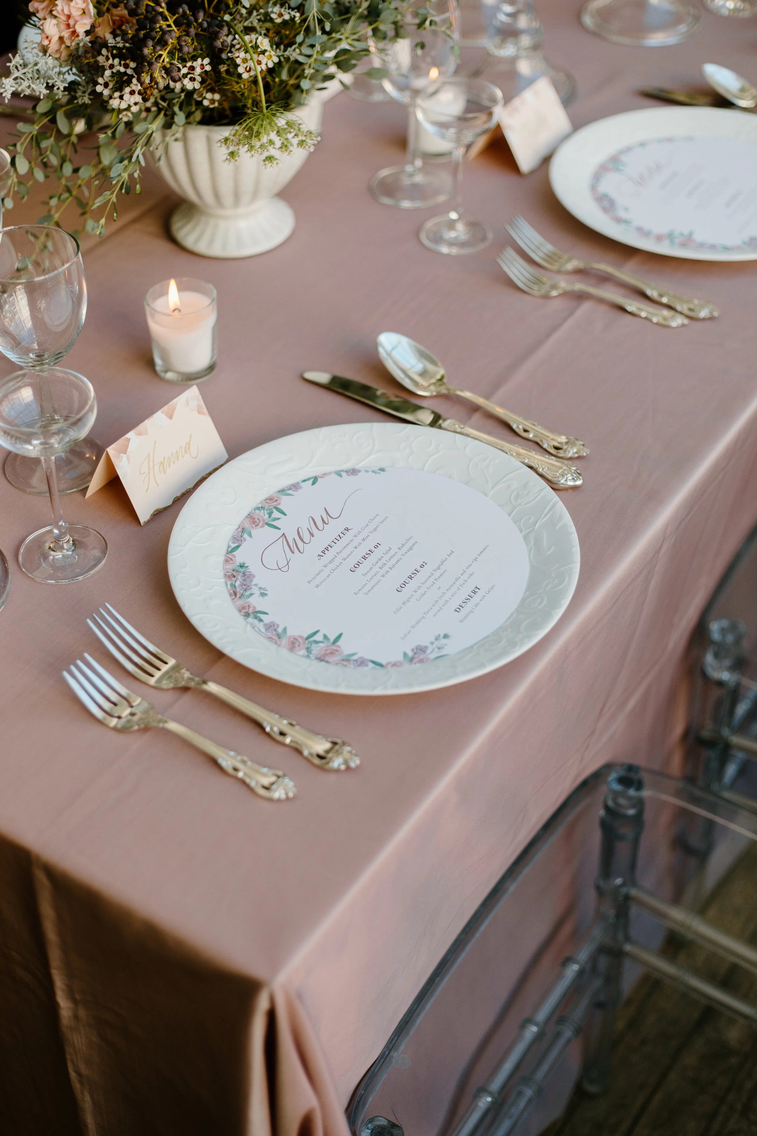
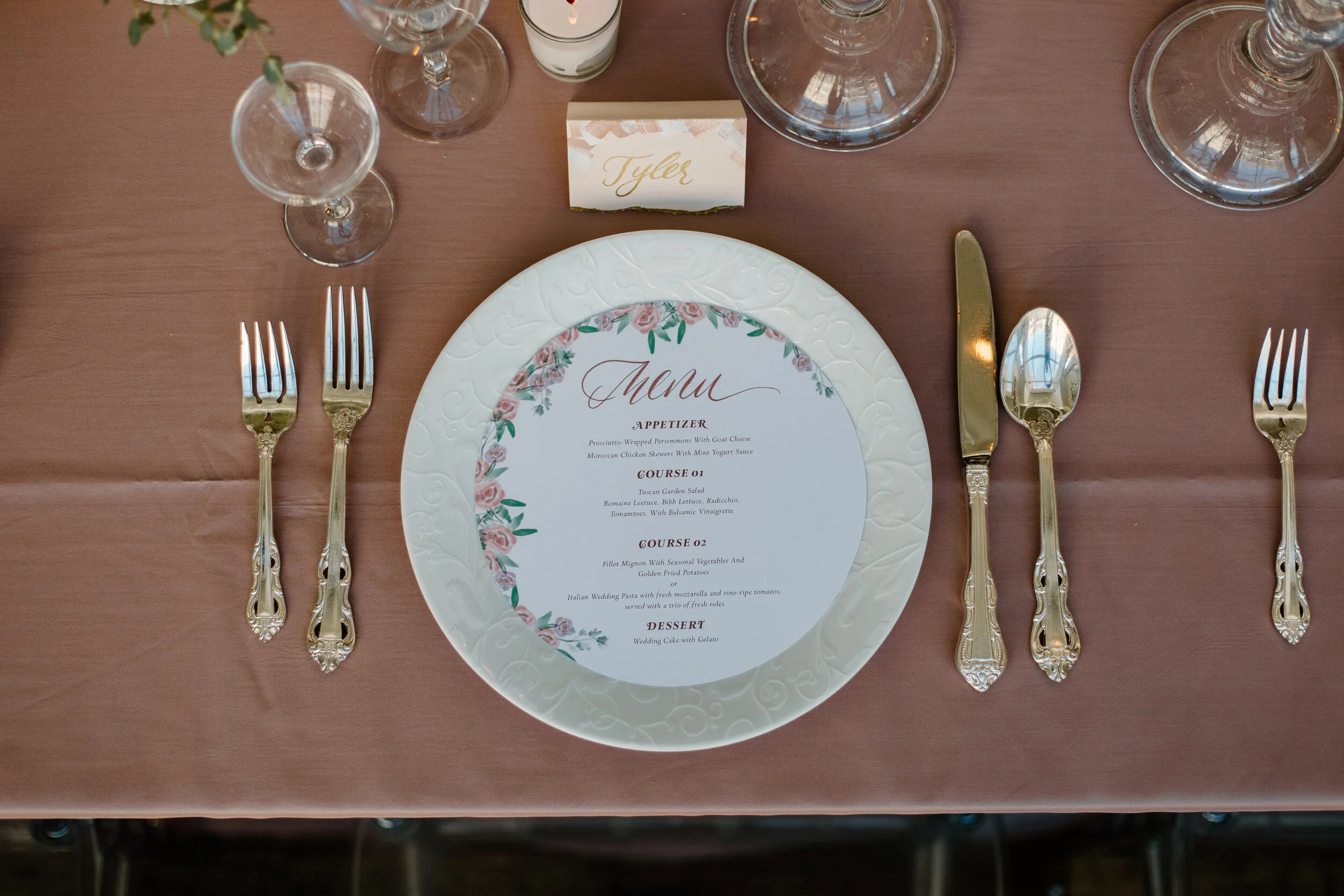
Additionally these do not have to stay a simple rectangle. Consider other elements in your day such as arches or making the menu fit in the charger of your guests place setting. These details are so fun and won’t go unnoticed by your guests!
Wise Wedding: Reception Paper Good Needs
You wouldn’t think so but the reception is the largest and most informational heavy part of your day. Cutting out signs or information might seem like a good idea when planning then the wedding, but you will have your guests miss out on important details because they never knew they were there in the first place.
Here is an overview of what you should provide at your reception and in the weeks to come I’ll be talking about more examples and specifics. Find a complete list of papergoods for your wedding here, including reception paper goods!
Signs
Last week we talked all about the signs needed for your ceremony and your reception. To recap here are the most common signs to include :
Welcome sign
Guestbook sign, especially if it is an interactive guestbook like signing a puzzle piece or wanting more than a name.
Cards and Gift location
Directional sign for cocktail hour, bathrooms, etc. for larger venues or venues that have multiple weddings happening at once.
Favor signs
Photobooth signs
Drink Signs for the bar if there is a special cocktail
Labels for any food items such as dessert table, snacks, or food truck
Wise Wedding: Ceremony Programs & Paper Goods
We’ve talked about the paper goods to set up and get your guests to your wedding, now what are you to have at your wedding to help provide special touches and communicate to your guests about your day? Let’s start with the ceremony.
Ceremony Programs
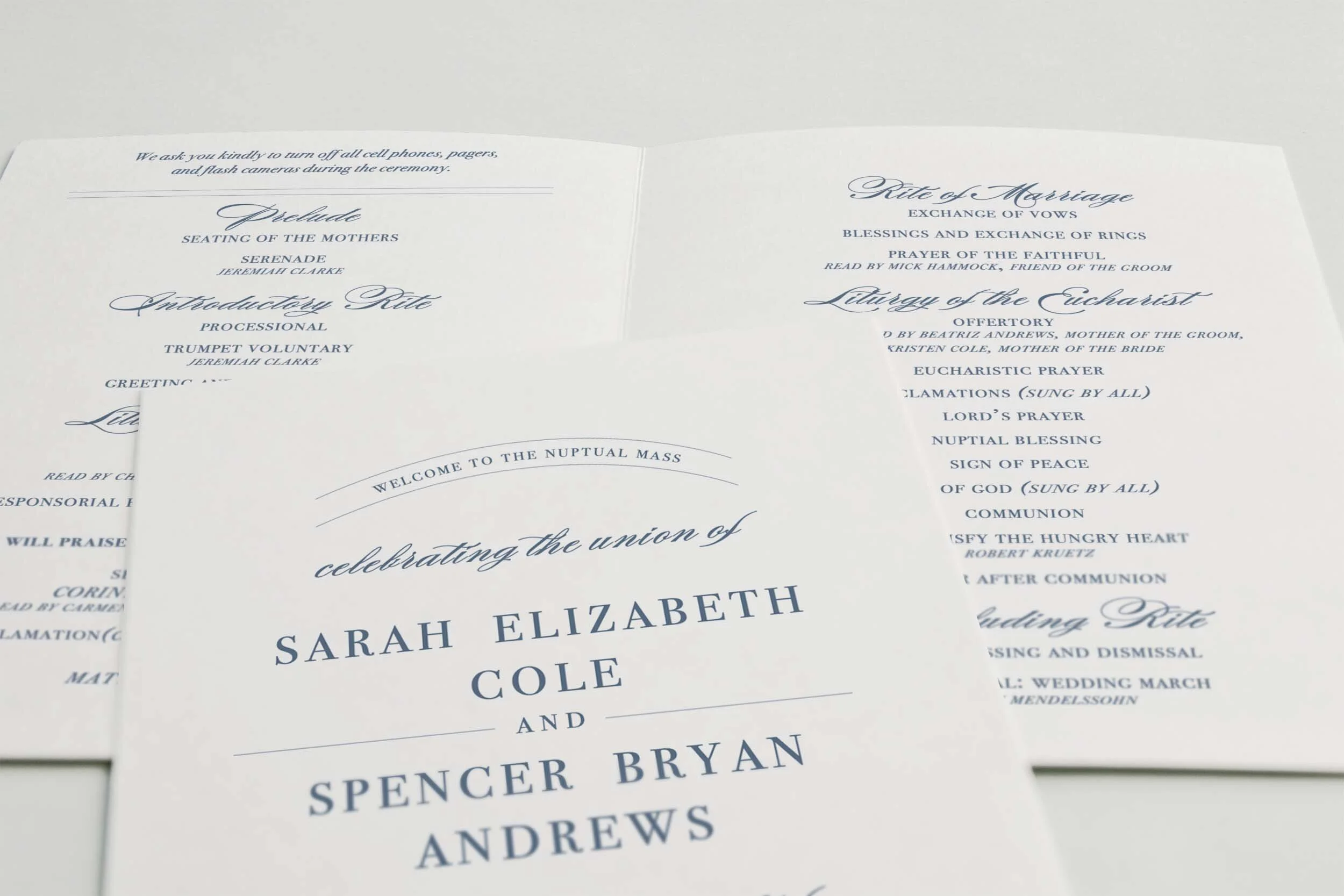
Ceremony programs are an informational tool to help guests know what to expect but are optional for you to have. There are two great options for programs if you opt to have them at your ceremony; paper programs or a program board.
Printed programs are great for more involved ceremonies or religious leaning services where the guests will be able to join in traditions such as a song, call and response readings, or communion. Programs also help you honor your bridal party and family involved by listing their names and potentially how you know them. This space too gives you the option to honor family members who are deceased publicly and acknowledge their absence on your big day.
Having a paper program can also allow you to add some special information for your guests such as a thank you note from the couple, the address for the reception if it is not in the same location, and even a new address for the couple if they have just moved in together. Often these style of programs are thought of traditional and are a sweet memento of your day to place in your future wedding photo album or keepsake box.
Photographers: Aaron and Jillian Photography Wedding Stationery: Silver Starfish
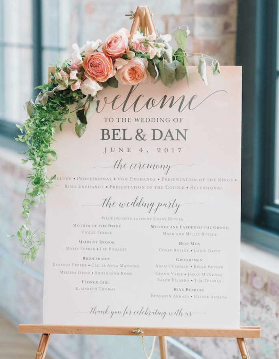
Program boards are a beautiful alternative option for more modern or laid back weddings. They still allow you to honor your bridal party and family members who have been by your side by listing their names and help the guests know the order of the ceremony. These are typically placed at the back of the ceremony or church for guests to read as they walk in to find their seats.
Important items to include on your wedding programs:
Your names and date of the wedding
Location of the wedding
Names of the officiant, bridal party members, and each family member you would like to honor. Typically this includes the parents and grandparents of each partner.
Ceremony schedule. Allow your guests to follow along to understand what is coming up next. Such items include processional, readings, songs, and vows.
Other items you can include in your programs:
Directions and address to reception.
Your love story or other fun details about you as a couple
Your new address as a couple
A note to unplug during the ceremony
Include bubbles, rose petals, or confetti when you hand out your program for when you walk back down the aisle as a married couple
Now it’s up to you whether you want to include a program or not. If you do choose to have one, make sure you include the basics like a running order of events and details about your wedding party.
Remember your wedding is a time to celebrate a joyful step in life and honor you as a couple. What you choose to include should do just that—honor your love story, personalities and create keepsakes (such as a wedding program) that you, your partner, and your guests will truly enjoy!
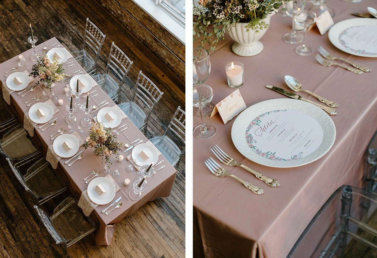
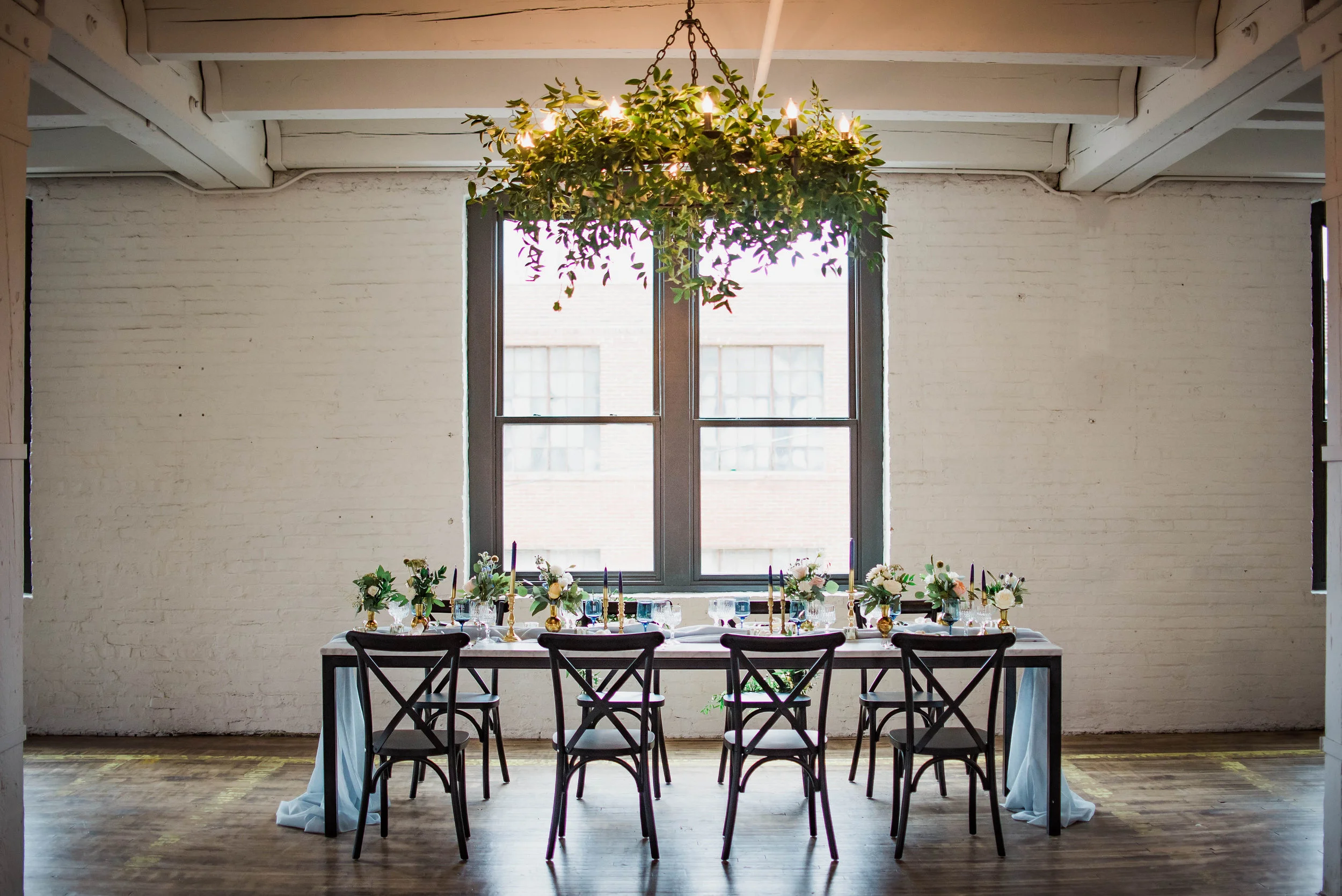
Styled Shoot: Romantic, Pink table at DL LOFT
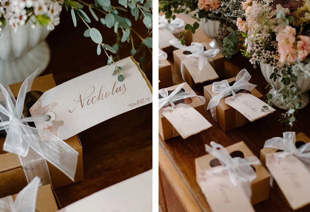
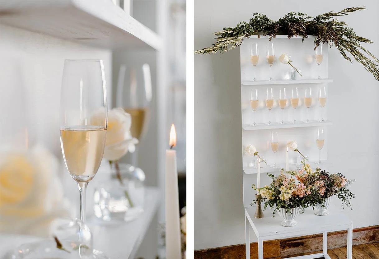
Here is the beautiful second shoot from the minds of K and K Celebrate! I love the mixture of prints, dusty pinks, and accents of metals that touch the table. The gorgeous florals mix perfectly with the glass accents that accentuate the light flooding throughout the venue. I loved getting to use a mixture of paints, calligraphy, and watercolor for all the paper goods! By using florals and textured paint strokes to create a pattern, the paper goods felt enhanced but not too over done.
The incredible team includes:
Planning: K and K Celebrates
Photography: 606 Photo
Grazing Boxes: Sage and Jam |
Floral: FleurInc
Venue: DL Loft, Chicago
Bubbly Wall: Bubbly Events Chicago
The perfect mix of elegance, romance and a dash of modern!
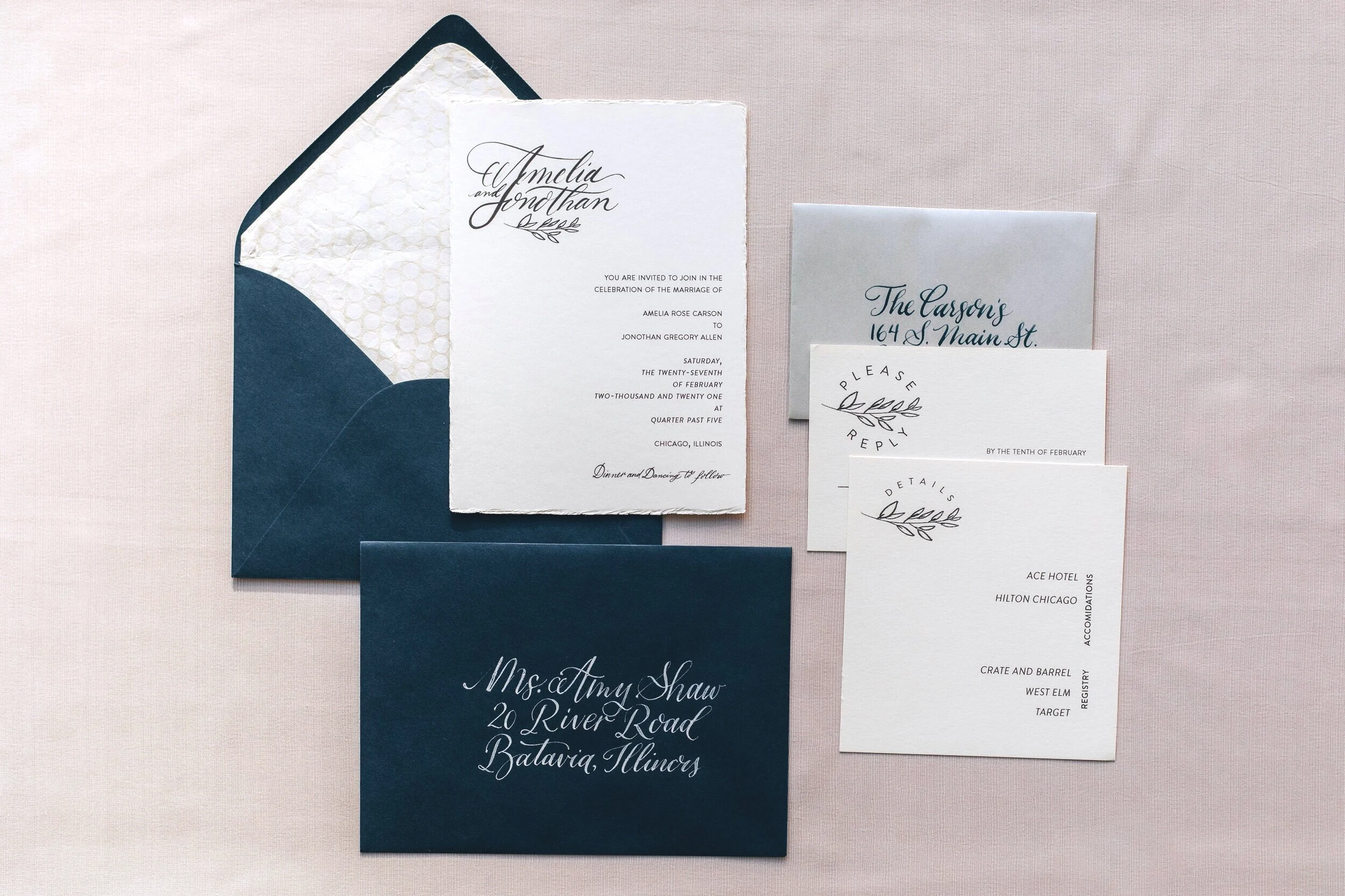
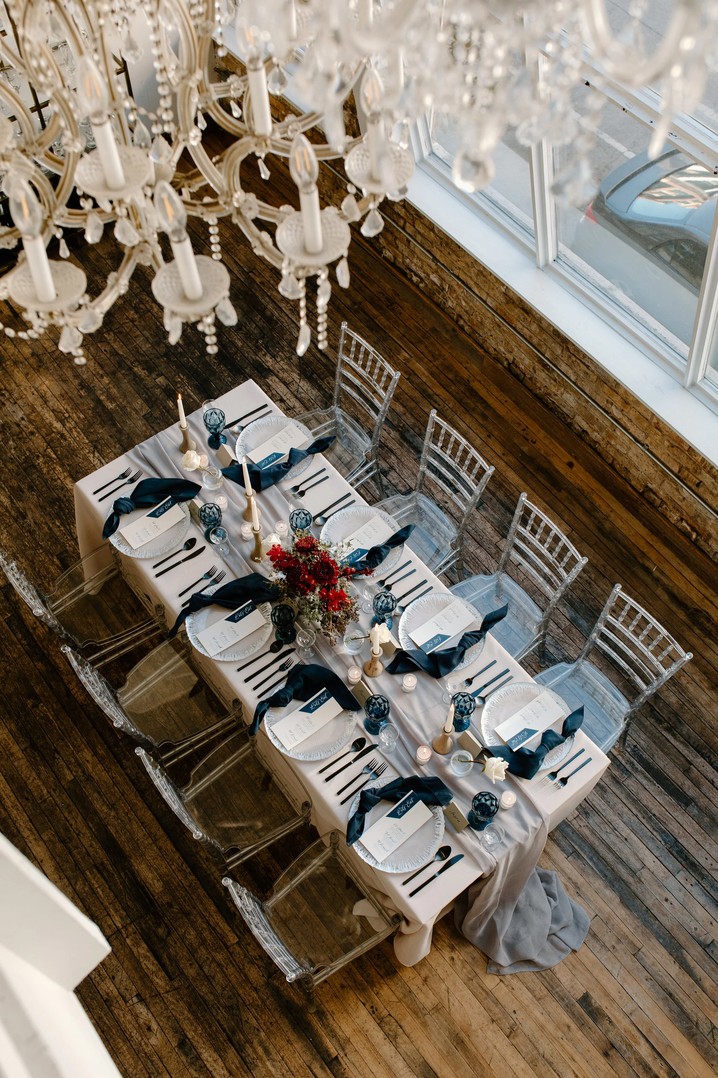
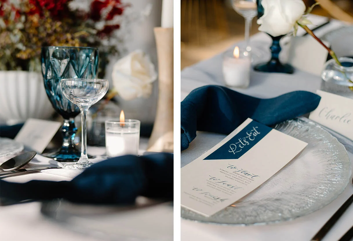
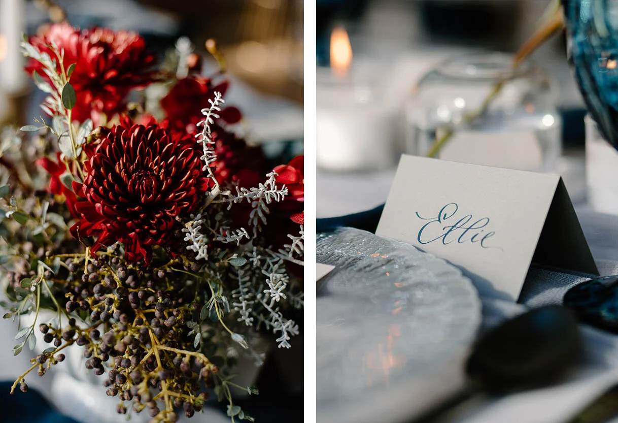
Styled Shoot: K and K Celebrates, Frosty Blues
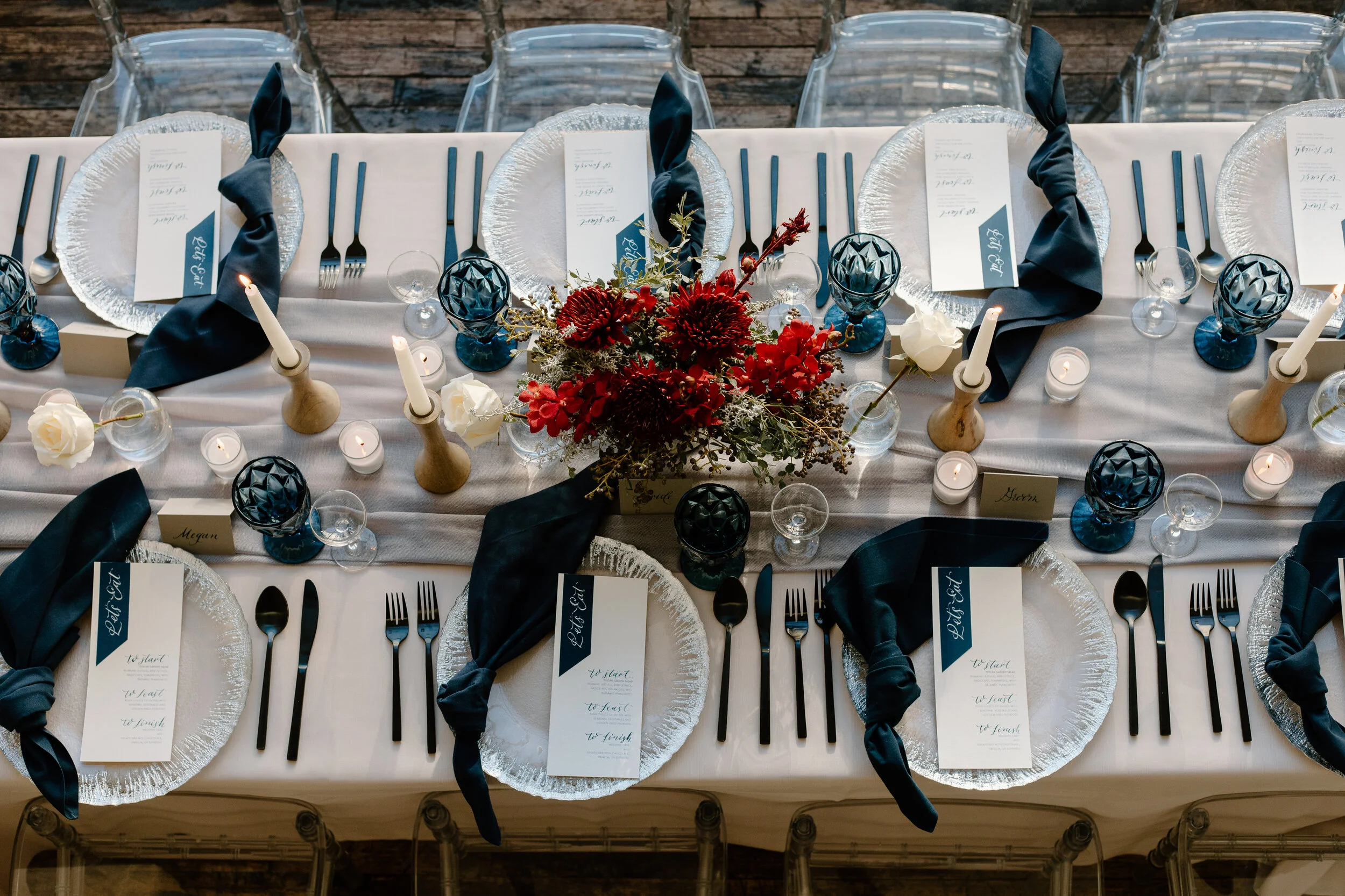
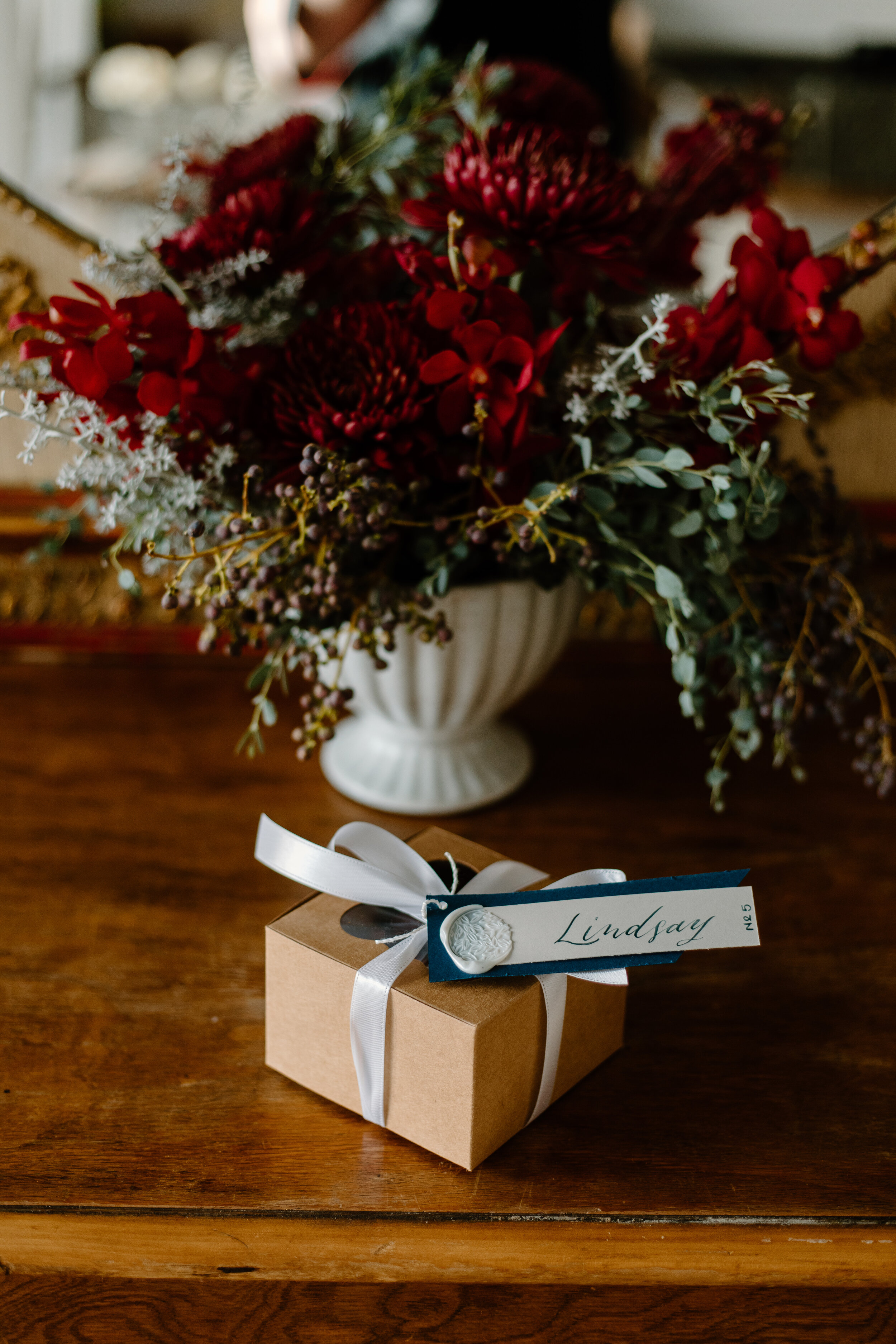
This past winter I had the pleasure of working with K and K Celebrates, a talented sister team based out of Chicago for two styled shoots. These two dreamy concepts were so fun to work with and create concepts for! The first one was this elegant, frosty blue color-scheme with hints of silver, white, and a pop of red florals.
The incredible team includes:
Planning: K and K Celebrates
Photography: 606 Photo
Grazing Boxes: Sage and Jam |
Floral: FleurInc
Venue: DL Loft, Chicago
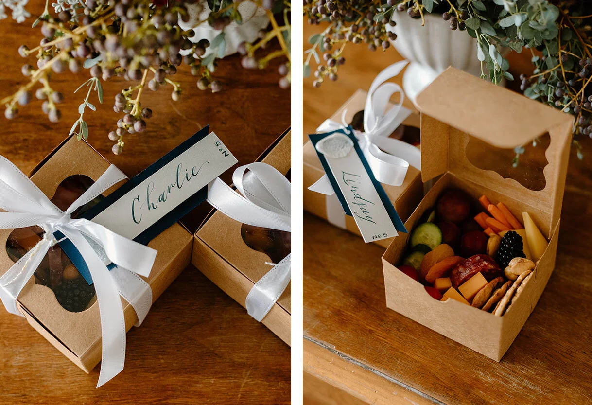
These beautiful grazing boxes by Sage and Jam serve as both a great cocktail hour solution, but a fun way to make sure all guests receive and locate their seats with their escort cards.
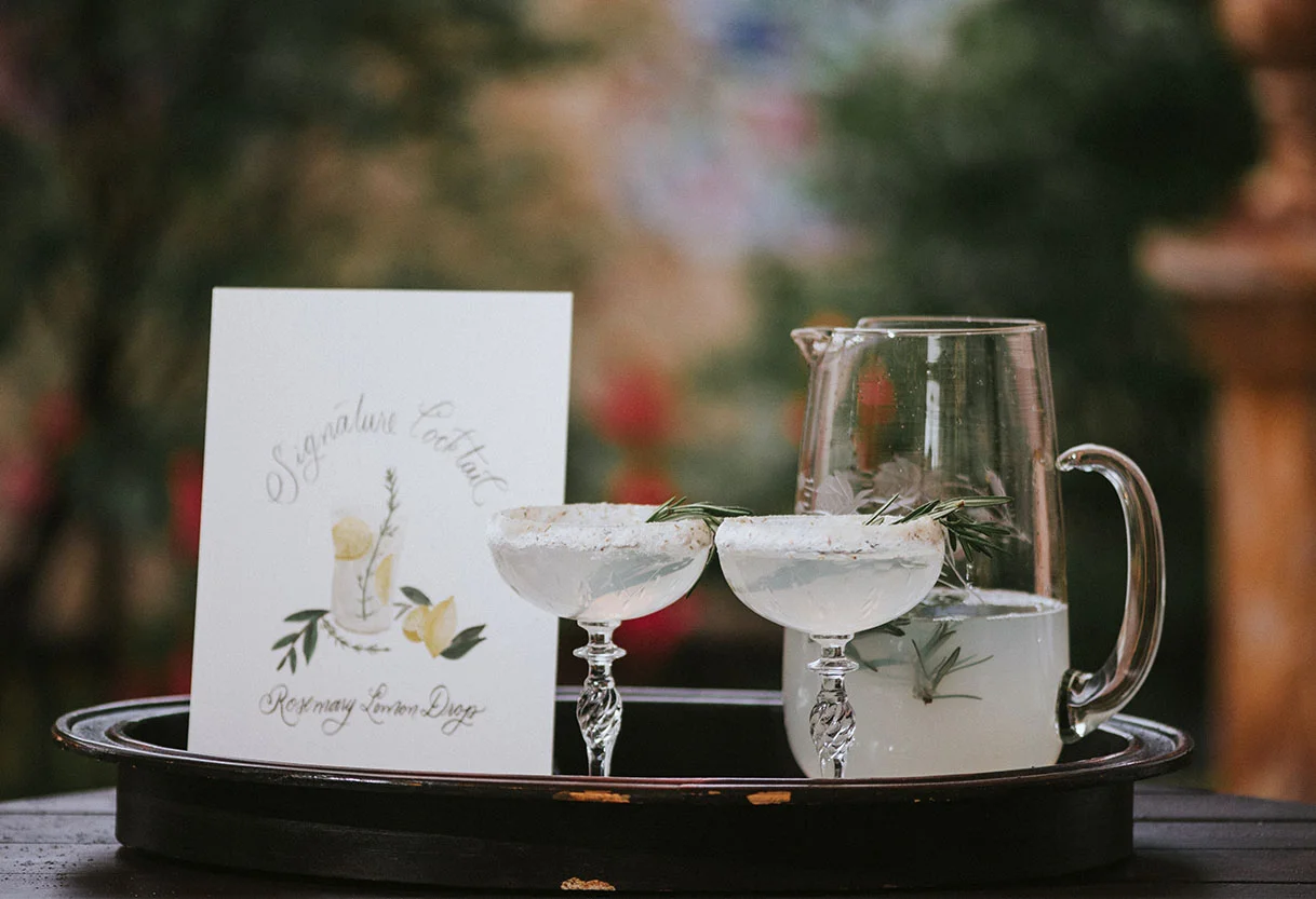
To add a special touch to the bar, I illustrated this mulled wine drink. How delicious does the real thing look? Yum!
Styled Shoot: The Clyde
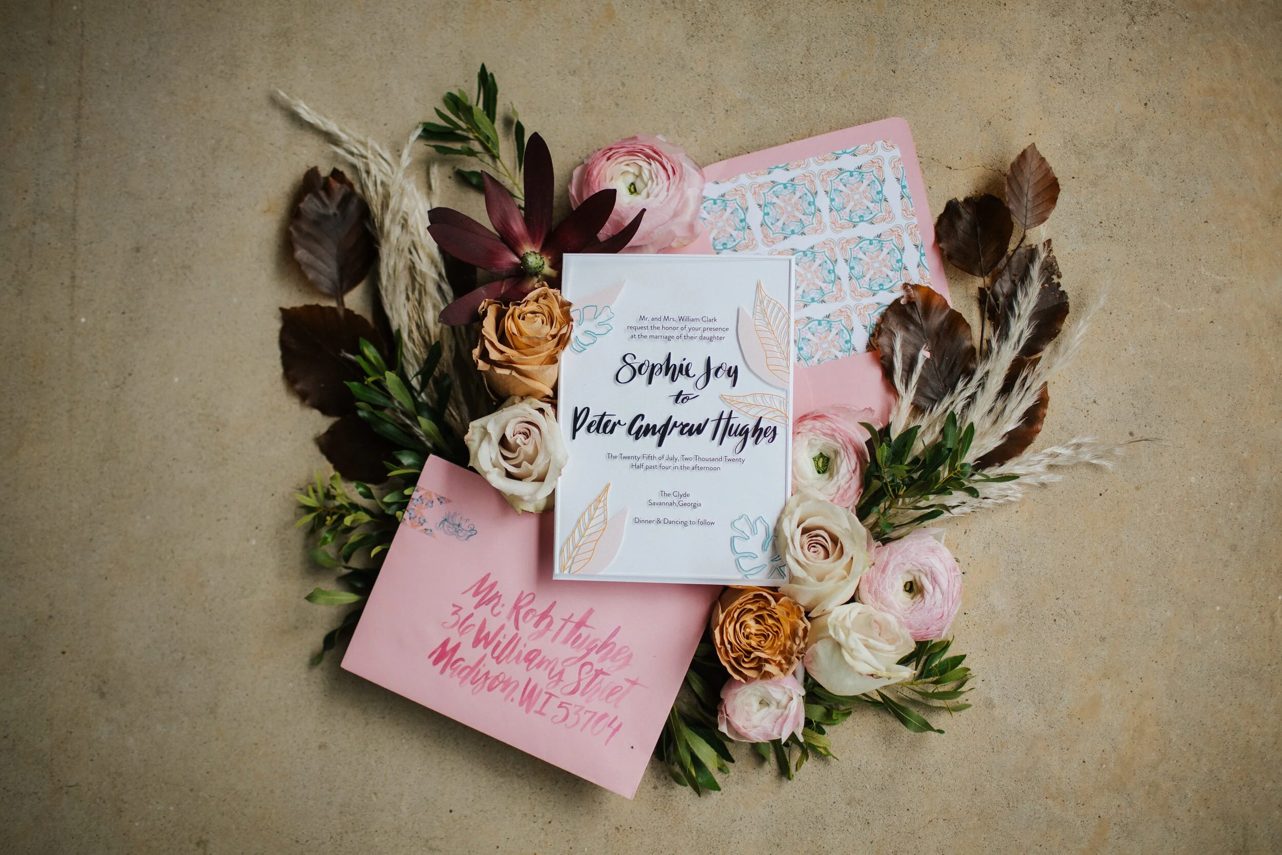
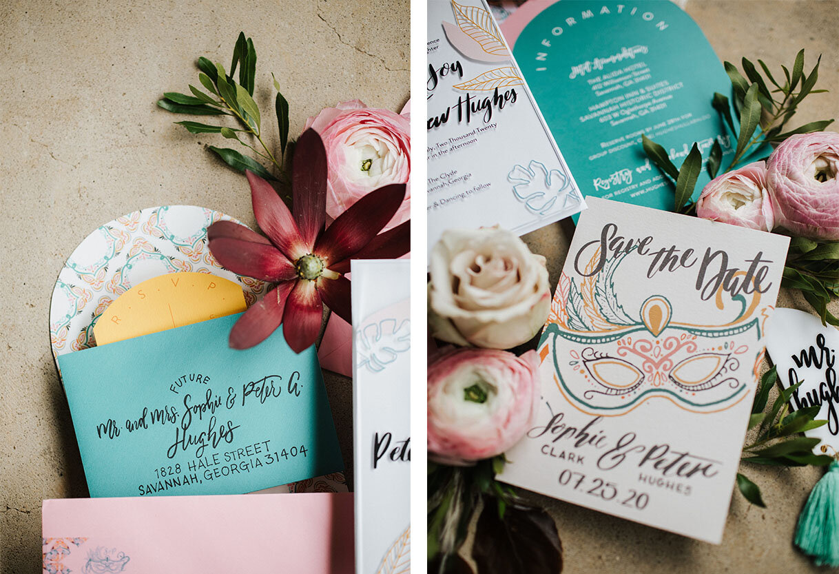
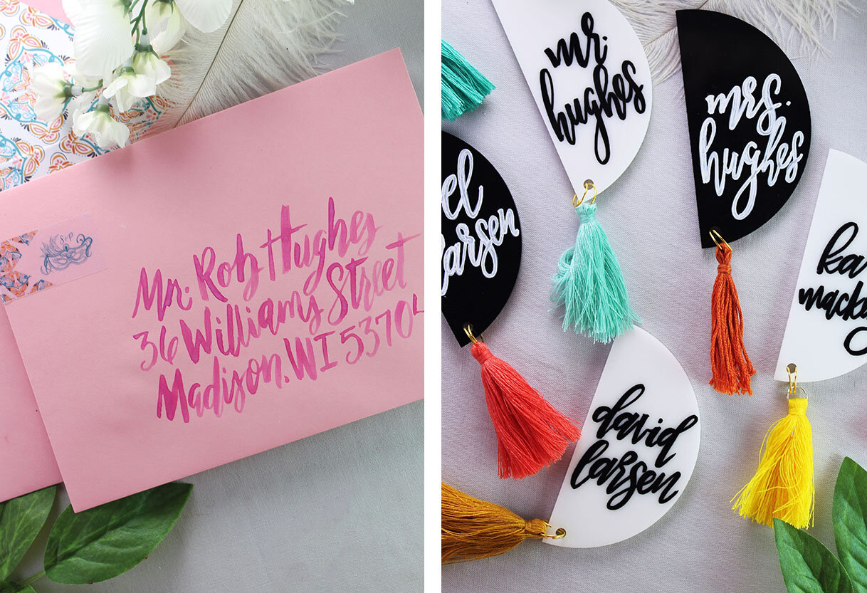
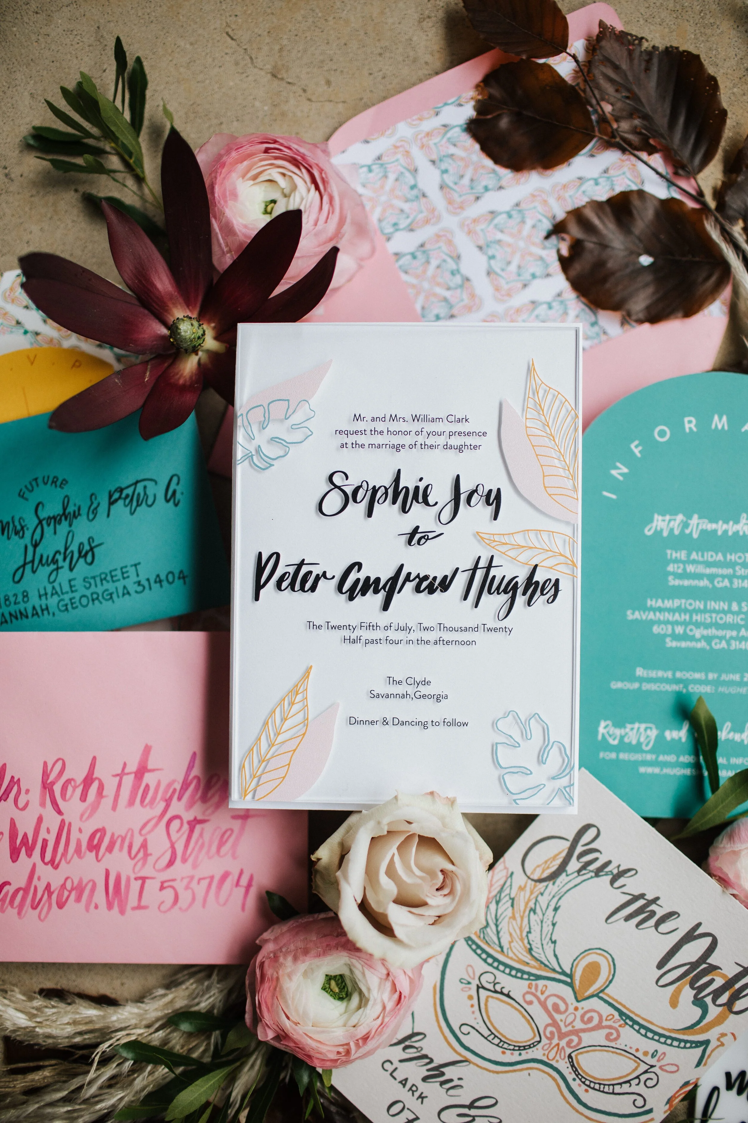
It was a dream to design these fun, patterned invites for this gorgeous shoot! Elisabeth from Ivory + Beau approached me to create this design first with a fun Marti Gras inspired design and summer color. As the shoot was pushed from July to early Fall, the colors darkened but the gorgeous pattern play and art deco feel didn't! I know if I got married today, this dress and venue would be a strong contender in my planning! Check out more of the inspiration and pictures at the Low Country Wed Blog.
PHOTOGRAPHY l Izzy + Co.
PLANNING & STYLING | Ivory + Beau
GOWN & FLORAL | Ivory + Beau
VENUE | The Clyde
PAPERIE | Lina Lulu Paperie
CAKE & PASTRIES | Sugar Whisk Co.
MOBILE BARISTA | Origin Coffee Bar
EVENT RENTALS | Bounce, Play, Love Event Rentals
BRIDAL ACCESSORIES | Anna Roses Atelier
HAIR & MAKEUP | Megan Anslie Johnson
MODEL | Victoria Gutierrez
Styled Shoot: Bohemian Chicago Wedding
This past summer, the talented Teresa Williams set-up a styled shoot to capture all the things that go into a wedding for her new course, The Wedding Photography Accelerator. I was and am so honored I got to be apart of this amazing resource in the tiniest way. Check out all these amazing vendors and the stunning outcome of this shoot!
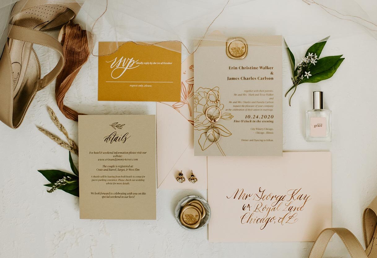
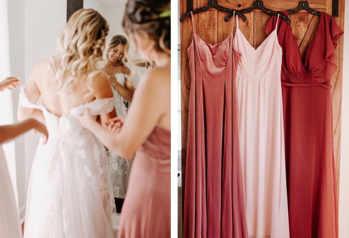
When Teresa asked me to be apart of this shoot, she sent me a mood board with the lushest and riches organic colors and shapes. I grabbed a few designs I had previously used and combined them to make a “custom” suite for the shoot. I pulled the primary earthy tones from the florals and the secondary color of a dusty pink and the beery red from the bridesmaid dresses. I love the way it turned out!
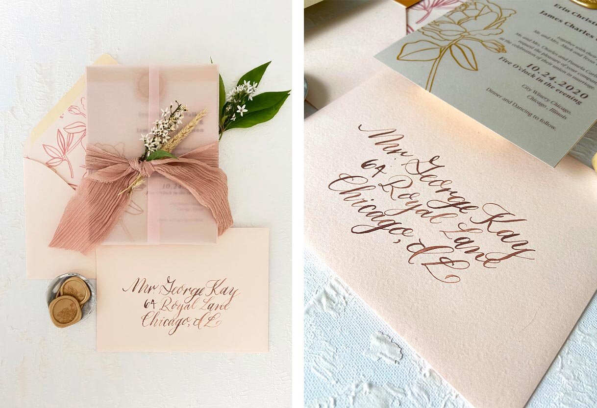
I love the trend of natural colors being used all year long. Since the pinks and deep reds were going to be the primary accent colors at the ceremony, I choose to use them as the accent colors of the paper goods. In the main suite, I played off the natural colors of the ceremony backdrop with a mix of brown, cream and gold. I loved finishing the suite off with a pink, vellum jacket tied with a natural dyed, silk ribbon. For a romantic touch, I placed a few of the smaller flowers in the ribbon.
How beautiful are the details of this ceremony backdrop? The natural architect of the venue, Artifact Events, was elevated but not hidden by this beautiful installation from Posh Studio Rentals. All the details of the day came together in the dreamiest way!
Vendor List:
Photographer: @_teresawilliams
Venue: @artifacteventschicago
Cake: @lusciouslayersss
Invitation Suite: @linalulupaperie
Prop + Event Hire: @poshstudiorentals
Florist: @bkfloralandevent
Hair Stylist: @emilyraebridalhair
Makeup Artist: @alyssadianamakeup
Gown + Suits: @adorebridals
Videographer: @mrssarahchapman
Production Assistant: @dani_stratts
Wise Wedding: All About the Timeline
You have your date picked out, you have your venue booked, your photographer scheduled, and all your favorite people are ready to celebrate you! Now we need to get everyone else on the same page and to your event on the right date and at the right time. I joke the invite is the most important item on the wedding checklist, I mean how else are you going to get everyone you love in the same room? I know there are so many more important things, like the ceremony and the marriage itself, but the invite is still a pretty important piece of paper. All jokes aside, couples ask often what is important to include in the invite and when they should actually send it out. The average time a couple spends planning their wedding is around 15 months these days. That’s a decently long time to be planning a party. Then when do you let everyone know about the who, what, where and when?
Over the upcoming weeks, I will be going into detail about all things paper, stationery, and calligraphy that you could use for your wedding, reception, and other events celebrating your big day! Here is a brief overview of each item. (Psst…Bookmark this post as a shortcut to the posts to come! I will be updating each section below with the link to the more in-depth post)
Sending out Save the Dates
Your Save the Date should be sent out around the 6-month mark, or sooner if travel is involved for a destination wedding.
Your Save the Date should be sent out around 6-9 months before the wedding, and at around the 1-year mark if it is an international destination wedding. The more travel involved the sooner the card should be sent out.
Save the Dates can include pictures, just typography, a fun illustartion of you as the couple or the destination you are getting married. These are the first introduction to your significant other to many family members, and will clue your guests into your vibe and potentially the feel of your wedding.
Sending out Invitations:
You should start thinking about invitation design around the 4-6 month mark before the wedding. The invitation should be sent out around the 2-month mark before the wedding.
Since the invitation is the “main event” and involves a few more pieces and more information than the Save the Date, we advise you to start the design process early on. If you choose from the collection with minimal changes, it can be anywhere from 4- 6 week period. If you choose to go custom, depending on the print style, at a minimum with a digitally-printed invitation, you are looking at around 6-8 weeks for design and production. If you are looking for anything additional (letterpress, foil, ribbon, wax seals, custom maps, liners, calligraphy, etc) it can potentially add more time to that process by a few weeks depending on guests count.
That’s at minimum 2 months of back and forth to help me create your invite, which in the grand scheme of things is so important to get all the right information on the right cards and out to the right people, am I right? It is also important to give your designer enough time to creatively work through your requests and give you the best options. Start inquiring about invitations at the 6-month mark. Especially for custom work, as a designer, I do not create items perfectly the first time around. By putting the work upfront in filling out your questionnaire, giving me complete information, color swatches, and a mood board is how you will help me create that custom, unique design that is just right for you and your fiancé(e) and be the perfect complement to your Big Day!
As noted above, the more info you have for your day the better. By having your date set, the venue booked, and having a rough idea or initial design meeting with your wedding planner on how the look and feel of your day will be a huge help when we start talking about your invitations. As soon as you have an idea of what you like, we can get started talking about design for your paper goods too!
I try to deliver the full suite at least a week prior to the “deadline” to ensure you can double-check your guest list and everything is in order. Check out my Wise Wedding: Invitation Details post for more information ( link will be posted here when ready).
RSVP information
Reply cards or RSVP cards are sent out with the invite 2 months before the wedding date.
Your RSVP is included in your invitation suite and will be sent out to all your guests when your invite is. Typically an RSVP date is 1 month before the wedding. This gives you ample time to make sure each guest has replied back to confirm with the caterer, start seating arrangements, or for you to track down replies in case an invite was lost in the mail or from an inconsiderate guest. Each venue is different and may require a guest count sooner or later than the traditional 1-month mark. Make sure to double-check this info with your planner and/or venue.
Calligraphy for Envelopes
Inquire at the time of your invitations if you are using the same person for design and calligraphy. If you are hiring a separate calligrapher than the invitation designer, inquire 1 month byt the latest before the invitations are to be sent out.
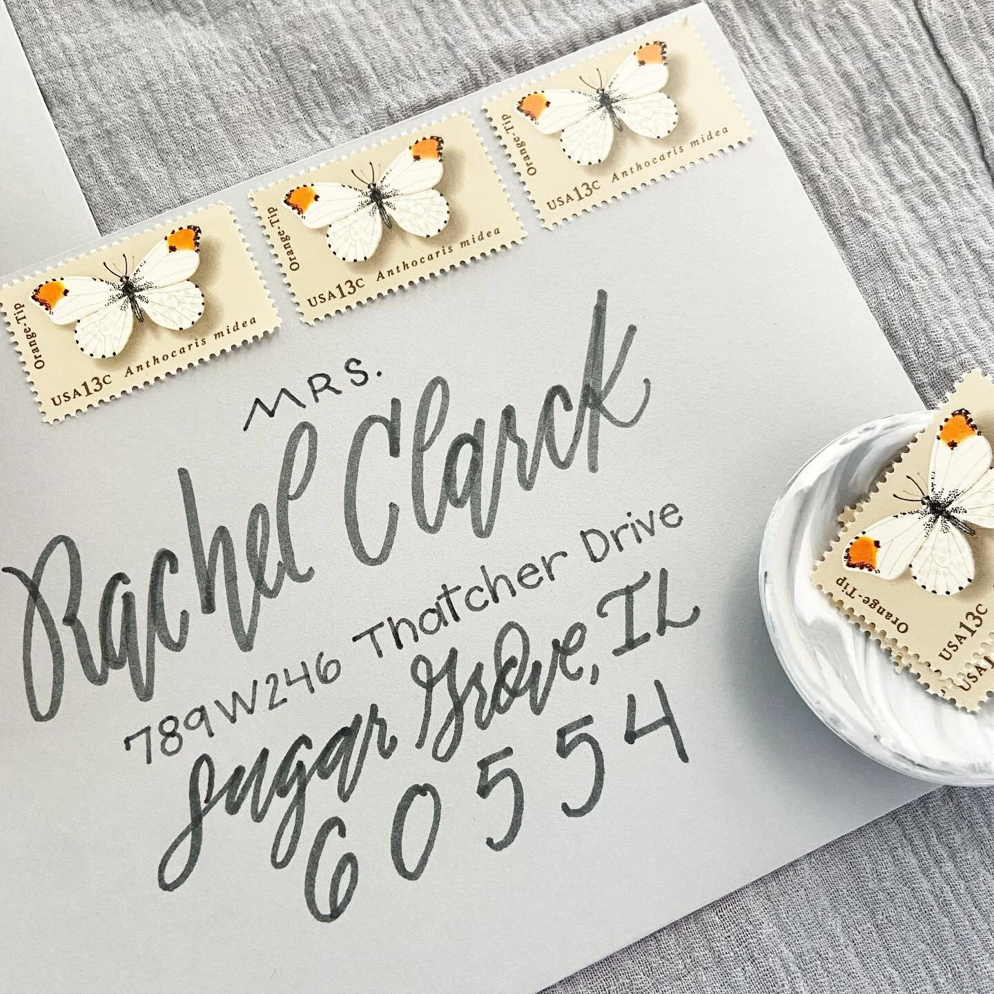
There are two options when addressing your envelopes, printed envelopes or hand-done calligraphy. Both can be beautiful options, but I am in full support of calligraphy for your mailing envelopes. When will you have another time in your life to really make a statement with your piece of mail? I may be biased, but I truly do believe that your invite feels complete with calligraphy addressing. I personally ask for at least two weeks for 50-100 names or three weeks for 150-250 names from when I receive the envelopes.
Yes, calligraphy can be done “last minute” but doesn’t need to be. Once I (or your designer) have decided on an envelope/paper color and it is ordered, the calligraphy can begin when the envelopes are received. Since you collected all your addresses with your Save the Dates way back around the 9-month mark before the wedding, you have all the information you need to send to your calligrapher. A quick tip is to keep your addresses in a spreadsheet with each guest’s title and full name included ( example. Dr. and Mrs. Jason and Sandra Smith, instead of Jay and Sandy Smith). Most designers and calligraphers, including myself, will ask you for a document like this. Bonus, this spreadsheet can help you track who has RSVPed, help with seating arrangements and keep track of wedding gift thank yous— win!
Designing Day of Items
You should start thinking about day-of items at least 3 months before your wedding date, and start finalizing everything in the 2-month and 1-month mark.
First, let me explain what a “day of item” is. It is anything that you will be needing just for the day of your wedding that adds to your decor and provides information to your guests. This can include programs, venues, place cards, escort cards, seating charts, welcome signs, etc. You should begin thinking about these around the same time you research your invitation look and feel. These items then can be booked around the 2-month mark. When you start your invitations, note to your designer the pieces you would like and which items you would like to coordinate with your invites look and feel and your receptions look at feel. This will allow them enough time to supply you with a design to approve, as well as order the right amount of product for you to receive finished, on time.
The last months of planning a wedding are of course full of finalizing details and making sure everything gets to the venue and set up the way you envisioned. This is no different for your day-of items. Learn more about the specifics of all the day-of items on the Wise Wedding: All the extra details post ( link will be posted here when ready).
Thank You Cards
Send a thank you from any bridal events 2-3 weeks from the event or from receiving the gift. From your wedding, thank you’s should be sent out no later than 3 months.
There is a myth going around that you have 1 year to send your thank you notes out from your wedding. This may be a newer myth due to couples opting to send a thank you card with a photo from their wedding on it, as wedding photos take longer to be edited and delivered to the couple. I recommend ordering a small amount of thank you cards that match your Save the Dates. This way you have themed cards on hand for thank yous for your shower and other bridal events or to write a special note to your bridal party. The nice thing about purchasing custom cards is that they don’t have to have the words “Thank you” printed on them. These cards can be have a pattern that is used in your weddding papergoods or have a monogram of your future, marrried name. By not including the actual words “thank you”, you can order a larger amount of custom cards that can be used for any event, including your wedding thank you notes.
If you have any other questions about the timeline for your paper goods or would like to talk about what I can help you with to check something off your current timeline, contact me here. In the meantime, to keep yourself organized, download my free wedding timeline checklist here.
Wise Wedding: Tackle Your Wedding Paper Goods timeline
There are many moving parts when it comes to planning a wedding. When I was planning my wedding (way back in 2012) Pinterest was just emerging, “breaking” traditional rules was just beginning to happen and I really didn’t know where to begin. Looking back, the process could have been a lot smoother if I knew what to expect and had a timeline to help me understand where to start, especially with my paper goods.
Over the upcoming weeks, I will be going into detail about all things paper, stationery, and calligraphy that you could use for your wedding, reception, and other events celebrating your big day—introducing Wise Wedding!
In this new series I will help you understand the important timelines, different paper goods, and how each could enhance your big day. These posts will contain bite-size information and go-to’s to clarify overlooked or often misunderstood items that not only add to your wedding but will help you understand the best options for your own big day!
Styled Shoot: Dreamy, Bohemian Style in Chicago
When I was asked to be apart of a shoot at Artifact Event Space I couldn’t say “yes” quicker! I have been to this space a few times, as well as helping with events, and it is just so dreamy! The exposed brick, gorgeous antiques, and light pouring in is the perfect setting for any Chicago party. All the touches from each vendor created the most magical blend of an elegant, city wedding with a touch of whimsy bohemian you could ask for!
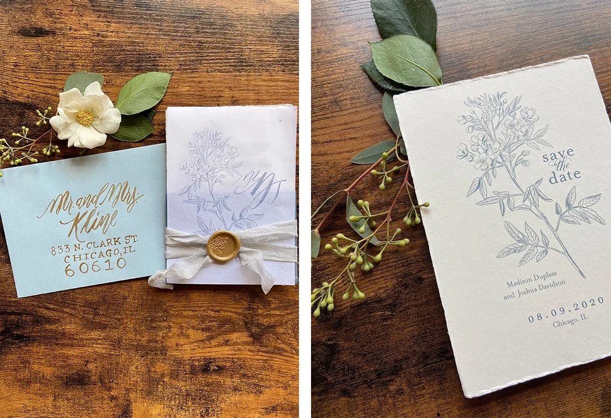
Paper goods set the stage for your guests to understand what the “feel” of your wedding will be. With this Save the Date and invitation suite I choose hand-made paper with rough, deckled edges to contrast the timeless feel of the typography and hand-drawn botanicals.
By using two colors for the invitations, black and cornflower blue, the traditional elegance of a black-tie wedding is conveyed without sacrificing the laid-back vibes of the bohemian decor that the bride and groom have throughout their day.
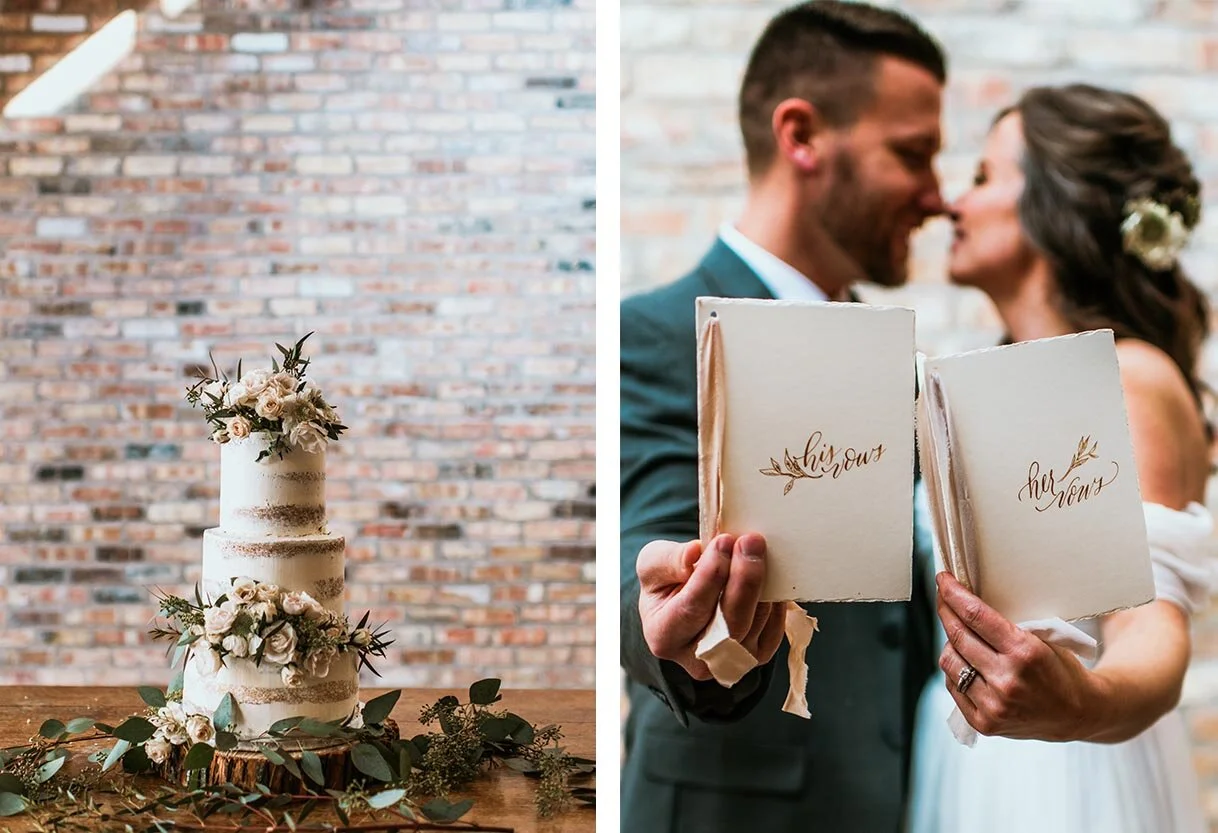
Hand-done details, such as the vow books and the accent mirror, lend the bohemian elegance to this unconventional space in just the right touches without feeling out of place.
One of my favorite extra items for this wedding was this mirror! The unconventional shape next to the cake adds dimension and unexpected whimsy to the sweets table. I used the lyrics from Andrew McMahon in the Wilderness to add that extra touch of romance and sentimental flair (not that this beautiful couple needed it in the slightest - they’re so sweet together!).
Photography: Teresa Williams | Flowers: Ashland Addison Floral Decor | Dress: BHLND | Hair: Emily Rae Bridal Hair, Chicago | Cake: Luscious Layers
Portfolio: Elegant and Simple,Calligraphy Wedding Invites
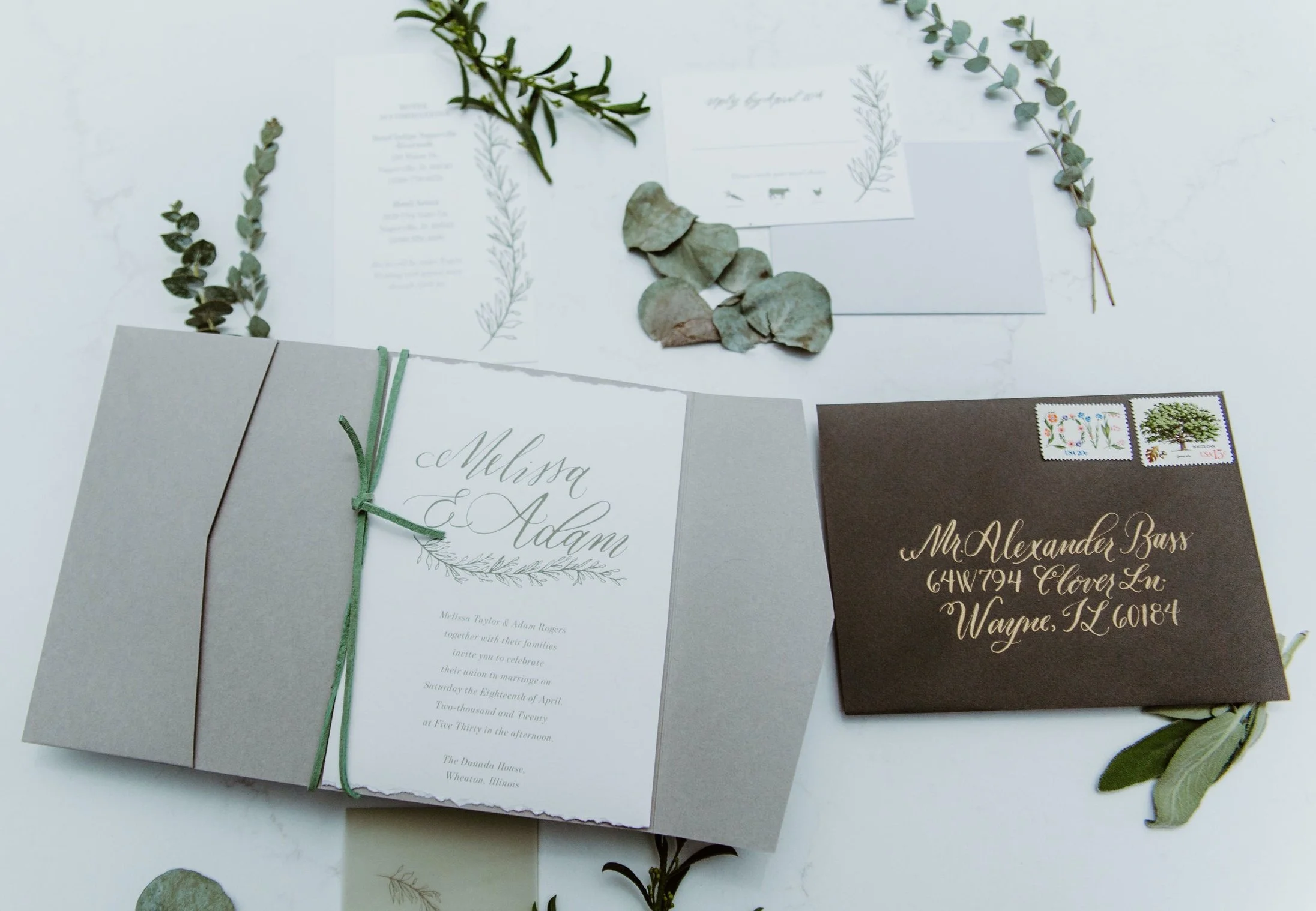
These elegant invites convey so much in their simple design. I loved incorporating so many beautiful elements including the natural, deckled edged paper; antique gold calligraphy on the dark grey envelopes; and the illustrated, vine that is included on all three informational pieces for this complete invitation suite.
The relaxed calligraphy emphasizing the couple’s names on the invite creates a modern monogram of sorts, as well as adds a touch of sophistication to the already subdue but timeless color palette. Using the pocket folder allows all the pieces to mail easily while adding an extra and dynamic to the opening experience for the guest.
Photos by Bozenavoytko Photography | Planner: Elisabeth Dari
Trending Wedding Colors : Winter 2019
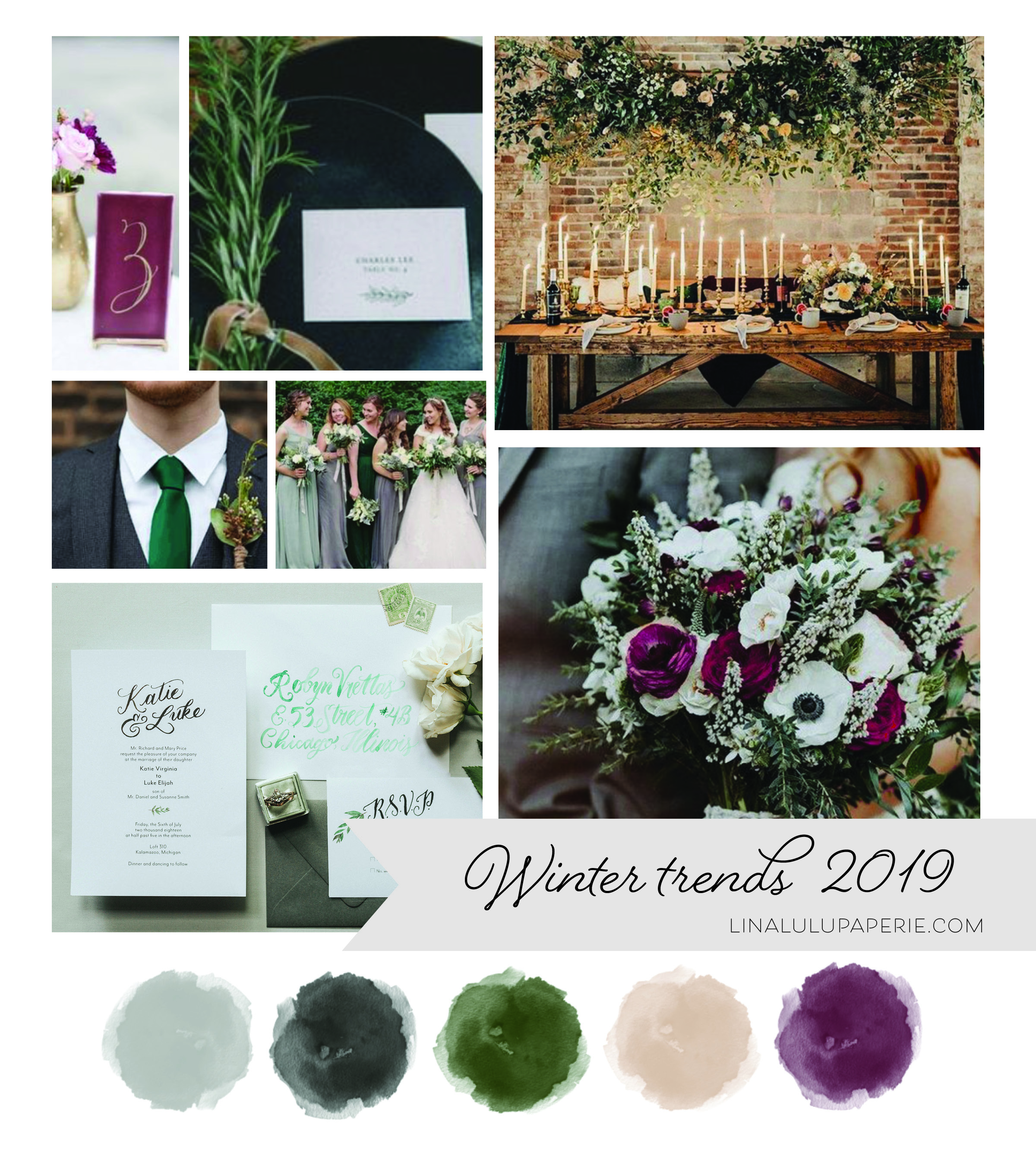
Winter months don’t mean you have to resort to traditional black, maroon or blues. With dusty colors and organic elements being hot through out the last few years, use a palette of jewel tones starting with emerald green to create a beautiful, full color palette that will create a elegant and minimalist vibe against a grey and white backdrop.
With less outdoor elements available, go with a chic industrial vibe using warm tones through out your decor by bringing organic elements such as brick, wood, and mixed metals through out your decor. Allow your guests to know your minimal but elegant affair design from the start with our Olive branch suite, showcasing our modern calligraphy and simple greenery design. With minimal neutrals and lush green being your focus, add small accents colors such as a lush Bordeaux red, a dusty rose pink or even a amethyst yellow among your tables and flowers to create that warm, inviting feel to draw your guests out of the cold and onto the dance floor!
Styled Shoot: Company 251
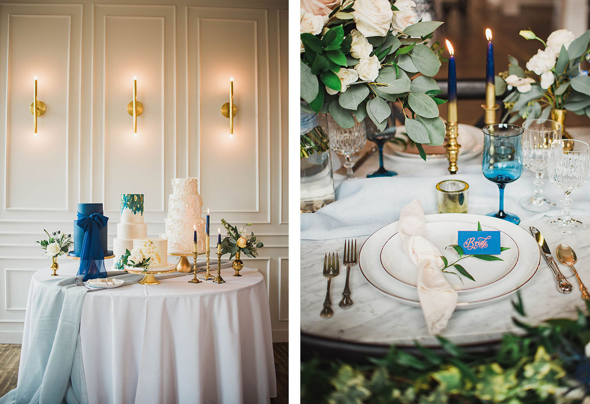
When I was invited to a styled shoot by the talented Elisabeth Dari at Company 251 I couldn’t say “yes!” quick enough! This venue has been on my list since it opened. The natural elements of the building combined with gorgeous mixed metals, tiles and modern, minimalistic design aesthetic is the perfect canvas for all styles of weddings. Elisabeth drew inspiration from the history of the location, combined with an organic and romantic vibe—and wow—it is just too dreamy beyond words!
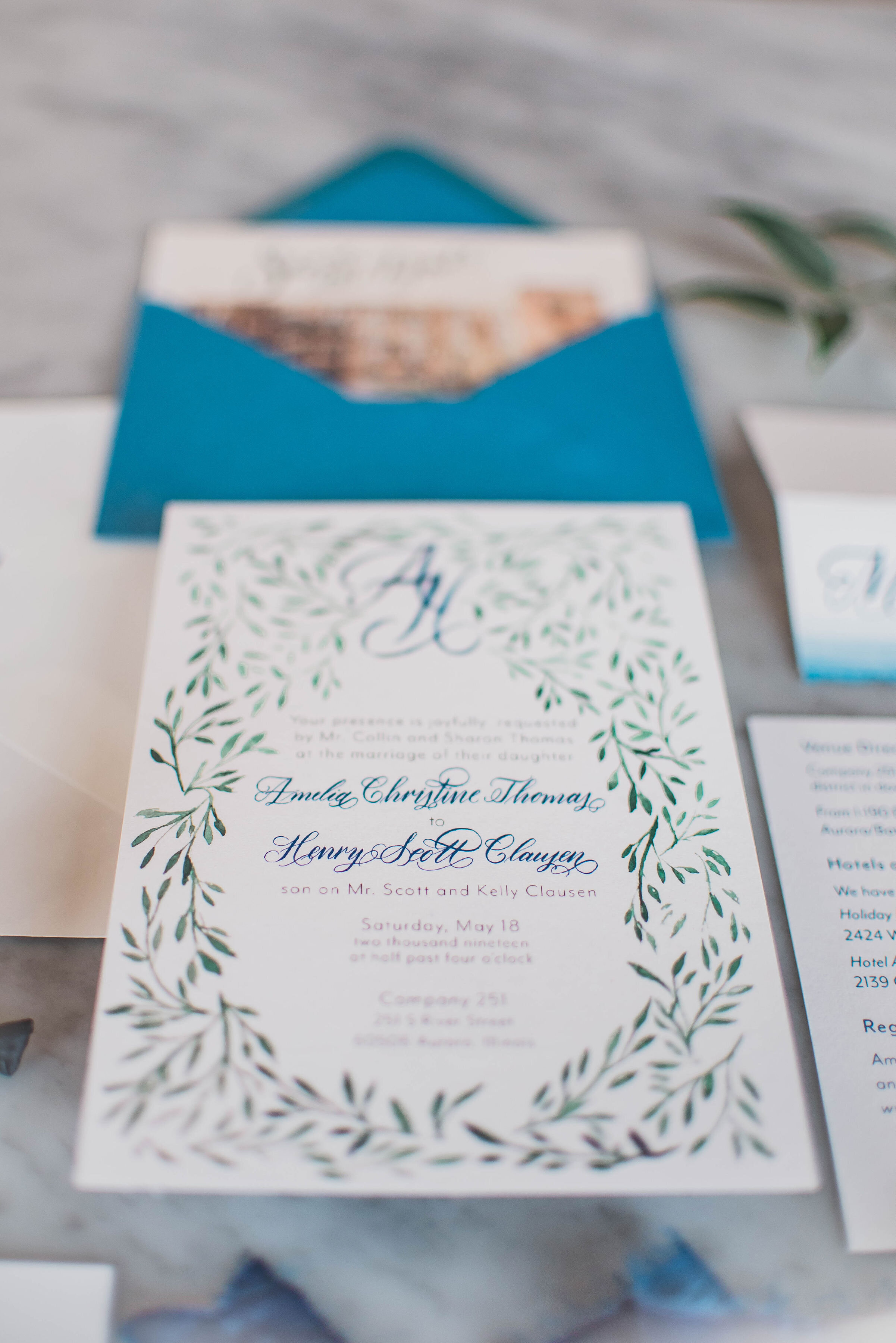
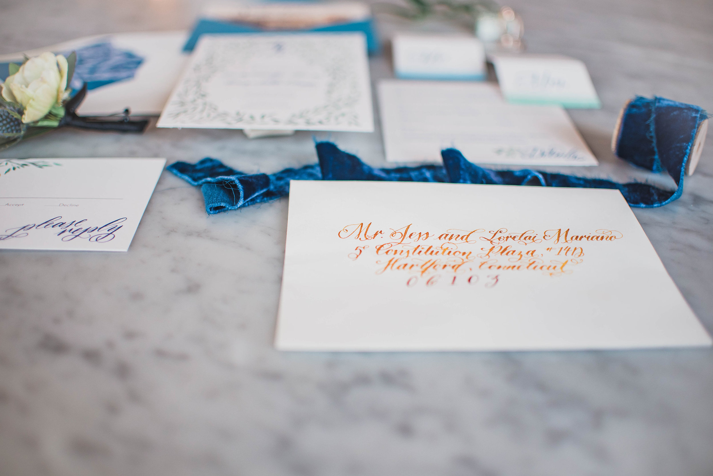
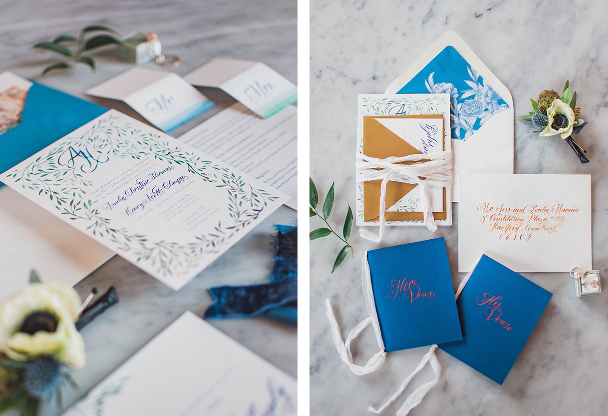
I created a custom invitation suite featuring lush, watercolor greenery flowing through out all the pieces and soft hints of the cobalt blue color that would be present in the cake, flowers and table decor. I love how my Rose calligraphy through out the suite create the romantic feel even before stepping into the gorgeous venue! I reflected the mixed metals elements of the space in the invites through an antique gold RSVP envelope and by using metallic ink on the mailing address.
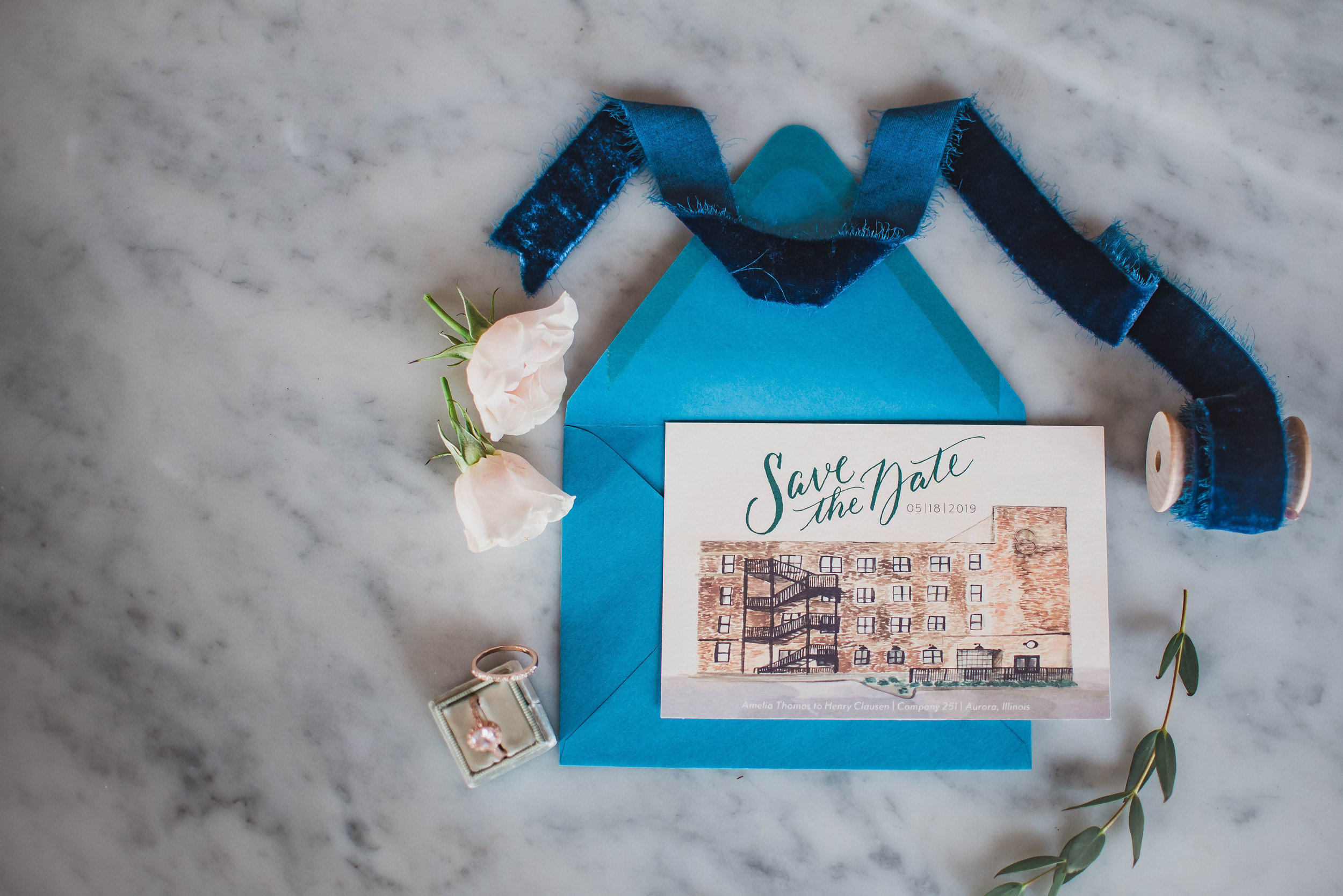
My favorite piece of the entire look had to be the custom watercolor Save the Date of the building itself! I loved creating this gorgeous and unique vintage postcard that could be used as a keepsake for the couple.
Vendors, Artists, Producers
Venue | @company251
Design and Styling| @elisabethdari
Cinematography | @kevinwagan
Floral |@stemmingfromlove @stevesflowermarket
Paper goods | @linalulupaperie
Catering | @flourishjuiceco
Bakery | @eyecandybakeshop
Bridal Boutique | @brizancouture
Artistry | @bsansostiartistry
All in the Details
Table Runner | @fabricwholesaledirect
Table Napkins, Flatware, Ring Box | #vintage Crystal Goblets, Mocktail Coupe | #vintage
Water Goblets | @lenoxusa #vintage Dinnerware | @westelm @westelmchicago
Styled Shoot: Vintage Tuscany at Galleria Marchetti
I am thrilled to have been apart of this gorgeous, inspired shoot !Designed by the talented and kind Lillian Rose Events, the tuscan elements combined with charm and elegant details of Galleria Marchetti created for a romantic, old world feeling wedding here in the Midwest! All photos by Jasko Omerovic Photography. For all vendor involved check the list below!
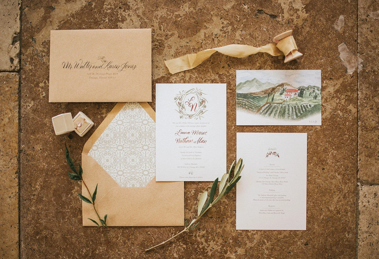
Inspired by the romantic fields and wineries of Italy, I chose to work with earth tones and simplistic elements. A custom monogram surrounded by olives adorned the main invitation (swoon!). The olives leaves are carried though out the rest of the wedding paper goods from the details card all the way to the wax seal bringing texture the the table menus.
My favorite two elements from the invitation suite quickly became the Italian tile inspired envelope liner and the lush, custom painted country side RSVP postcard. Both elements bring in more color to an other wise soft and romantic feeling invitation.
Each paper element, though slightly varied from one another, are all connected through the calligraphy. I used my Lily style to bring a romantic but modern movement to each element. Choosing a soft grey ink allowed each paper good to feel rustic and compliment the gorgeous tones of the vintage dishes, beautiful table linens and gorgeous muted toned florals.
To find more of this stunning shoot and a gorgeous video capturing the experience, check out the post from Chicago Style Weddings
Find the incredible and talented vendors here:
Venue: Galleria Marchetti, Photographer: Jasko Omerovic Photography, Videography: Newlyweds Cinema, Event Planner: Lillian Rose Events, Floral: Phillips Flowers, Décor & Rentals: Dish & Decor Vintage Rentals, Hair & Makeup: Meghana Prasad, Stationery: Lina Lulu Paperie, Linens: BBJ Linen, Bride’s Gown: Edith Élan via Dame Couture, Bride’s Shoes: James Ciccotti, Bride’s Accessories: Davie & Chio; Ti Adoro Jewelry; Jennifer Leigh Veil Design, Formalwear: The Groomsman Suit, Models: Naftali Kark & Stephanie Straka
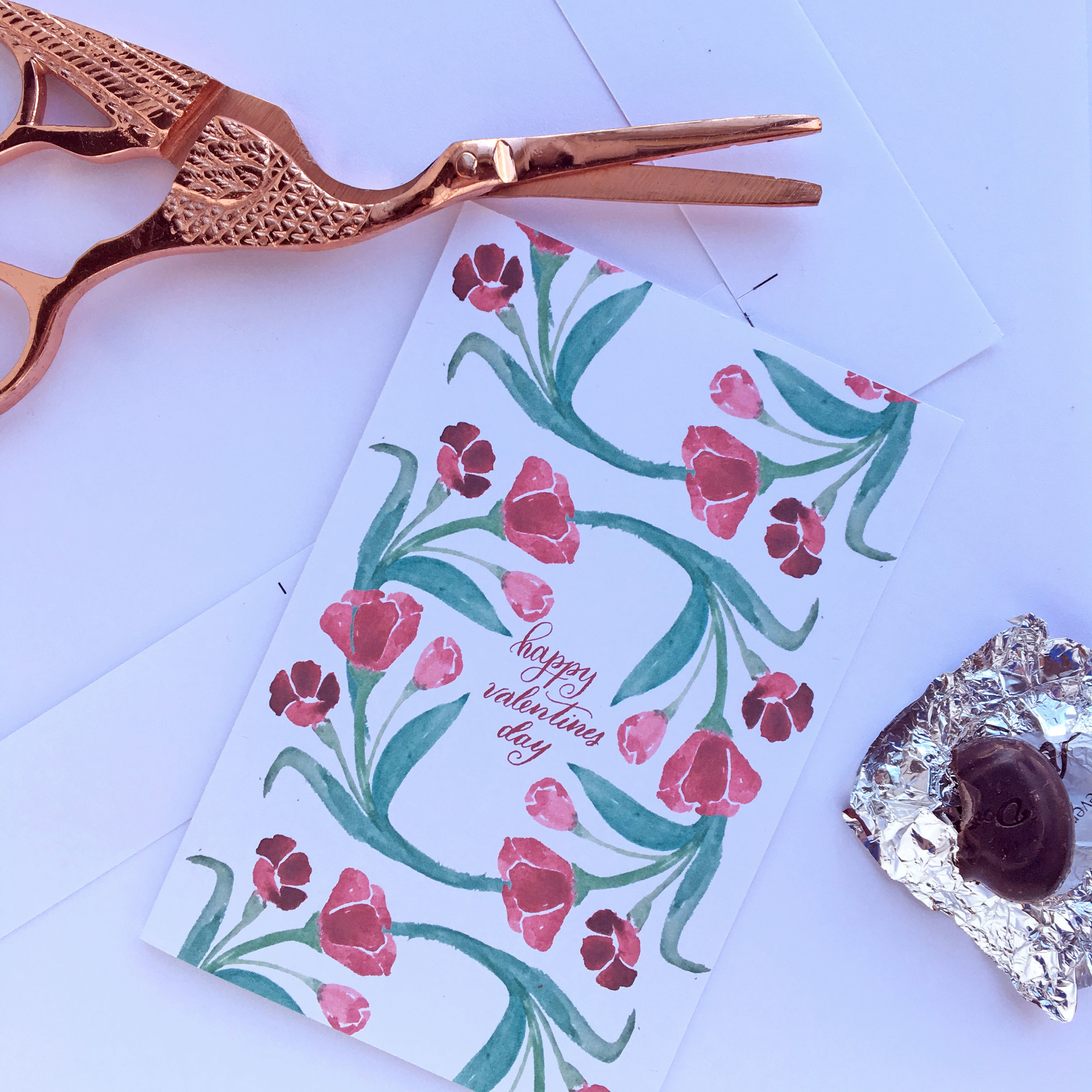
Free Download: Valentines Day Card
Love comes in all manners and today I want to give a little love back with two free printable Valentines Day Cards! It is never to late to tell the ones you love that you are thinking of them. Happy Valentines Day!
Download the cards here: Happy Valentines Day | Kisses
Stationery Classics: Party Animal
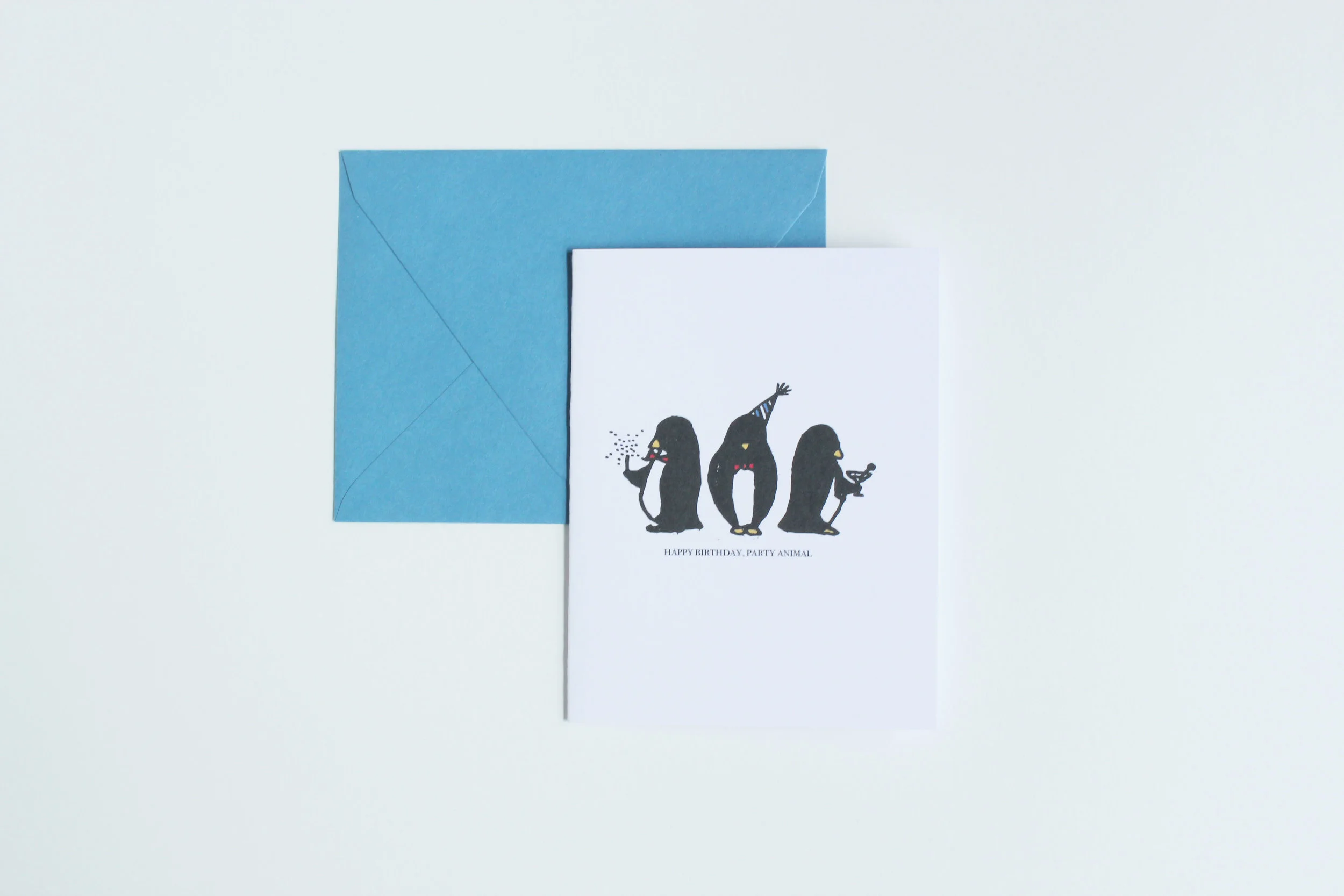
My favorite birthday card I have created would hands down be these penguins. Adorned in their finest party attire, these penguins were originally sketched out for a New Years card. Yes, these dapper gentlemen were meant for the New Year, but I loved them so much I knew they need to send more cheer all year long. I'm so glad these guys turned into my most beloved card.
