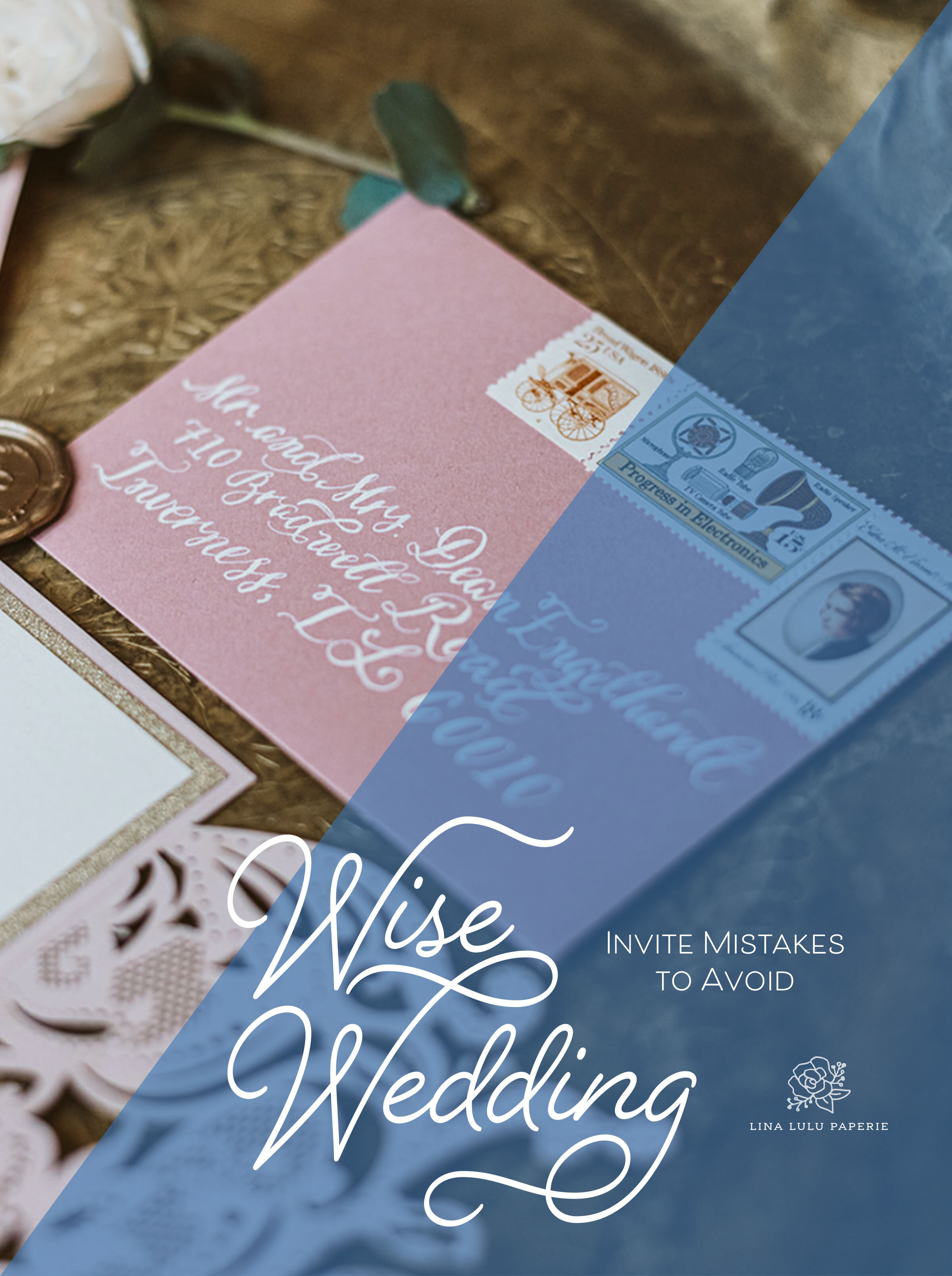
Wise Wedding: Invite Mistakes to Avoid

Today’s Wise Wedding advice is going to be simple and to the point. Weddings can be expensive, and people often don’t fully understand everything that goes into planning a wedding. This can include not understanding how many people a reception hall allows, RSVPing in a timely manner, and frankly who you actually want to be there on your day.

WiseWedding_Invite Mistakes to Avoid.jpg

1. Mistake: Not Clarifying Who is Invited

We want to make sure it is clear to the recipient who the invite is actually inviting. The easiest solution is clearly writing or printing out every guest who you expect to attend on the mailing envelope of the save the date and the invitation. This will provide clarity early on for the guests. If you are wanting to have an entire family/household attend including children, use wording such as "The Williard Family” or write out each name “ Mr. and Mrs. John Williard, Jonothan, Mary and Sarah”. If you would like just the adults to attend, use the wording “Mr. and Mrs. John Willard”. This implies they are the only ones expected to attend. For those with a plus one or a significant other who you would like to attend, write “Jonothan Willard and Guest” or if you know their partner’s name, go ahead and address it directly to the two of them.

For formal weddings, you can use an inner envelope and again write out each name of the people you would like to attend. For those with a plus one, the address envelope should just state the guests name and the inner envelope is the correct space to add the words “and guest” for the parties with who you have given one.

If you would like to go a step further, as talked about last week, you can fill in the number of guests or directly write the guest’s names on the RSVP card who you are expecting to attend.

2. Mistake: Sending out B-List Invites

This may be slightly controversial, but I know most couples have a B-list of guests. Whichever way you fall on this choice if you are to send out invites to anyone on your B-List make sure to print extra invitations and have the RSVP card have a later return date. This will ensure that those guests will have a resturn date that is later than when they receive their invitation. Remember, whoever receives a Save the Date should always receive an invitation, but those who receive an invite do not always have to have a save the date.

3. Mistake: Forgetting to put a stamp on the RSVP

To ensure that your RSVPs get back to you, don’t forget to address the return envelope to the correct person and stamp your RSVP envelope. This simple courtesy will cut out the extra step of guests needing to buy a stamp and will help your RSVP return to you in a timely manner.

In the case of an online RSVP, make sure directions are clear and web address is easily typed out.
Wise Wedding: Details and Insert Cards

In the last few weeks, I have talked through how important the invitation is, how to word the invitation but many people get tripped up on what to include WITH the invite suite. Today we are talking through the “extra” cards you include in an invitation suite to help your guests fill in the rest of the information gaps. These cards also keep the questions to you, your forever love, and your parents to a minimum—hooray!

WiseWedding_Details.jpg

The cards that most often get included in a suite are the RSVP card, a Details card and an accommodations insert. Let’s break down what is most important for each:

LinaLuluPaper_JImandLindsay.png
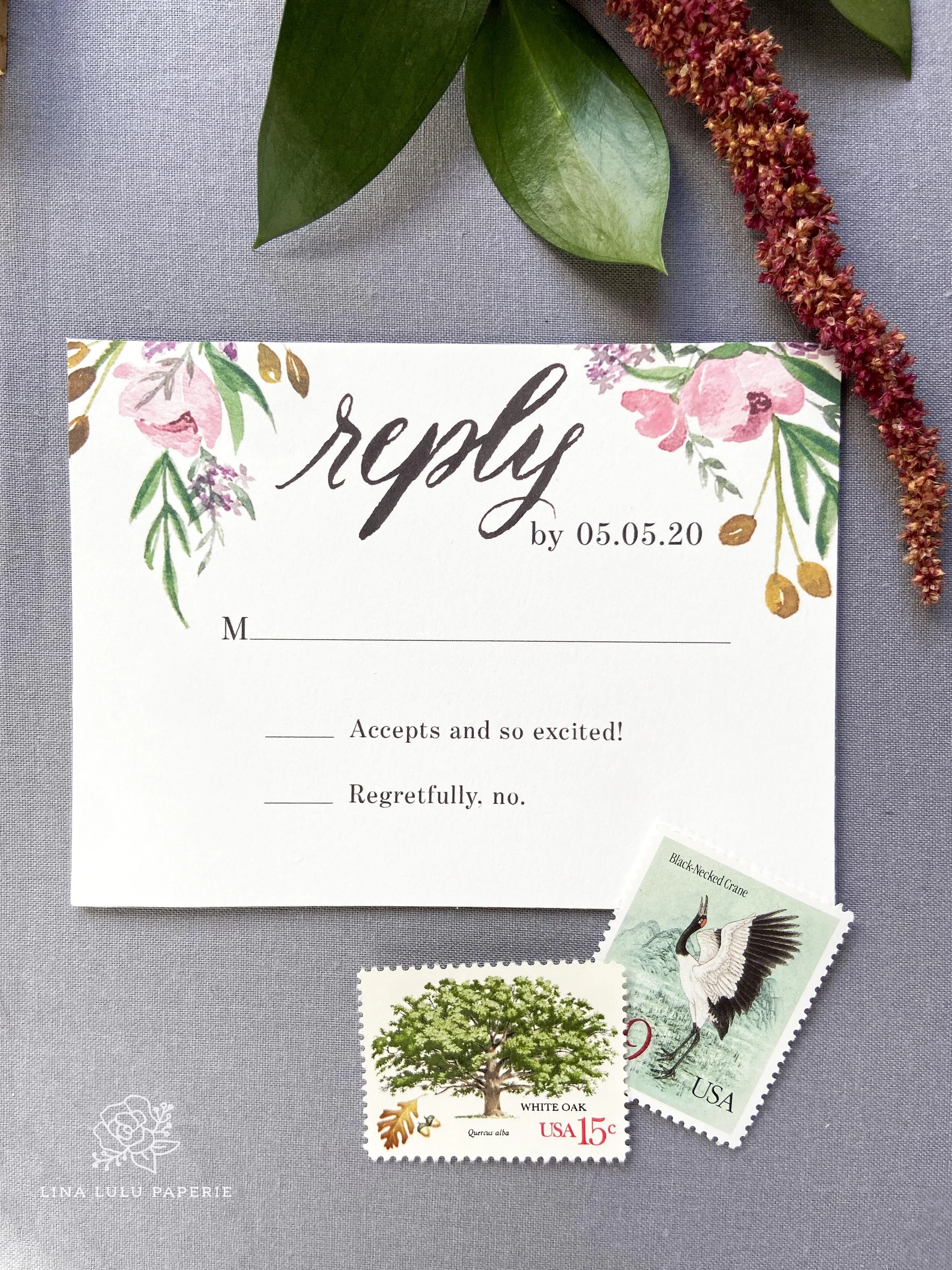
RSVP_LinaLuluPaper_SpringFlorals.jpg

The RSVP Card

This item is a separate card that guests mail back to you to let you know if they will be or will not be attending your wedding. These cards are traditionally a one-sided card with the RSVP date, a line to fill in the name of your guest, and a “yes” or “no” to circle or a check box to mark off. Other items that can appear on the card can include a meal choice or a spot to have guests write in a song for the DJ to play.

(Helpful tip: To avoid an uncomfortable conversation or unexpected guest, you can write the expected guests’ names on the RSVP before sending it out. This will help your guests know who is invited, especially guests with children of a certain age or a possible plus one. To make it clear for guests who can bring a date, you can pre-write the guest’s name and the wording “& Guest”, “and plus one”, or have a line for a number of guests and fill in the correct number for them on the RSVP to help them know if they truly have the option to invite a date. We will explore the wording of this in the upcoming Wise Wedding entries. )
RSVP cards are most often sent with an accompanying envelope addressed to the couple (or the person in charge of guest count) and a stamp. For more casual weddings, an RSVP postcard can be used as well. Remember to include a stamp with either choice for your guests.

If you are asking your guests to RSVP through your wedding website, you can still include an RSVP sized card with no envelope in the invite suite. This typically one sided card would contain the address and how-to directions to RSVP on your website. You can also add this information to the details card to cut costs.

Your RSVP date should be set 1 month prior to your wedding date. As discussed in Wise Wedding: Tackle Your Wedding Paper Goods Timeline, always check with your event space and caterer for when they need a final guest count.

LLPWildPoppy_WeddingRSVP.jpg

The Details Card

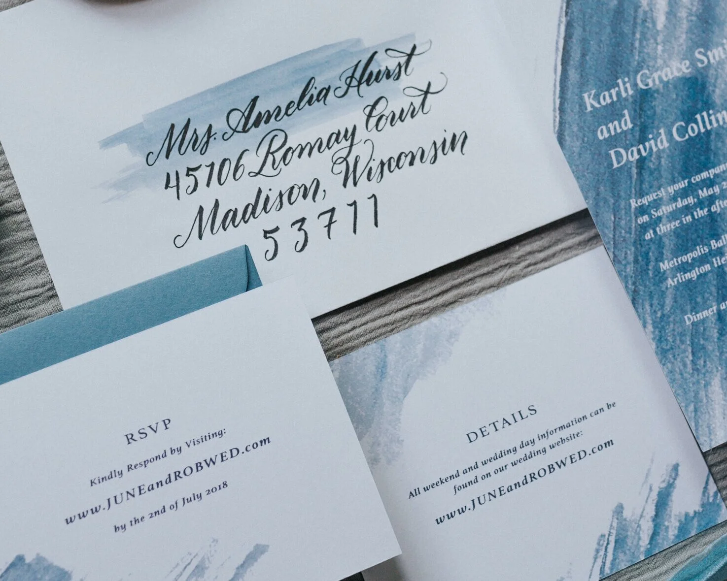
Your details card or insert is an additional card to include with your invite and RSVP card. This strictly informational card helps guests understand additional expectations or helps draw attention to anything about your wedding/weekend that they need to be aware of ahead of the day. Many couples now have a wedding website that addresses these concerns and contains the same information. The details card can include this website address, as well as the information you think your guests might miss if they don’t visit your website.

LLP_willowweddinginvite_calligraphy.jpg

Often these cards are sent with the invitation but can be sent ahead of the time with the Save the Date if important information is needed to conveyed sooner. Such information could be to book accommodations or flights ASAP for a destination wedding, if your wedding date is over a holiday, or is in the same city as a busy event such as Mardi Gras or the Super Bowl.

Other items to include on the details card(s) include:

  • If your reception is in a different location than your ceremony, formal etiquette says to leave the address and that information off your invite and place the reception address on the insert.

  • Wedding website address

  • Accommodations and if you have room block information such as a date to book by or a code provided by the hotel to give a discount to guests.

  • Transport information, such as shuttle busses to the wedding or airport location

  • Attire. Here you can let know guests to wear a “casual cocktail” or if you have a mostly grass location to advise them to wear sandals or flats, etc.

  • Parking or driving information if it is out of the norm or would be hard to find. This could include parking garage information for city locations, signs to look for, or special instructions for locations such as a friend’s house, national park, or more secluded location.

  • Special instructions for the venue, time of year, or whether instructions (such as if it rains where the ceremony will be held ).

  • Registry information. Though it is not traditional to include registry info with your invite, the details card would be the best location to do so.

Other items you can include in your details insert are special wedding weekend activities such as a welcome cocktail party, wedding brunch, or afternoon picnic. If not all guests are invited to these events, include them on different cards and insert them into your wedding invitation suite.

Make sure to include a heading on your card for guests to easily identify. This can be as simple as the words “Details” or something like “More information” or “We’d Like You to Know…”. If the card is more themed such as directions or weekend details, use those headings for guests to see.

LLP_Details_WeddingCard.jpg

Design of your Details Card

The fun thing about your details card is that since you are not fitting it into its own envelope, you can design it in a more “fun” style and shape. The only rule of thumb is to keep it smaller than the invite to give the invite precedents. You can have a half-circle, a folded card, or a two-sided, skinny card—it’s up to you! Allow the design to be functional, but compliment the vibe of your wedding and invitation suite.

Accommodation Cards

Not all weddings have multiple items for the guests to be aware of. One of the more important pieces of info to get to guests is the accommodations. This information can be on a separate card or the oppiste side of the details card if need be. This separate card can be helpful if you have multiple hotels at different price points or for destination weddings to include airports and rental car information.

LLP_Details_WiseWEDDING.jpg
MaggieCaleb_InviteSuite_LinaLuluPaperie.jpg

Website Cards

As discussed earlier, I’m seeing more couples are choosing to have a wedding website as a one-stop place for all things wedding weekend information for their guests. To help your guests know the address you have a few options:

  1. As previously mentioned, include it on a RSVP style card and have guests RSVP on your website.

  2. Include the address on the details card with wording such as “Find all wedding weekend information at www….” or “Please visit or wedding website for all information at www…” This is best for more traditional weddings where you use your details card to list only important information such as booking accommodations and reception address. You then can use your website to list such things as directions to the venue, registry information, and other items for your weekend on the website instead of the details insert.

  3. Include a separate wedding website insert card with just the website address for guests and wording such as “For more information, please visit: www….” This insert card would be the smallest of the insert cards included in your invitation suite.

The last item you can insert is a map for your guests. This is especially a fun detail for destination weddings or if the majority of guests are from out of town. I will discuss maps more in the upcoming weeks.

If you have any questions on insert cards or interested in me designing your wedding suite, contact me here!

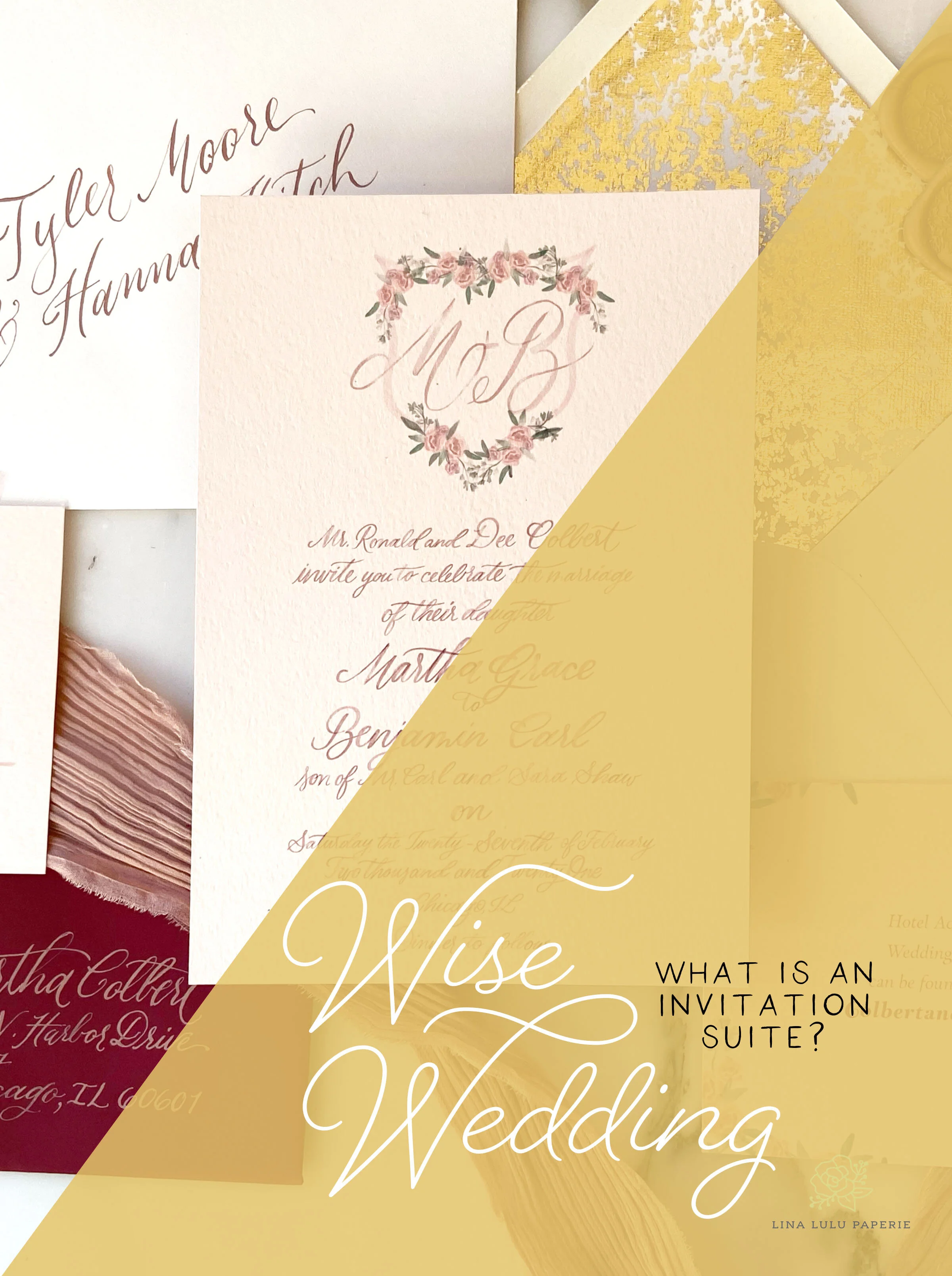
Wise Wedding: What is an Invitation Suite?

Have you heard the term “invitation suite” and had no idea what it meant? You are not alone! There are a handful of terms that can sound the same or confuse you when talking with a wedding industry expert. I've compiled a helpful guide outlining these terms and what exactly an invitation suite contains.

LinaLuluPaperie_WiseWedding_Invitation_Suite

Why call it a suite?

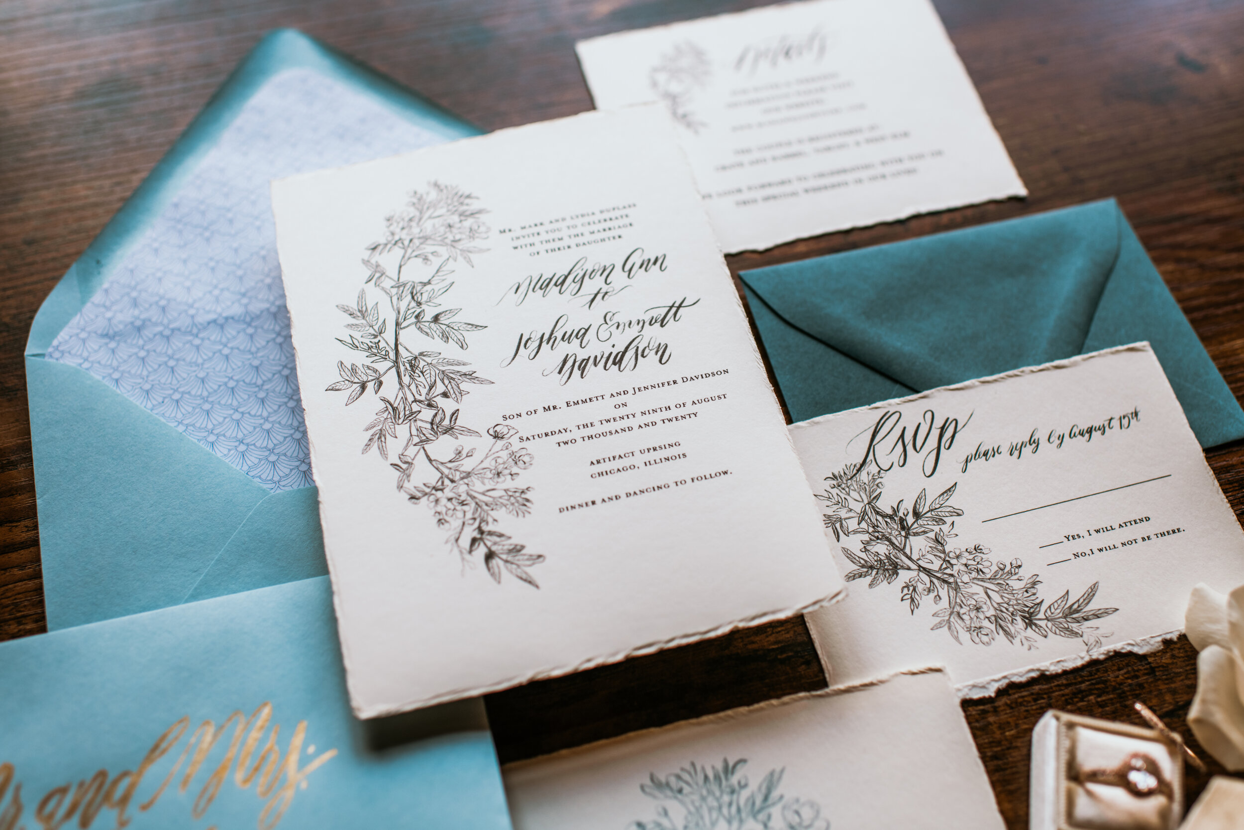
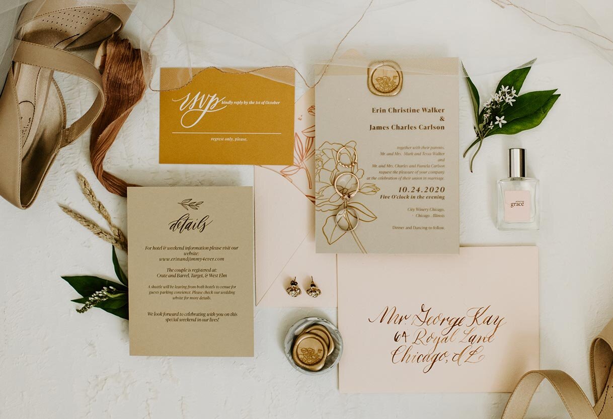
The term “suite” refers to a set or a number of things forming a series. Thus your invitation suite is the set of paper items letting your guests know the information for your big day. It should always include the invite and an RSVP card, as well as a card for important information like directions and accommodations.

LLP_wedding_suite_photo_2020_version02.jpg

The basic wedding invitation suite consists of:

1. Your invitation—which is the largest piece–includes the key information of your name’s, wedding date and time, venue, and can include the ceremony venue address without a zip code.

2. The outer mailing envelope is the largest envelope and is addressed in the style of your choosing—printed or hand calligraphy—to your guests. These can be white or for a more fun touch a color or metallic of your choice.

3. The details card includes reception venue name, address, reception start time, and accommodations info such as where you have hotel room blocks. You may also include your website at the bottom of this card or registry information. 

A second card (that you may or may not need) can be included with such information as directions, travel arrangements, or other pertinent information for guests. ( See optional items to include below)*

4. The RSVP card is a smaller card to allow guests to write their name(s) and let you know if they are attending. You may also include a space for meal choice, song requests, or website information.

5. The RSVP envelope is the smallest envelope and should always include an address that goes back to you or the coordinator of the guestlist. (Don’t forget to place a stamp on this so your guests can easily drop them back in the mail to you.)

LinaLululPaperie_WeddingSuite_Floral_Blue_Vintage

Other items you can include in your invitation suite*

Inner Envelope

An inner envelope can be used to tell guests who is (and is not) invited to your big day. The envelope is slightly smaller than the mailing envelope and holds the invitation suite inside. This is traditionally used in more formal weddings but allows you to clearly state who you are expecting to show up. Examples include your Guests’ names and noting if they have a plus one (i.e. Mr. Robert Smith & Guest). This is also the place to indicate whether or not children are invited by just writing the parent’s names.

LinaLuluPaperie_watercolor_Invitation_suite

Weekend Details Card

If you have multiple events going on during your wedding weekend, such as a brunch, welcome drinks, after party, etc. include a weekend details card. You want to have your guest know what to expect as well as what to pack appropriately for all the different social events.

LinaLuluPaperie_Vellum_Wrap_Ribbon

Invitation Wrapper

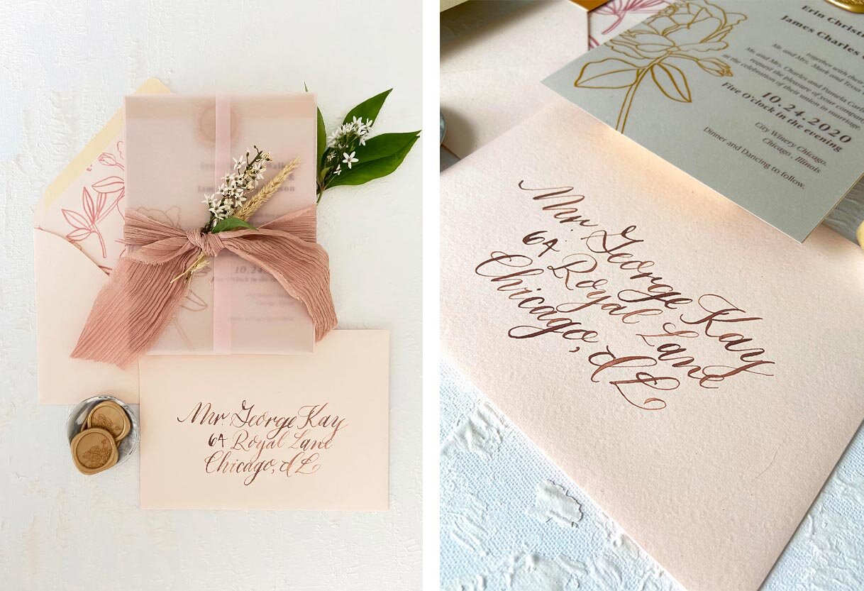
An invitation wrapper is not necessary but is a beautiful and practical addition to your suite. This “wrapper” can be twine, ribbon (Seen in the picture on the left), a belly band, a folder, or even a layer of vellum wrapped around the invite. It is a beautiful accent to keep all the contents of your invite safely together when being mailed.

Website Card

You can include your wedding website on your details card or include a smaller card with just the web address. If you choose to have a website, which is a helpful resource for your guests, include as much information and details of your weekend/wedding there. This will cut down on how many text and phone calls you and your parents will receive from loved ones about your big day.

Envelope Liner

An envelope liner is a beautiful insert to your mailing envelope that allows you to add an additional splash of color, pattern, or shimmer to your invitations. It is also a fun surprise for your guests. It adds additional weight and quality to your overall invite.

Directions/Maps

Including an insert for directions or a map is great for a destination wedding or if you have multiple events happening in the weekend and need an easy guide for your guests. These can be done simply or more elaborate with watercolor features and illustrations. These beautiful pieces are not only functional but can be a keep-sake of your wedding to be framed.

LinaLuluPaperie_WaxSeals_Gold_BlueInvite

Wax Seal

A popular but beautiful new trend includes the wax seal (Pictured below). These small but impactful pieces are a fun and elegant way to add color, texture, or even your monogram to your envelopes or invitation. They can be used on an invitation wrap, on the inner envelope, or on the outer envelope. If you use them on the outer envelope, know that the suite then must be hand canceled by the post office as they are not always read by the modern machines.

Postage Stamps

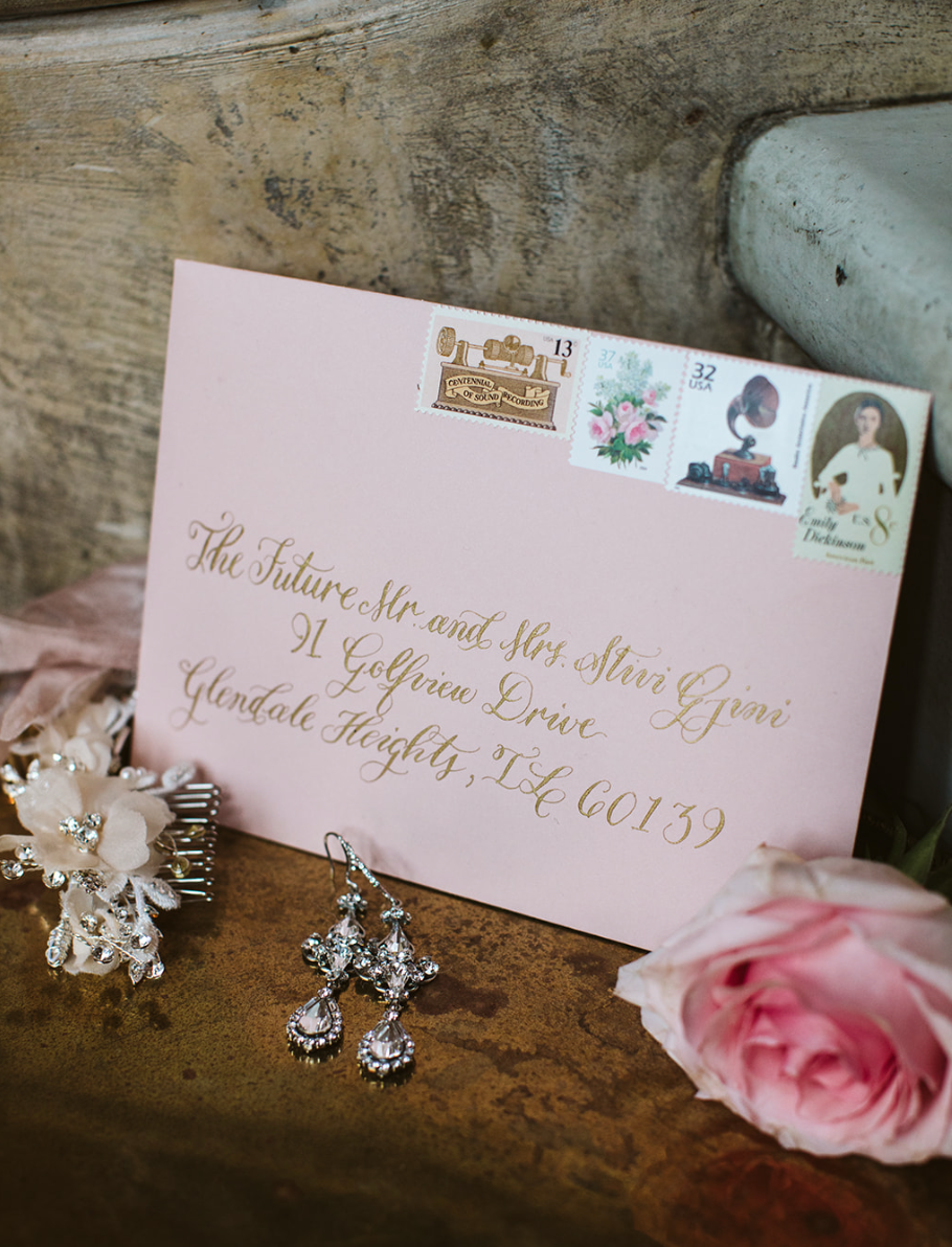
One thing your should not overlook is your postage stamp. This small item can make or break the mood of the front of your envelope, choose wisely! There are a handful of beautiful options from the USPS. As well, you can choose vintage stamps totaling the right price for a layered look that will stand out in your guest’s mailboxes.


Photo by Jason Adrian Photo

Photo by Jason Adrian Photo

LinaLuluPaperie_Clementine_WeddingInvites_Suite

You can include as many of these items as you see fit and are helpful for your wedding weekend. Just remember, the two most important items are the invite and RSVP, then build your suite from there! Next week, I will be talking about the importance of invitation wording.

As always, if you have a question-feel free to message me!

Styled Shoot: Bohemian Chicago Wedding

This past summer, the talented Teresa Williams set-up a styled shoot to capture all the things that go into a wedding for her new course, The Wedding Photography Accelerator. I was and am so honored I got to be apart of this amazing resource in the tiniest way. Check out all these amazing vendors and the stunning outcome of this shoot!

Fall2020_TeresaWilliams_StyledShoot_02.jpg

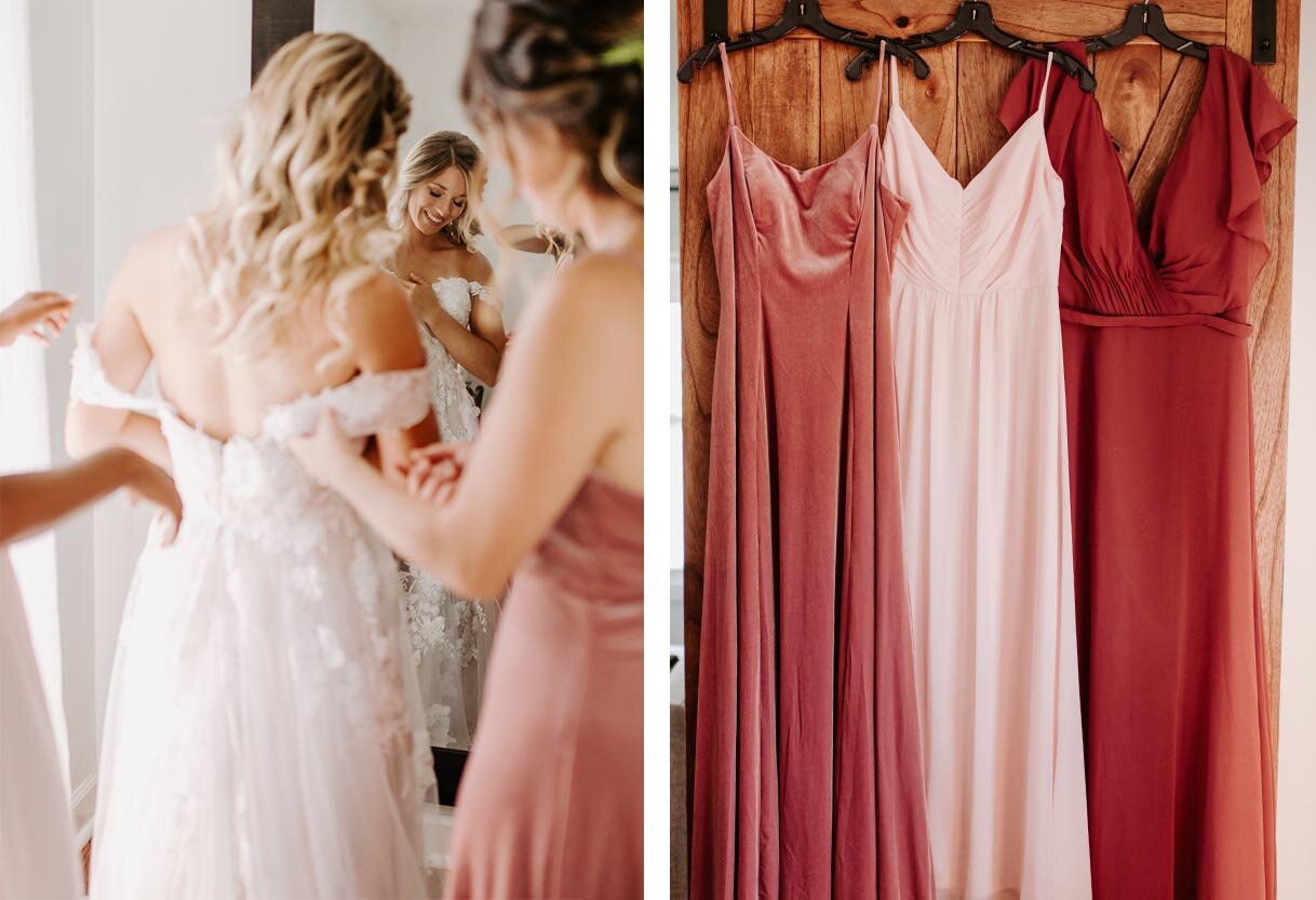
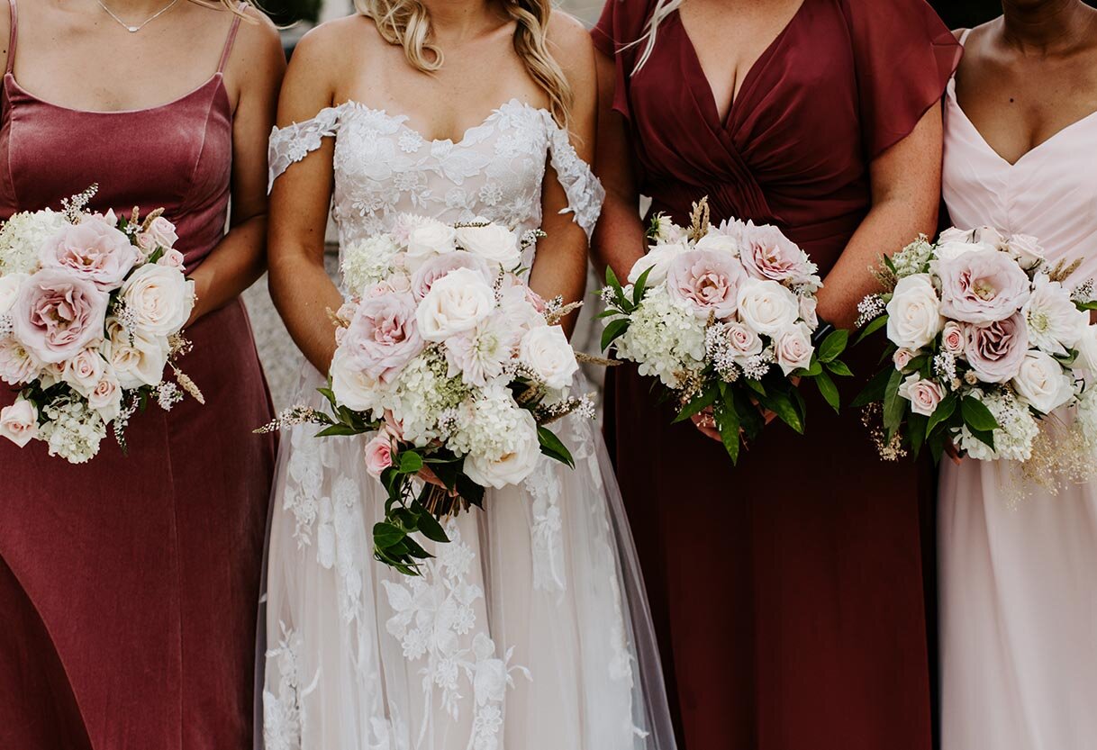
When Teresa asked me to be apart of this shoot, she sent me a mood board with the lushest and riches organic colors and shapes. I grabbed a few designs I had previously used and combined them to make a “custom” suite for the shoot. I pulled the primary earthy tones from the florals and the secondary color of a dusty pink and the beery red from the bridesmaid dresses. I love the way it turned out!

Fall2020_TeresaWilliams_StyledShoot_03.jpg
Fall2020_TeresaWilliams_StyledShoot_09.jpg

I love the trend of natural colors being used all year long. Since the pinks and deep reds were going to be the primary accent colors at the ceremony, I choose to use them as the accent colors of the paper goods. In the main suite, I played off the natural colors of the ceremony backdrop with a mix of brown, cream and gold. I loved finishing the suite off with a pink, vellum jacket tied with a natural dyed, silk ribbon. For a romantic touch, I placed a few of the smaller flowers in the ribbon.

Fall2020_TeresaWilliams_StyledShoot_01.jpg
Fall2020_TeresaWilliams_StyledShoot_04.jpg

How beautiful are the details of this ceremony backdrop? The natural architect of the venue, Artifact Events, was elevated but not hidden by this beautiful installation from Posh Studio Rentals. All the details of the day came together in the dreamiest way!

Fall2020_TeresaWilliams_StyledShoot_07.jpg
Fall2020_TeresaWilliams_StyledShoot_08.jpg
Fall2020_TeresaWilliams_StyledShoot_06.jpg
Fall2020_TeresaWilliams_StyledShoot_05.jpg

Vendor List:

Photographer: @_teresawilliams 
Venue: @artifacteventschicago
Cake: @lusciouslayersss
Invitation Suite: @linalulupaperie
Prop + Event Hire: @poshstudiorentals
Florist: @bkfloralandevent
Hair Stylist: @emilyraebridalhair 
Makeup Artist: @alyssadianamakeup 
Gown + Suits: @adorebridals 
Videographer: @mrssarahchapman 
Production Assistant: @dani_stratts

Styled Shoot: Vintage Tuscany at Galleria Marchetti

I am thrilled to have been apart of this gorgeous, inspired shoot !Designed by the talented and kind  Lillian Rose Events, the tuscan elements combined with charm and elegant details of Galleria Marchetti created for a romantic, old world feeling wedding here in the Midwest! All photos by Jasko Omerovic Photography. For all vendor involved check the list below!

StyledShootMarchetti(149of333).jpg

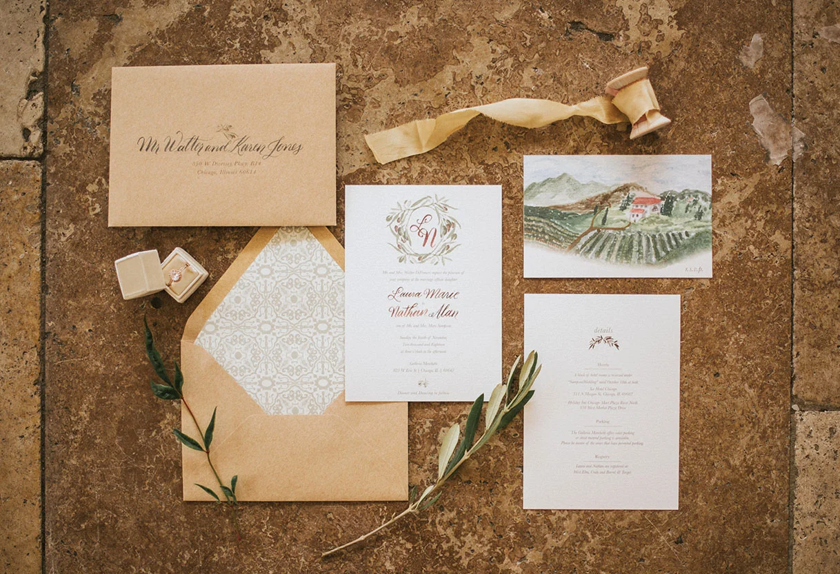
Inspired by the romantic fields and wineries of Italy, I chose to work with earth tones and simplistic elements. A custom monogram surrounded by olives adorned the main invitation (swoon!). The olives leaves are carried though out the rest of the wedding paper goods from the details card all the way to the wax seal bringing texture the the table menus.

My favorite two elements from the invitation suite quickly became the Italian tile inspired envelope liner and the lush, custom painted country side RSVP postcard. Both elements bring in more color to an other wise soft and romantic feeling invitation.

StyledShootMarchetti_06.jpg
StyledShootMarchetti(278of333).jpg
StyledShootMarchetti_03.jpg
StyledShootMarchetti(152of333).jpg
StyledShootMarchetti_01.jpg

Each paper element, though slightly varied from one another, are all connected through the calligraphy. I used my Lily style to bring a romantic but modern movement to each element. Choosing a soft grey ink allowed each paper good to feel rustic and compliment the gorgeous tones of the vintage dishes, beautiful table linens and gorgeous muted toned florals.

StyledShootMarchetti_02.jpg
StyledShootMarchetti_04.jpg

To find more of this stunning shoot and a gorgeous video capturing the experience, check out the post from Chicago Style Weddings

Find the incredible and talented vendors here:

Venue: Galleria MarchettiPhotographer: Jasko Omerovic PhotographyVideography: Newlyweds CinemaEvent Planner: Lillian Rose EventsFloral: Phillips FlowersDécor & Rentals: Dish & Decor Vintage RentalsHair & Makeup: Meghana PrasadStationery: Lina Lulu PaperieLinens: BBJ LinenBride’s Gown: Edith Élan via Dame CoutureBride’s Shoes: James CiccottiBride’s Accessories: Davie & ChioTi Adoro JewelryJennifer Leigh Veil Design Formalwear: The Groomsman SuitModels: Naftali Kark & Stephanie Straka

The Big Fake Wedding: Chicago 2018

When I heard about the Big Fake Wedding, I immediately thought about when I was a bride planning for my own big day. Being younger in age as a newly engaged bride-to-be, I hadn't attended many weddings with the mindset of what I liked about them and if I would repeat anything for my own day.

The concept of the Big Fake Wedding is so simple and smart. They come to a city, gathering talented local vendors and “create an experiential opportunity for wedding vendors to showcase their products and services to shopping brides and grooms just as they would at a real wedding.” You get to see the wedding in the form of a vow renewal ceremony and the reception complete with drinks, DJ and dancing. The best part s if you like something you see, taste or hear you can talk to the vendors who created it right then and there! How cool is that?

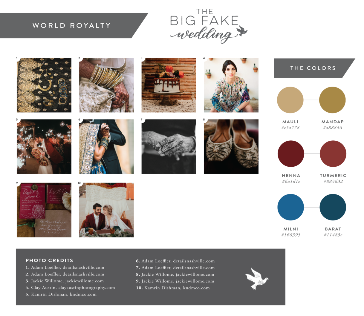
Each city is a different theme and experience for the couples attending, and Chicago did not disappoint. With the theme of “World Royalty” and pulling from beautiful, rich tones—there was so much inspiration to play with! Check out how the day pulled together over all:

unnamed.png

The venue was the beautiful Zhou B Art Center owned and founded by two Chinese brothers, both incredible artist who rent out the space for art exhibits and events. This industrial and chic venue was full of charm and some seriously beautiful art.

Elizabeth Greve Photography

Elizabeth Greve Photography

Elizabeth Greve Photography

Elizabeth Greve Photography

My role in this big day was one of two invitation designers. With such a rich color scheme and moodboard full of pattern and texture to work from, I knew that I wanted to do something more elevated than a standard invite to incorporate these elements. After deciding on this beautiful paper cut folder in a rich gold to house the invitation suite, I wanted to incorporate each color in a unique way on the rest of the accenting pieces.

Blending the free strokes of the watercolor with the formality of the calligraphy created the perfect mixture of classic and modern that would be represented in both the venue and the elements of the wedding day overall. I loved how this suite represented the theme in a chic way!

Elizabeth Greve Photography

Elizabeth Greve Photography

Thais Photography

Thais Photography

The day flowed like a real wedding, complete with photos of the “bridal” party, ceremony and reception. The bride and groom who modeled for the day performed a vow renewal during the ceremony portion including their pastor, real friends and family in their “bridal” party.

It was a beautiful ceremony complete with string quartet playing a custom arrangement as the bridal party walked down the aisle and an incredible copper arch with lush florals serving as the backdrop for the bride and groom’s ceremony. The reception was full and fun with fantastic appetizers, desserts and specialty mixed drinks. The bride even performed a special choreographed dance mid reception!

Thank you again to the team at The Big Fake Wedding for having me, it was such a fun party to be apart of and incredible to meet so many wonderful couples!

Thais Photography

Thais Photography

Elizabeth Greve Photography

Elizabeth Greve Photography

Elizabeth Greve Photography | Mila Craila

Elizabeth Greve Photography | Mila Craila

Elizabeth Greve Photography

Elizabeth Greve Photography

Cakes & Catering SOCIAL sparkling wine @socialsparklingwine

Favors & DetailsThe Standard Canvas @TheStandardCanvas

Groom & His MenBlank Label @blanklabelclothing

Bridesmaid Dresses Brideside Jewelry European Jewelry @europeanjewelryinc

Photo Booth Smilebooth@smilebooth

Cake ParfaitsVanille Pattisserie@vanillechicago

Day Of CoordinatorWedicity. DJ & EmceeCharizma Entertainment Group

Floral & Event Design: Bouquets, Boutonnieres & Tables 5,6,7 Eden

Floral & Event Design: Ceremony Backdrop & Tables 1,2 Nightshade Floral

Floral & Event Design: Flower Wall & Tables 3,4 Crafts By Stacey @craftsbystacey

Hair Styling Carrie Kacen Hair and Make-up Artistry @carriekacen

Hotel Accommodations W Hotel @wcitycenter

Invitations The Paperie Co @thepaperieco | Lina Lulu Paperie @linalulupaperie

Craft Cocktails CraftYours @craftyours

Makeup Artist Fearless & Bella @fearlessandbella

Marshmallow Favors Malvi: Marshmallow Confections @malvimallow

Catering LM Catering @lmcateringchi

Seating Chart, Custom Drawing, & Paper Goods XO Art & Design @xo_artanddesign

Dance Lessons Windy City Wedding Dance @windycityweddingdance

Photo Magnets Flash Magnets @flashmagnets

Ceremony Musician Bridge and Bow Music

Wedding Registry Mishkalo@mishkaloregistry Wedding Cake ECBG Cake Studio

Signage & Custom Jackets KRorerDecor @krorerdecor

Sparkling Water Spindrift Cookies Warm Belly Bakery @warmbellybakery

Table Accents The Blonde Scribe @theblondescribe

Travel Agent LovinAway @lovinaway

Photographers Thais Photography @bythaisphotography | Mila Craila Photography @milacrailaphotography | Elizabeth Greve Photography @egpwed

Venues Zhou B Art Center @zhoubevents

Wedding Dresses Winnie Couture @winniecouture

Wedding Films Eyework Studios


Portfolio: Voss Baby Shower

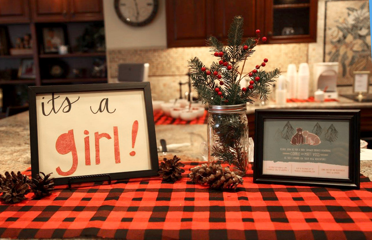
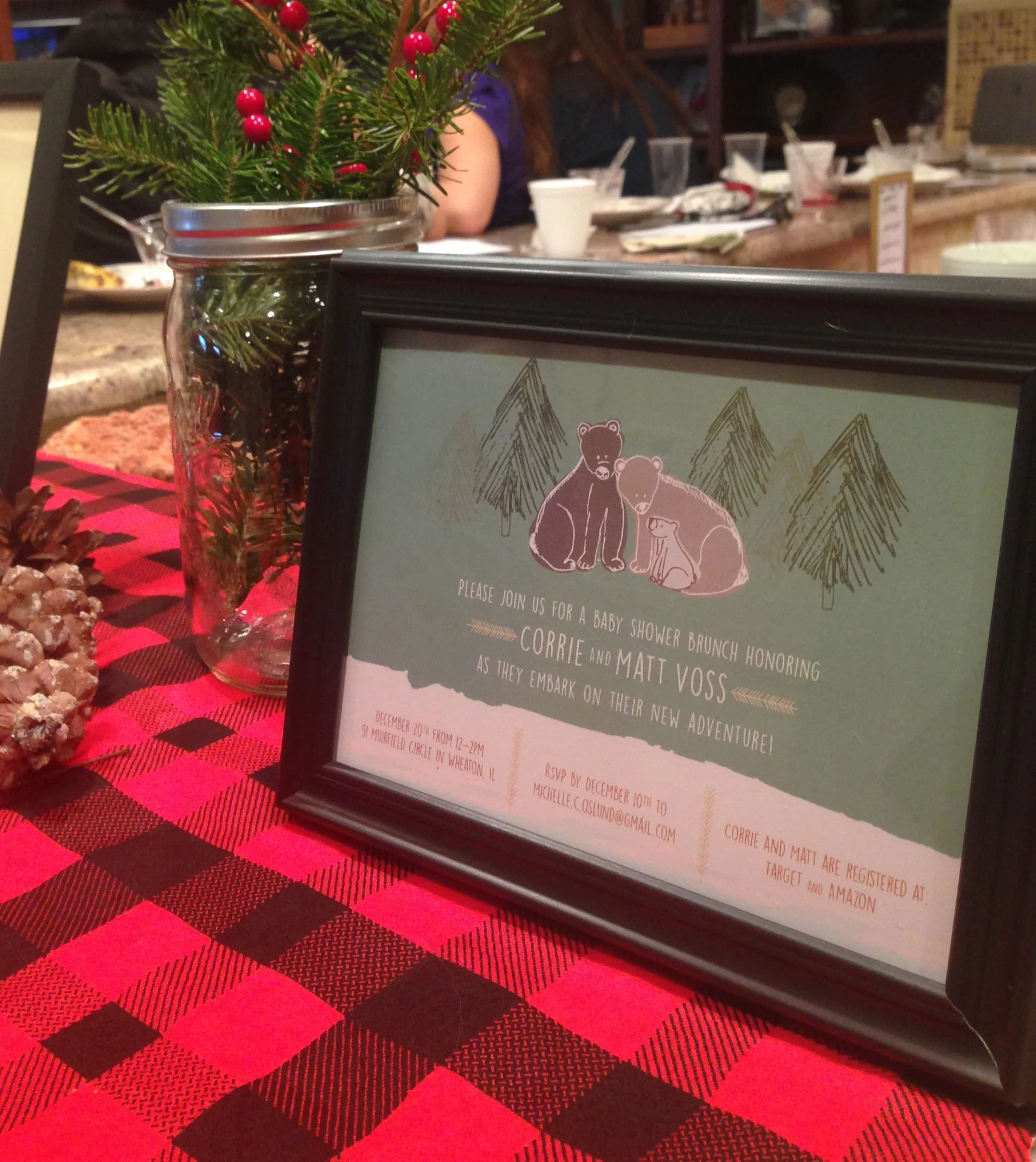
Over the holiday's I had the opportunity to celebrate my sweet friends Corrie and Matt and their baby girl! I met my sweet friend Corrie through mutual friends back in high school when they both knew Corrie and I were going to the same college. Fast forward a handful of years later, all of us being married, and now she's having a baby! To celebrate, a handful of our friends threw the most adorable outdoor themed baby shower. I loved getting to design the invitation and are so excited to meet their new baby girl this spring! Congrats Corrie and Matt!

Portfolio: VanSoelen Baby Shower

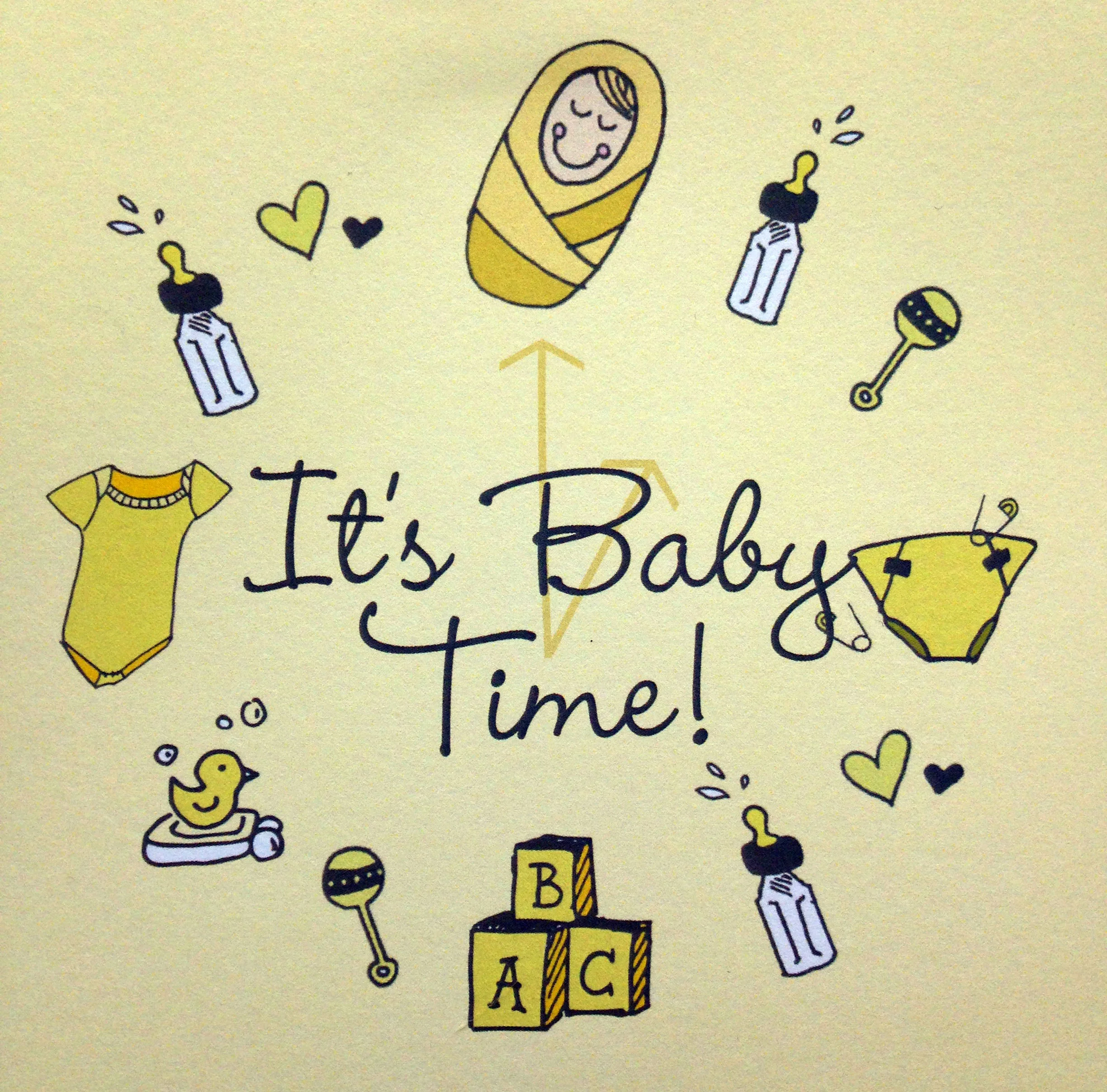
Another one of my sweet Sister-in-laws is expecting and this will make my seventh niece or nephew! To celebrate my mother-in-law threw a "Time" themed baby shower, complete with "It's Baby Time!" invites. 

I loved working on the illustrations for this one and thinking of all the sweet things new Baby V will be getting and doing in the near future. The invite included a "time of day card" to let the guests know which part of the day their gift should be the centered around such as "Bath Time", "Nap Time", "Play Time", ect. So clever and a fun way to involve the guests in the theme.

Unfortunately I wasn't able to celebrate that day with family as we were out of town, but I'm so excited to welcome the little one and celebrate with the wonderful parents to be this fall!


Portfolio: Olson Bridal Shower

Watercolor flowers done by Angie Makes

Watercolor flowers done by Angie Makes

A few months ago I had the delight to work on these fun, oversized bridal shower invites. The party theme was a garden tea and the client was looking for something subtle but with a nod to the brides wedding colors. After a few different designs, we both settled on these graceful, watercolor flower invites. I really love how they turned out!


Portfolio: VandenBranden Bridal Shower

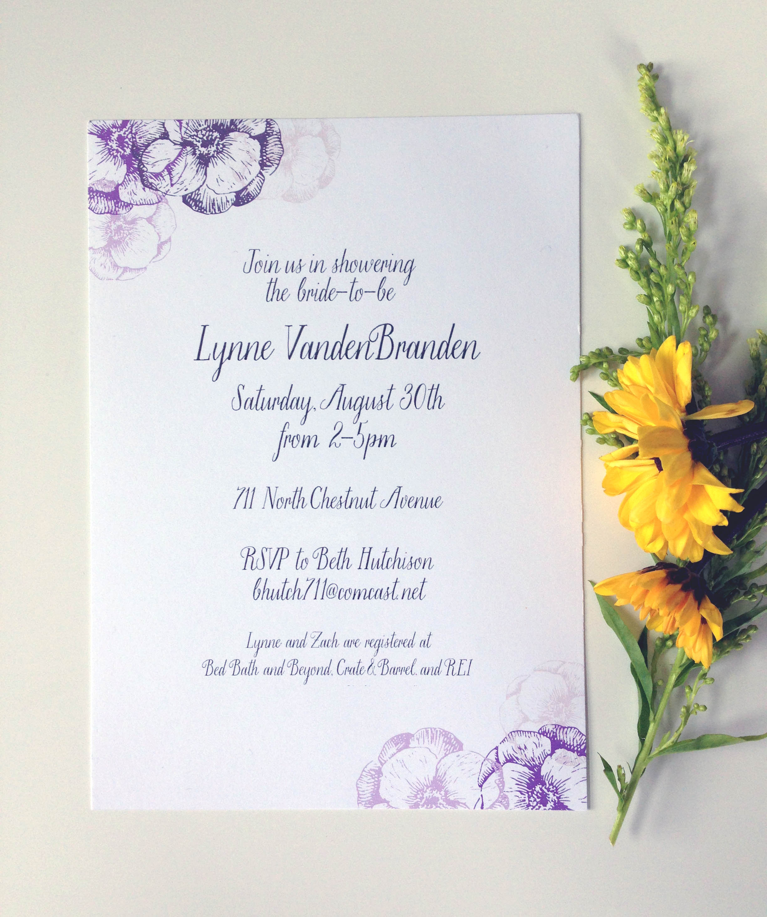
I did these lovely invites to honor a family friend back in the late summer. Set with a a color palette of purple, cream, and grey - I knew I wanted to keep the invite itself airy, feminine, and bright. I had been admiring the Saint Agnes font for sometime and knew that these sweet invites would be a perfect use for the elegant, but whimsical font. The combination of it all created a beautiful outcome, don't you think?

Saint Agnes is a part of the foundry Great Lake Lettering started by Molly Jacques and Dathan Boardman.


Portfolio: Baby Berge Shower

Heatherinvite.jpg

A few weeks ago a group of ladies and myself threw a sweet baby shower for our friend and mama-to-be, Heather! This is Heather and husband, Daniel, first baby - and they are waiting to find out the sex of the child! SO brave but very fun!

We picked up on their nursery theme, Jungle Animals, and chose gender neutral colors of yellow and mint to compliment the fun animals. Heather is only a week away from her due date and we all can't wait to meet this newest little one!

See more of Heather's invite in our gallery.

HeatherInvite_02.jpg

Portfolio: Longyne/Smies Wedding

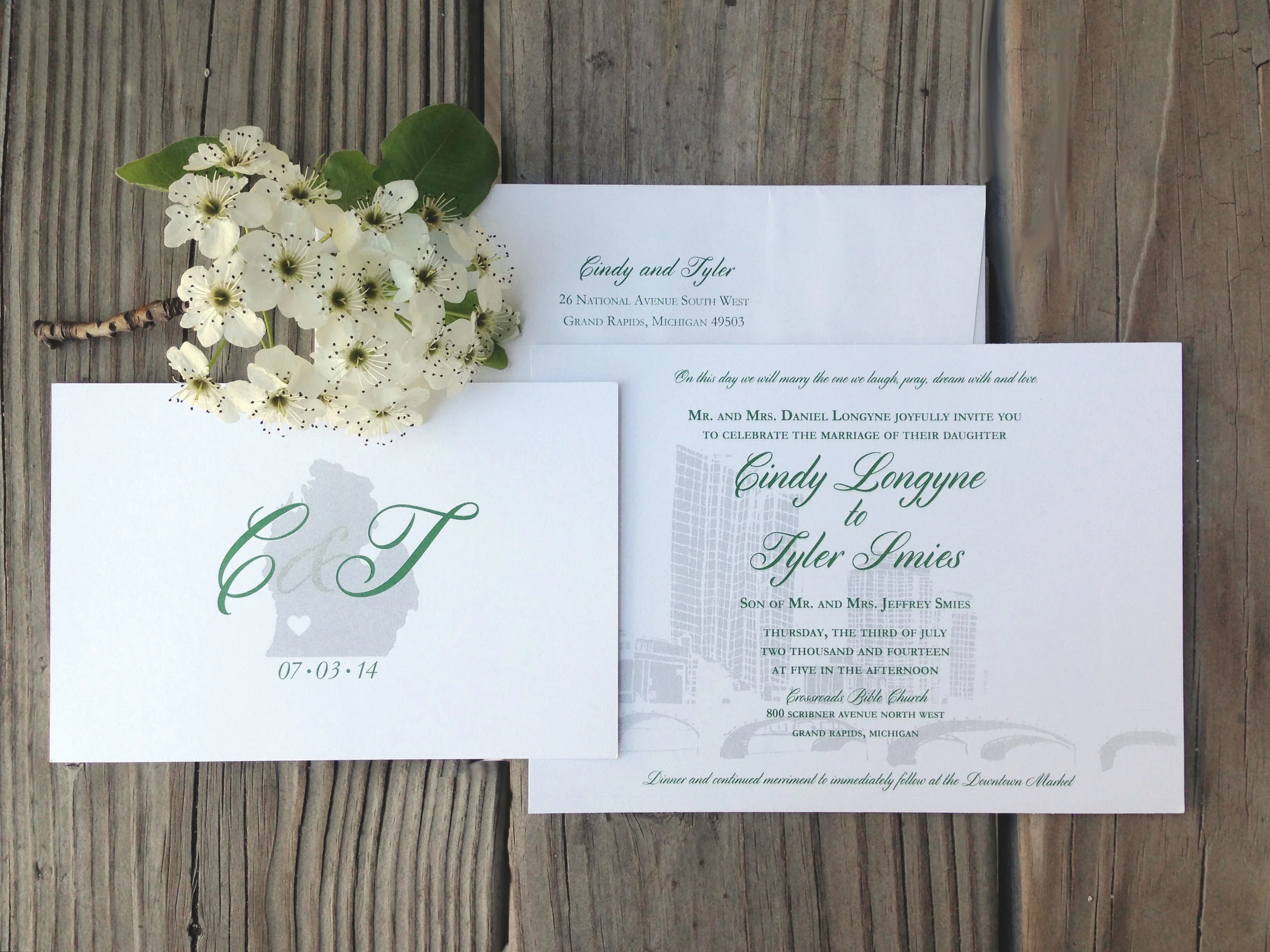
A few months back I had the pleasure of illustrating a beautiful, city inspired wedding suite for Cindy, and husband-to-be, Tyler. You can see the mini moodboard here I created when beginning this project.

CT_02.jpg

I loved hearing the passion that Cindy and Tyler have for the city of Grand Rapids, MI and how it has played a role in their relationship - and now in their wedding! We went with dark green and a grey metallic inks to bring out the scheme of their wedding. I love how the metallic ink shimmers and makes the city feel alive in the background.

Best of luck you two - I know the Lord has much in-store for you in marriage!


CT_invitetif.jpg

Portfolio: Lindsay's Baby Shower

Invite_ReiminkBaby.jpg

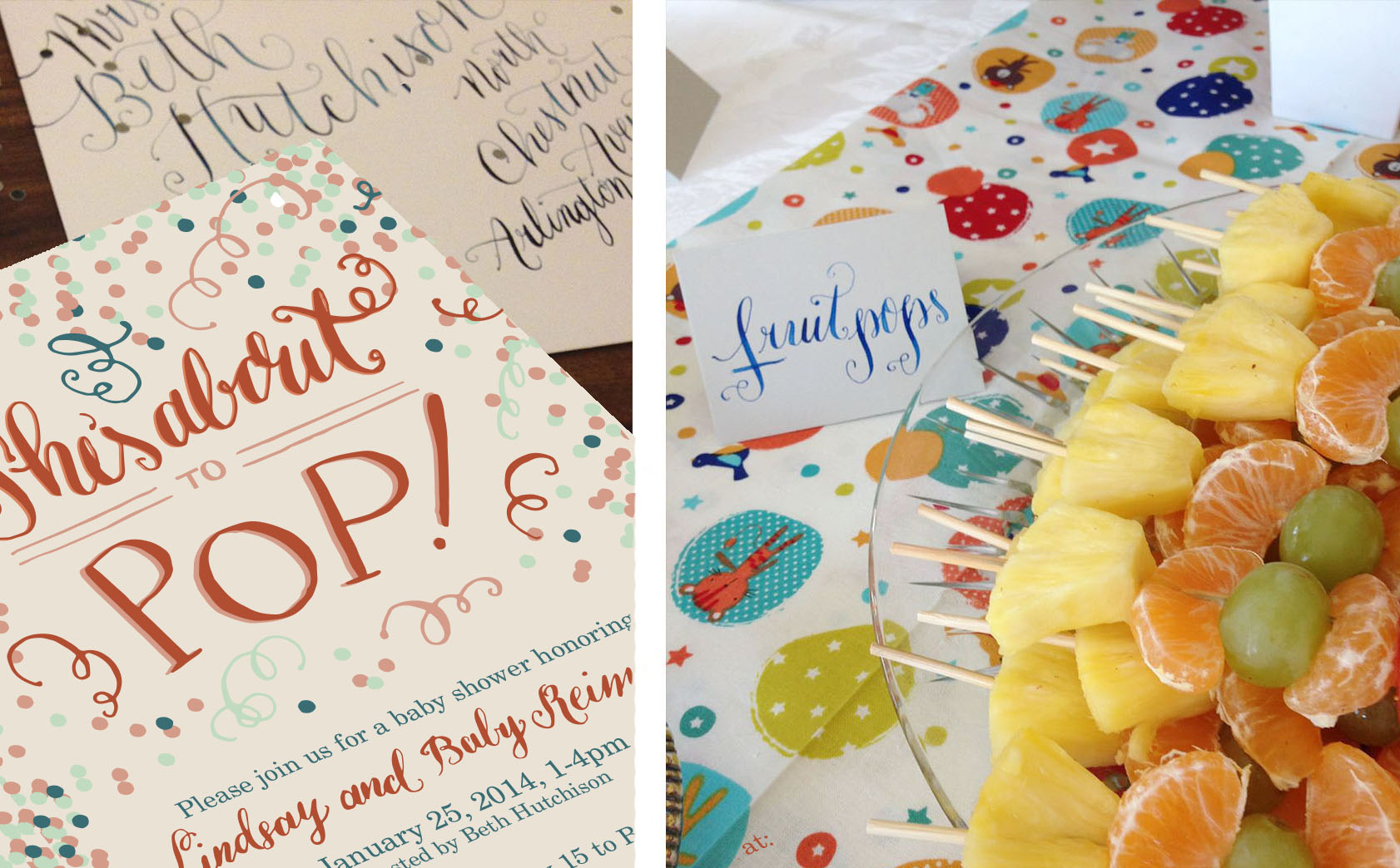
To celebrate my sister-in-law, mommy to be Lindsay and baby, my mother-in-law hosted an adorable baby shower in their honor! I was so excited to add my calligraphy to the (already) wonderful decor and joyous celebration.

Shower_Reimink.jpg
Shower_Reimink_04.jpg

Beth out did herself with her theme "She's about to Pop!"  by including all things "pop" worthy including cake pops, blow pop champagne "poppers", poppyseed muffins and so many other delicious treats!

Shower_Reimink_03.jpg

Portfolio: Aagaard Wedding | Invitation Suite

A while back I gave you a glimpse of the process I went through to come to this beautiful invitation suite, here and here.

KeithWedding_01.jpg

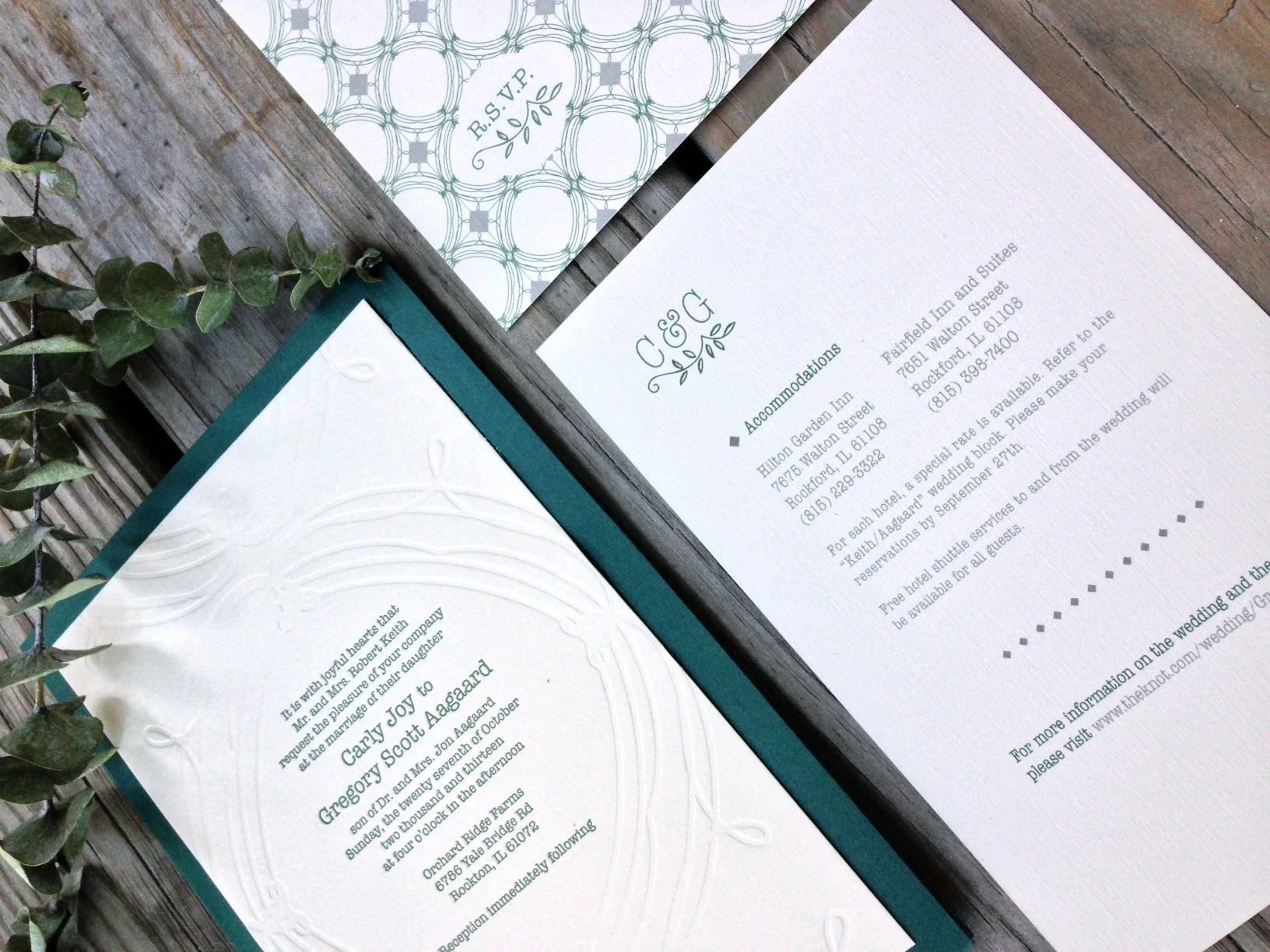
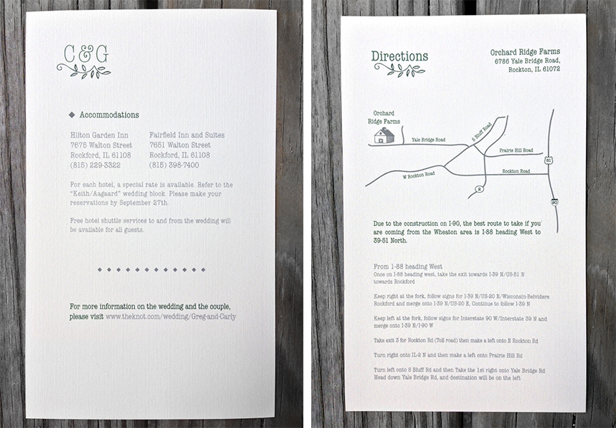
The bride was inspired by the mix of antique finds of her own and the bold mix of patterns seen at such stores like Anthropologie and J.Crew. With this in mind, we created a pattern and monogram that was repeated through out the suite.

InviteaCard.jpg
AagaardFullSuit.jpg

The finish product was a sweet mix of hand-done elements - like the screen printed booklet cover, and the engraved invitation- with an elegant simplicity to allow the importance of the text to shine through. The mix of the subtle but bold nature of the pattern on each piece gave a modern feel to this classic style of invite.

Portfolio: Aagaard Wedding | Sketches

Agaarod_Sketches.jpg

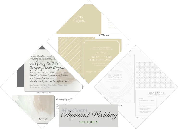
A few weeks back I shared this mood board with you from the lovely Aggaard wedding. You can see how the Mood board dictated the inspiration for the three comps I ended up showing the client. With details of a muted palette and a vintage but classic feel to the suits to match the rustic wedding she was planning, each suite captured a different mood we had talked about. The first having a contemporary look and a splash of watercolor to create color; the second being more straight cut classic, with modern vibes, and the third being a clean pallet of grey and white with a mix of patterns and vintage fonts. In the end we mixed and matched pieces from each set to create the final suite she had envisioned from the beginning. I can't wait to show you how it ended up!