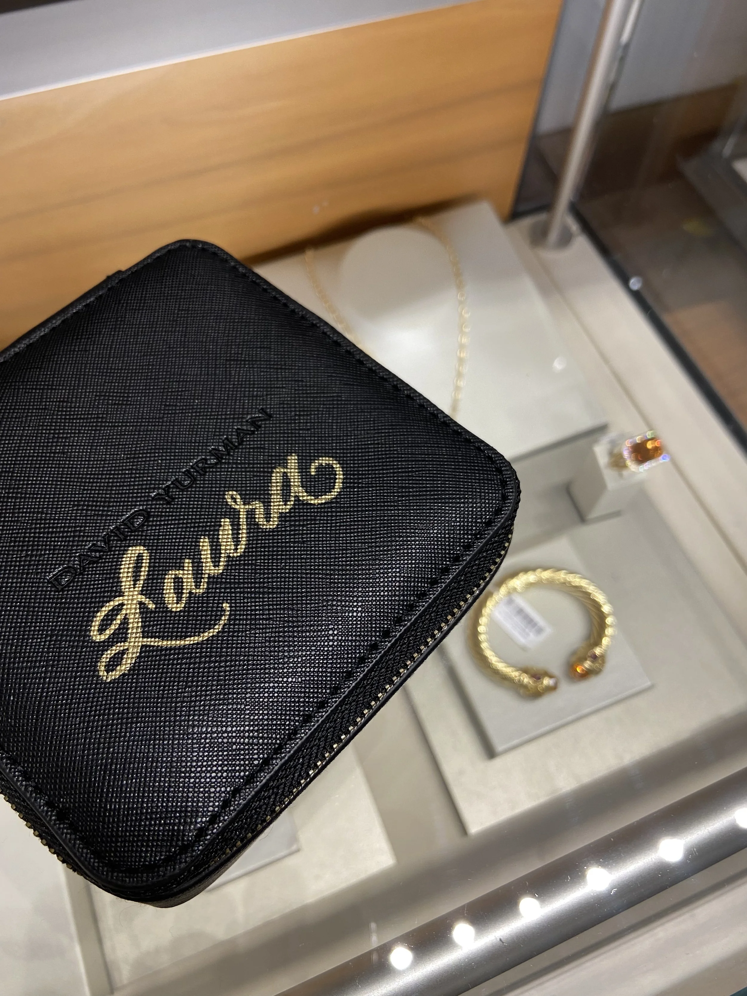
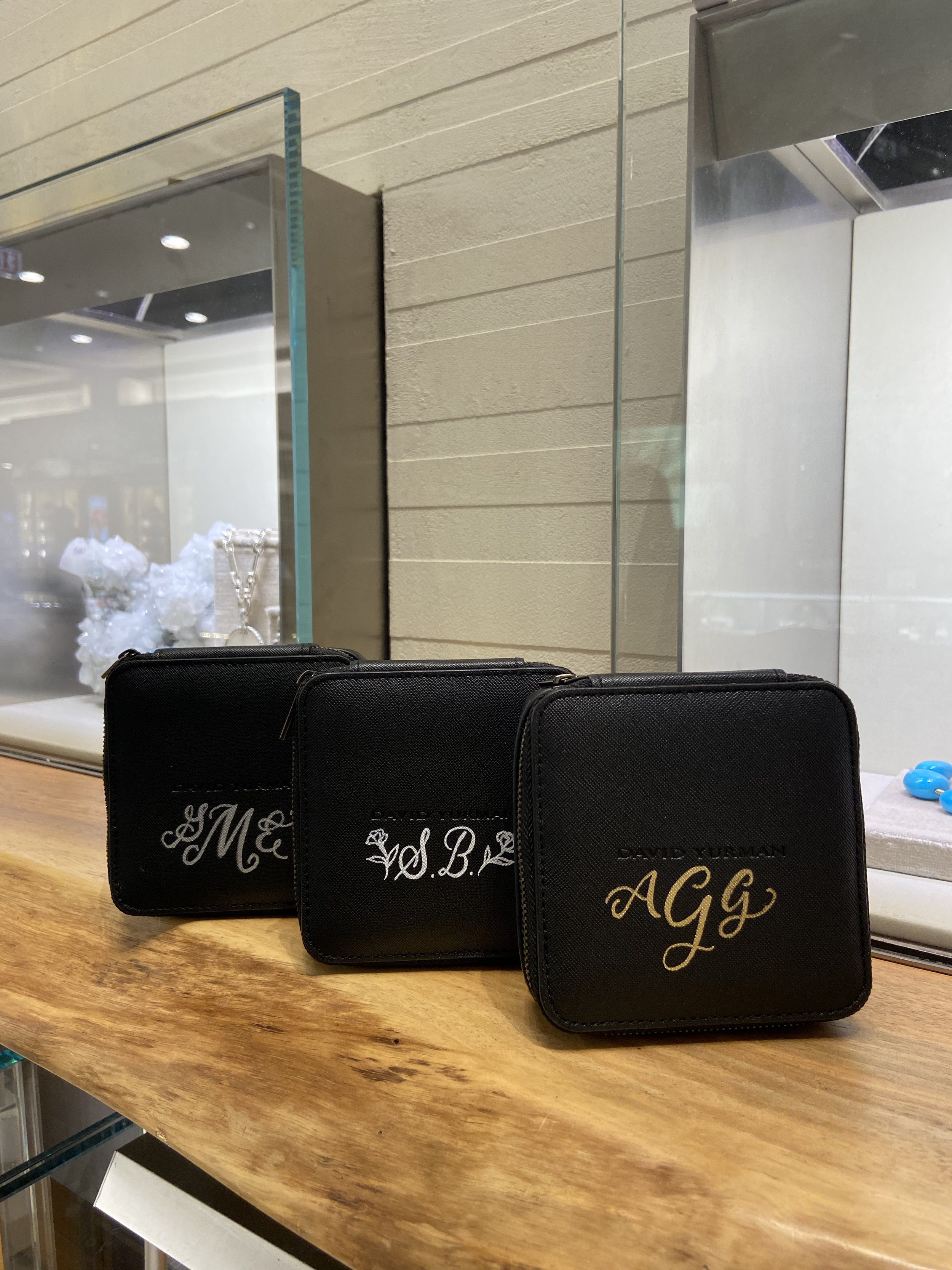
It was a pleasure to be back at the Michigan Avenue Bloomingdale’s, this time adding calligraphy to David Yurman Jelwery cases. This simple but elegant touch was a great way to compliment the already gorgeous jewelry. Thank you for having me Bloomingdales and David Yurman Chicago!
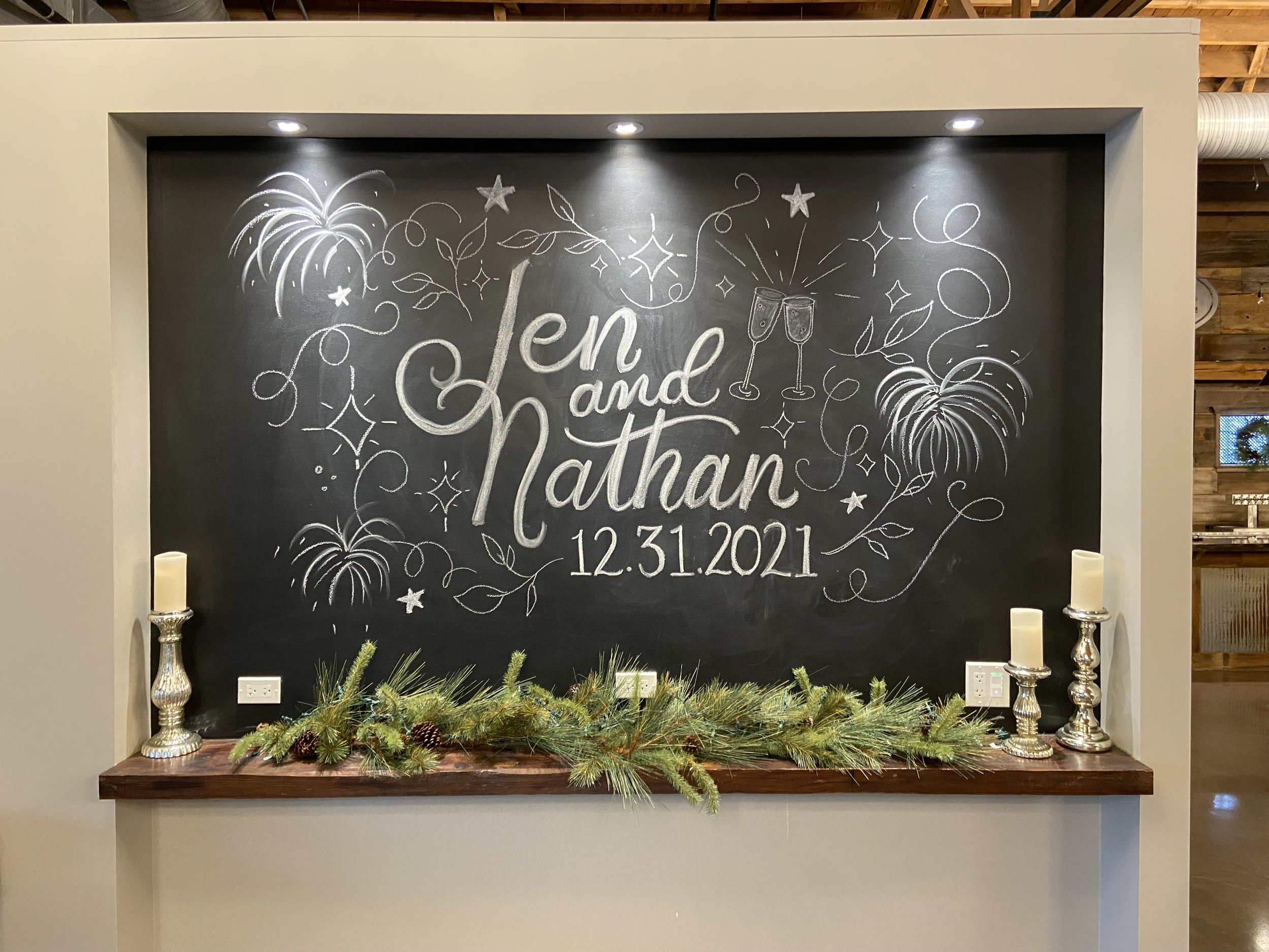
Jennifer and Nate - NYE Wedding Chalkboard
How fun is this wedding chalkboard on New Year’s Eve? It is always fun to help a client’s idea come to life. For Jen and Nathan they wanted more of the party feel to continue onto the chalkboard. We added fireworks, florals and fun sparkles to match the NYE vibes.
Congratulations to Jennifer and Nathan!
Wise Wedding: Escort Card vs. Place Card vs. Seating Chart
There are a lot of terms when it comes down to planning your wedding and the day-of items involved. With traditional rules being “broken” more casually these days for formal weddings, the terms you are hearing can easily be combined or misinterpreted. A casualty of these “broken rules” are place cards and escort cards. These two terms are often interchangeably used, but did you know they are actually two different things?
What’s the difference then?
PLACE CARDS
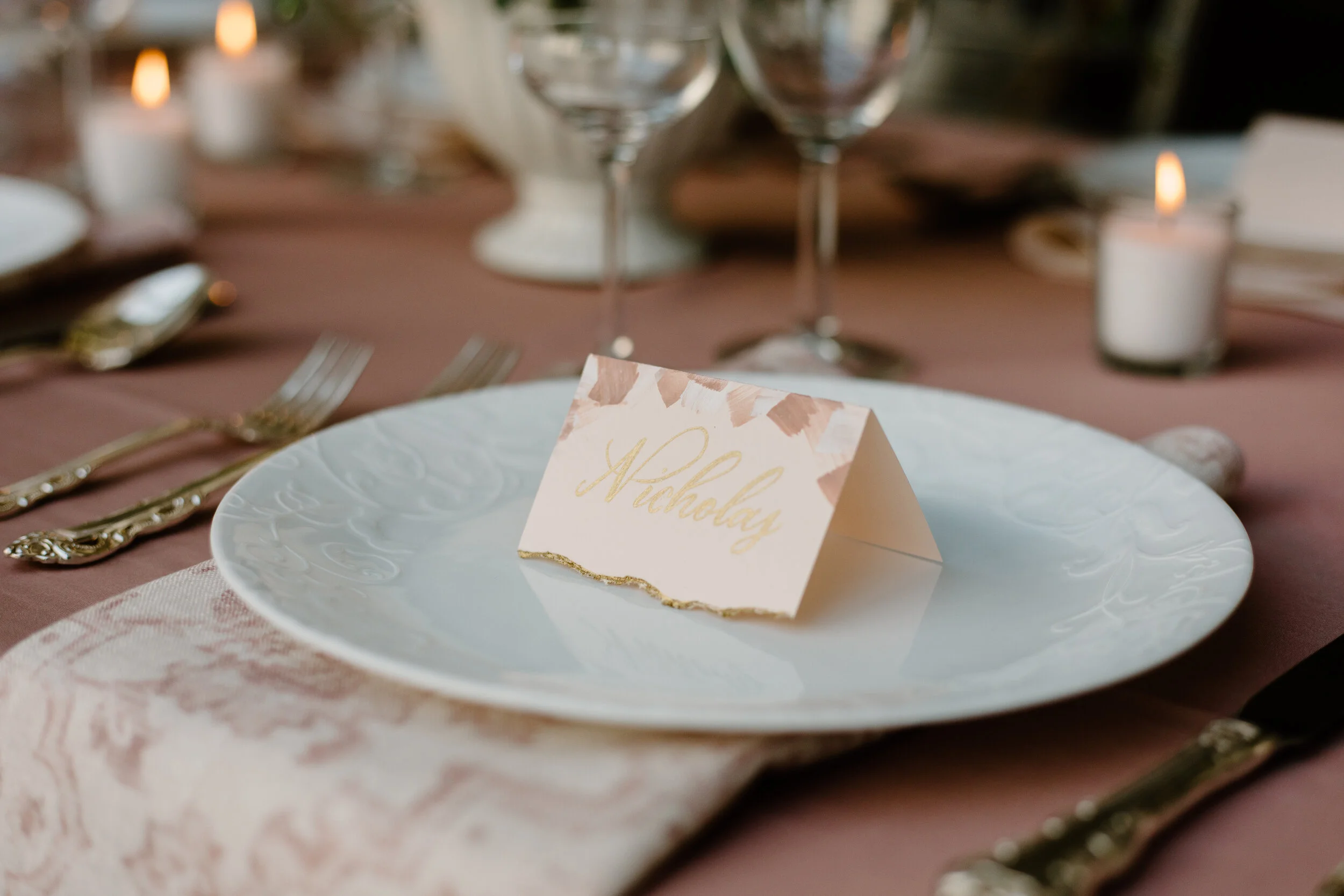
Place cards are used to assign seating and are placed at the place setting for the guest to find at the table. They contain a single guest’s name, no table number but can include a meal choice indicator. They can help the serving staff at a formal sit-down dinner to know which meal you have chosen for the evening. They are often used at more formal or black-tie weddings.
ESCORT CARDS
Escort cards are used to direct your guest or guests to the table they will be sitting at. These cards traditionally will have the couple’s name together or the single guest’s name along with the table number. This is essentially a seating chart in individual cards as they will be set-up in the reception hall, typically towards the entrance. If you do not have specific place cards at the table, these help guests “reserve” their spot at the table to ensure they can sit by whom they like or the direction they would like to face. Though they can be used alongside a place card at an event, they are viewed as the casual alternative to a place card if used alone. If need be, they too can hold the meal choice to helpt the serving staff indicate food allergies or special meal requests for the guest.
SEATING CHART
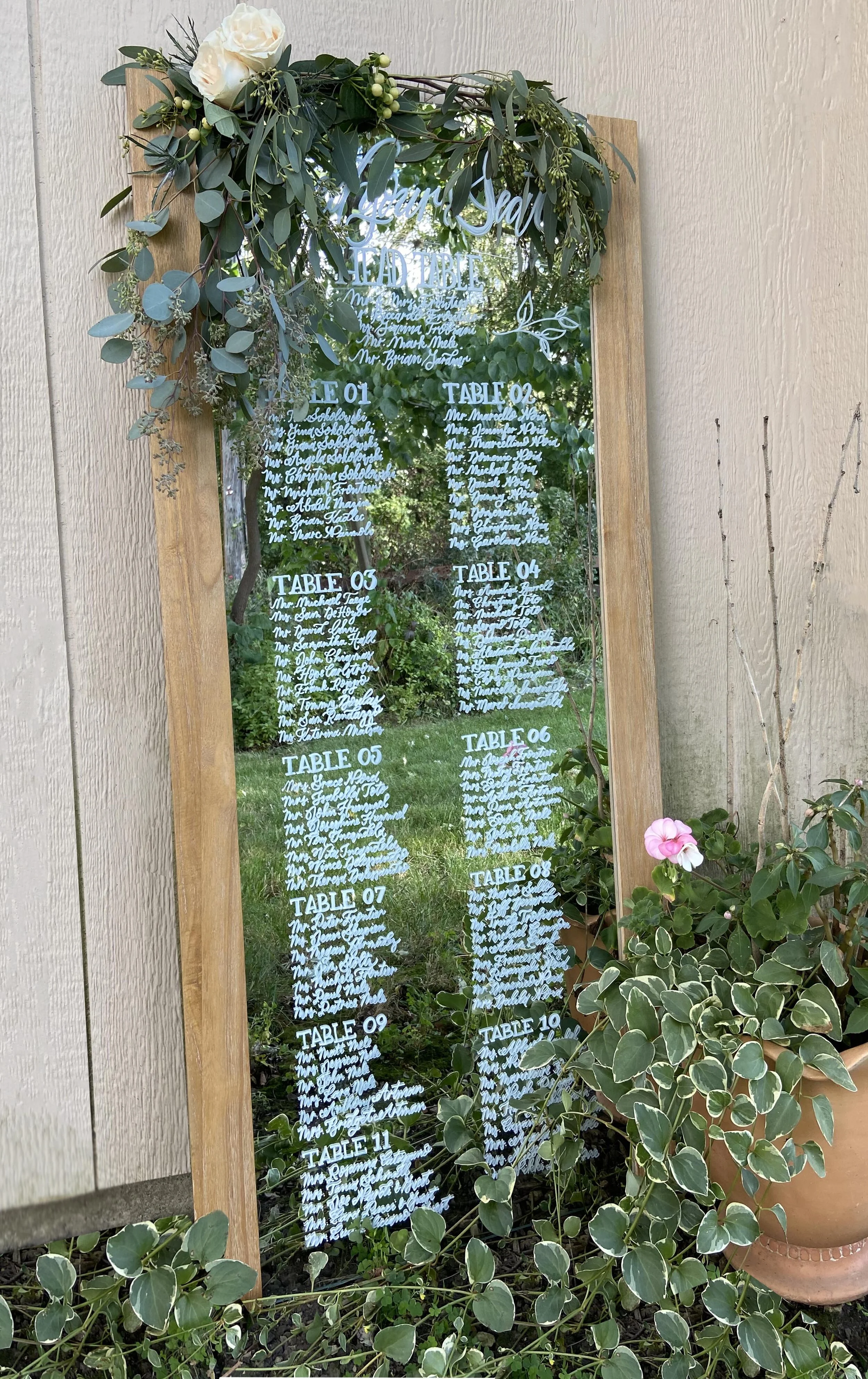
An alternate choice for both a place card and escort card can be a seating chart. Seating charts are a large board, mirror, or another beautiful art piece that displays all your guest’s names and which table they will be sitting at. These make beautiful decor pieces for your reception and can cut down on the use of paper for your event and/or free up space if you do not have room for another table to place your escort cards on. A seating chart is typically used at a wedding when the guest count is too large for escort cards and/or when the wedding guests didn’t have an option to select their entree in advance. This style of seating is perceived as more casual, but can also be used in tandem with a place card.
What should I use then for my wedding?
I am often asked if both escort cards and place cards are necessary, or if they should scrap both and go with a seating chart. Guests want to know where they are sitting and often will look for their seats first thing at a reception to place down purses or to get a “good” spot to view the important events.
Here are my tips for you to help decide what fits best for you:
If you are having a smaller wedding, 30-50 people or under, I would advise a seating chart. Then based on how you have your tables, I would also recommend place cards for a small wedding to help get the more important guests (such as parents, grandparents, etc.) to the spots that they can see all the special events without obstruction. Nobody should be blocking mom or making grandma crane her neck to see the cake cutting.
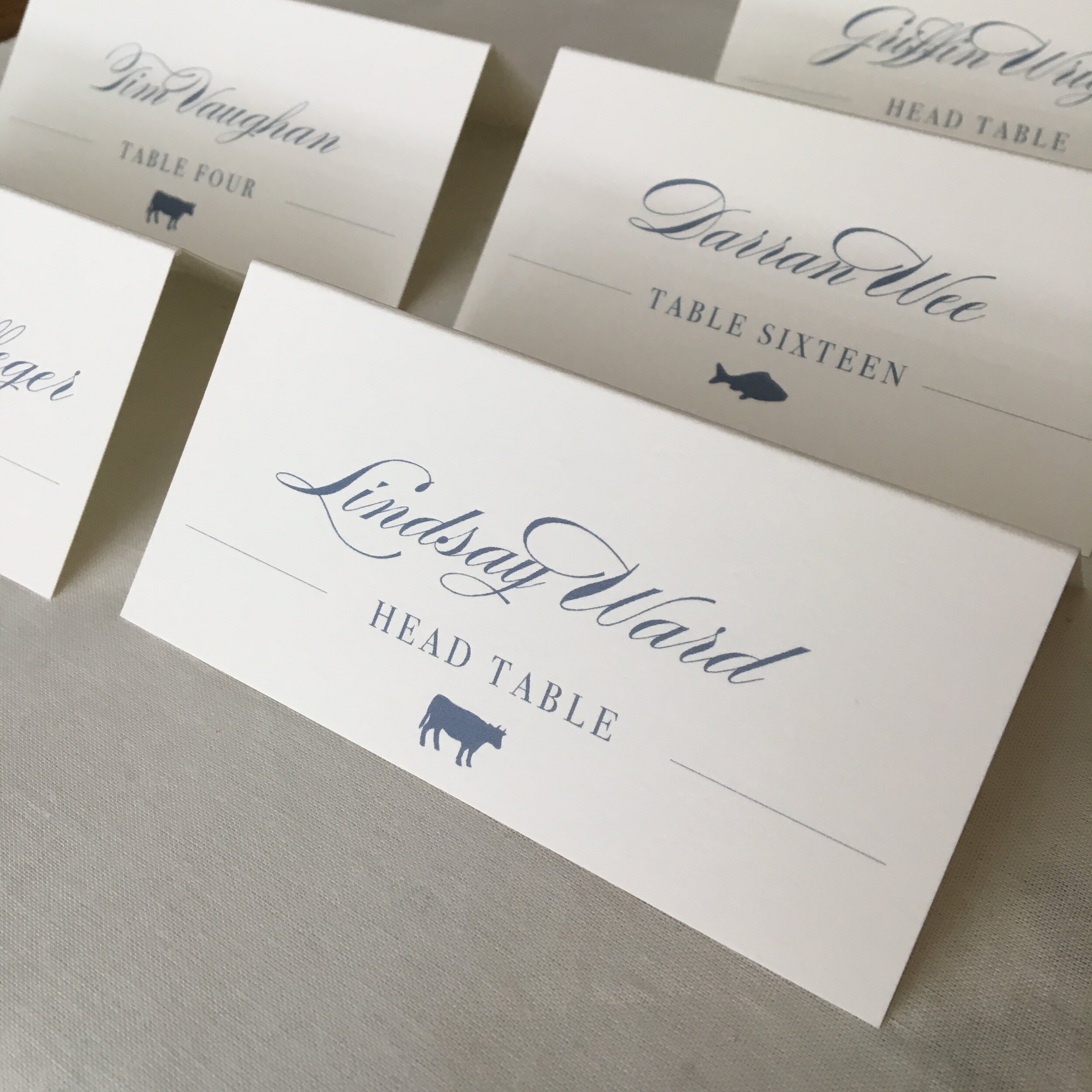
Example of place card
If your venue is asking you to use a card for meal purposes, traditionally a place card would be used alongside an escort card or seating chart. For a less formal feel, you may use an escort card and place an icon (as seen above) or letter such as “F” for fish to help the serving staff quickly decipher the meal for each guest.
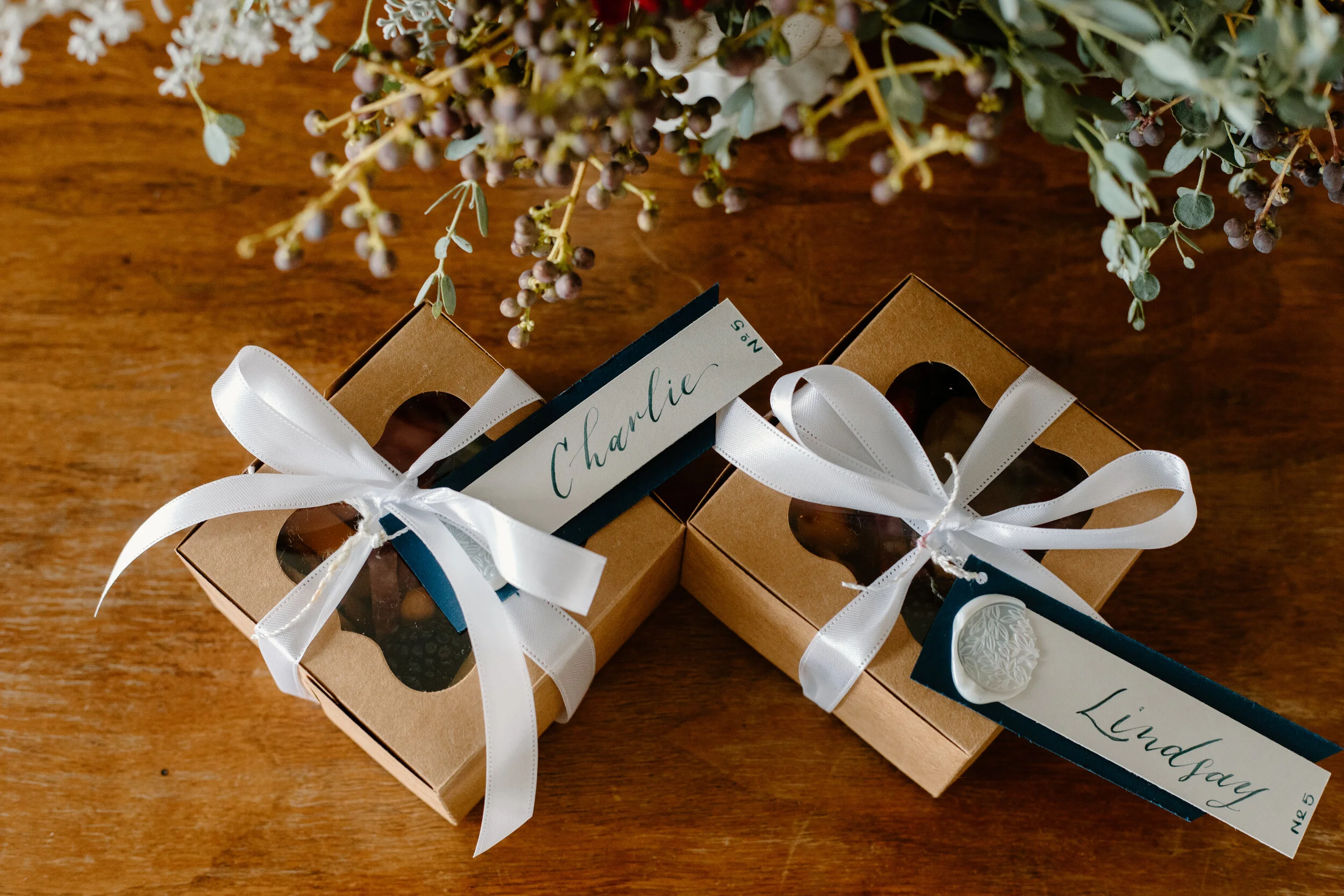
If you choose to use both an escort card and a place card, ensure that the two look different. For your place cards, instead of a traditional paper card, choose a unique item that can add to your tables decore such as a seashell, tile, leaf, or a sentimental favor with their name attached on a tag (See example below). Guests will be delighted by these unique items and they take them home as personalized favors!
Example of unique place card for guests.
Regardless of the direction, you take your guest seating, I always advise you have a seating plan. From formal place cards that direct guests to the correct seat, to the less formal escort card to direct guests to the right table, make a clear plan with whoever is setting up your reception. This will ensure your reception gets off on the right foot.
Portfolio: Elegant and Simple,Calligraphy Wedding Invites
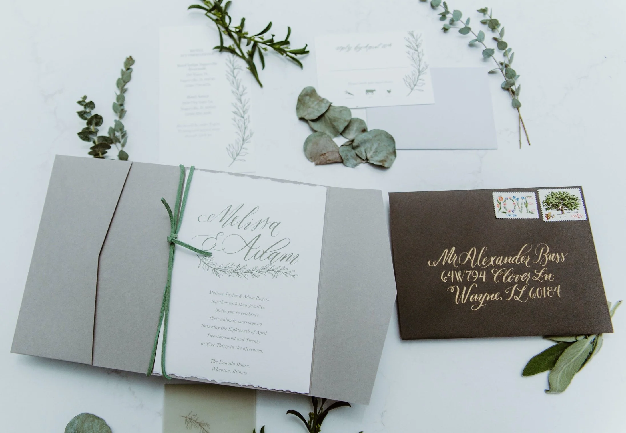
These elegant invites convey so much in their simple design. I loved incorporating so many beautiful elements including the natural, deckled edged paper; antique gold calligraphy on the dark grey envelopes; and the illustrated, vine that is included on all three informational pieces for this complete invitation suite.
The relaxed calligraphy emphasizing the couple’s names on the invite creates a modern monogram of sorts, as well as adds a touch of sophistication to the already subdue but timeless color palette. Using the pocket folder allows all the pieces to mail easily while adding an extra and dynamic to the opening experience for the guest.
Photos by Bozenavoytko Photography | Planner: Elisabeth Dari
Styled Shoot: Romantic, Gold and Green Brunch
I loved getting to be apart of this wedding brunch styled shoot with so many beautiful additions dreamt up by the Elisabeth Dari and her team! The gold, cream, and green accents are the perfect engagement or bridal brunch accents to warm up the colder, dreary months of winter. Check out the magic below.
For the invitations, I went with a modern shop square accented with arch typographic details. The colors in the watercolor strokes and the touch of spot calligraphy added that bohemian feel.
Adding to the theme of mixed metals and greenery, I choose a gold envelope liner with gold calligraphy on the mailing envelope to off set the bronze and dark gun-metal gray on the invite.
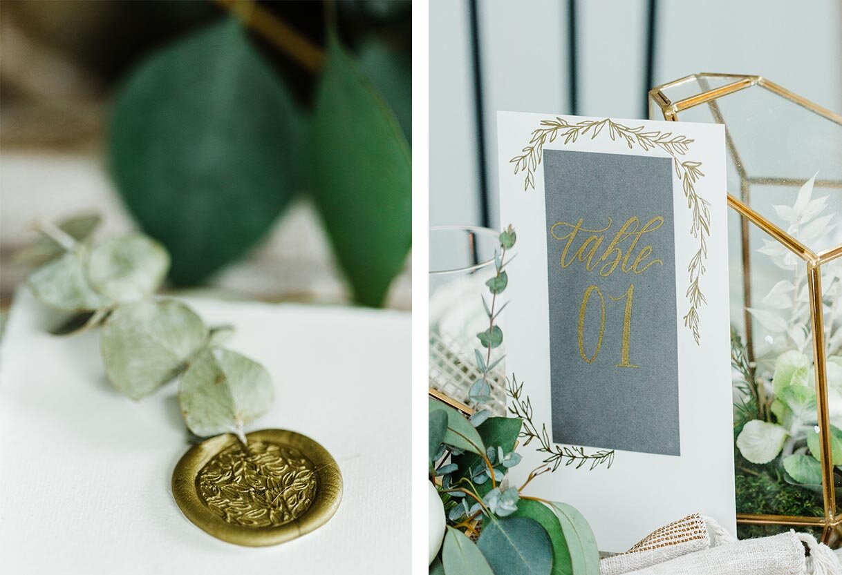
Adding these watercolor sayings to individual place settings, each with a different poem, lyric or phrase added that touch of intimacy to the table that a smaller gathering allows. Topping them off with eucalyptus and a gold wax seal added texture to this already beautiful tablescape.
Photos by Bozenavoytko Photography | Planner: Elisabeth Dari | Flowers: Stemming From Love
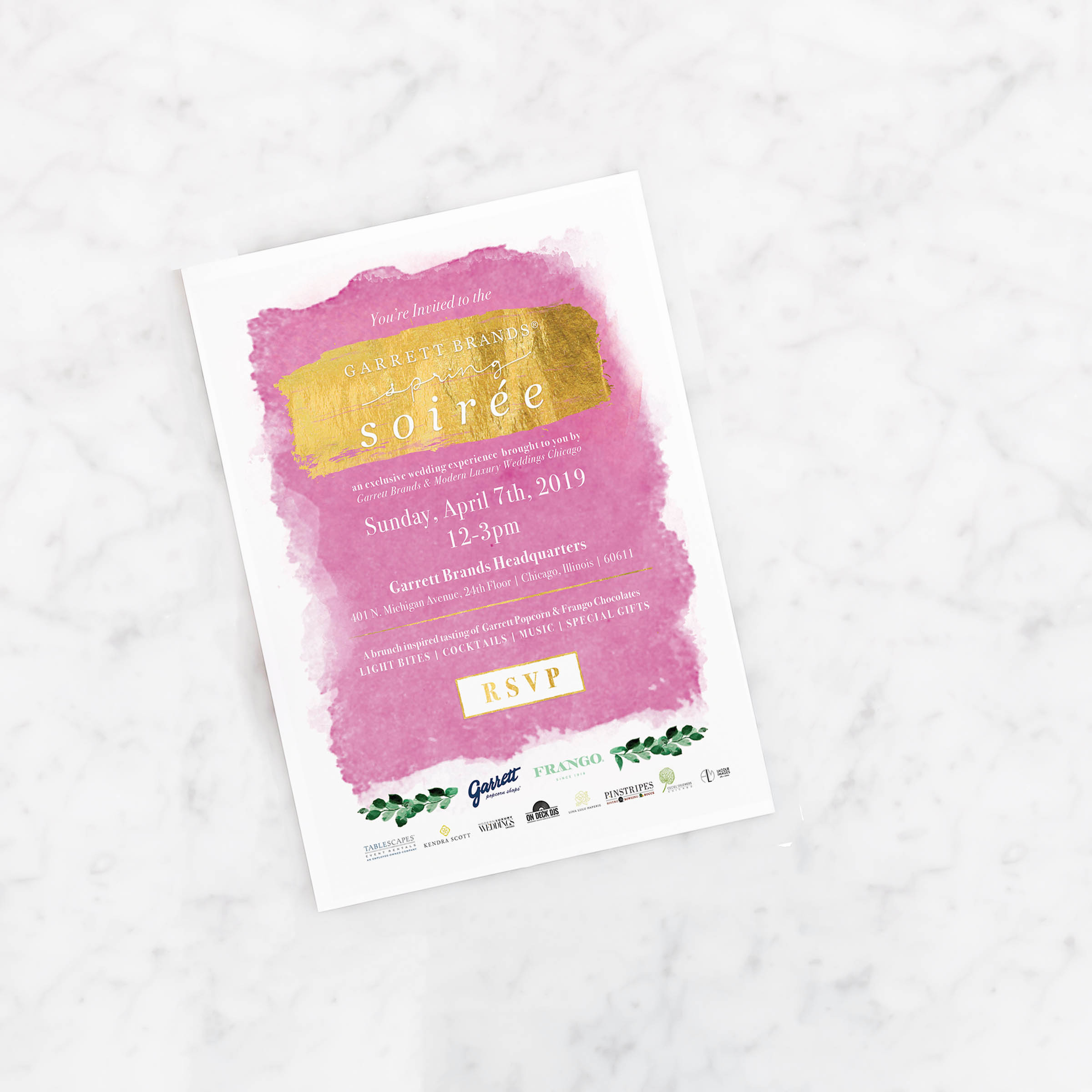
Garrett Spring Soirée: April 2019
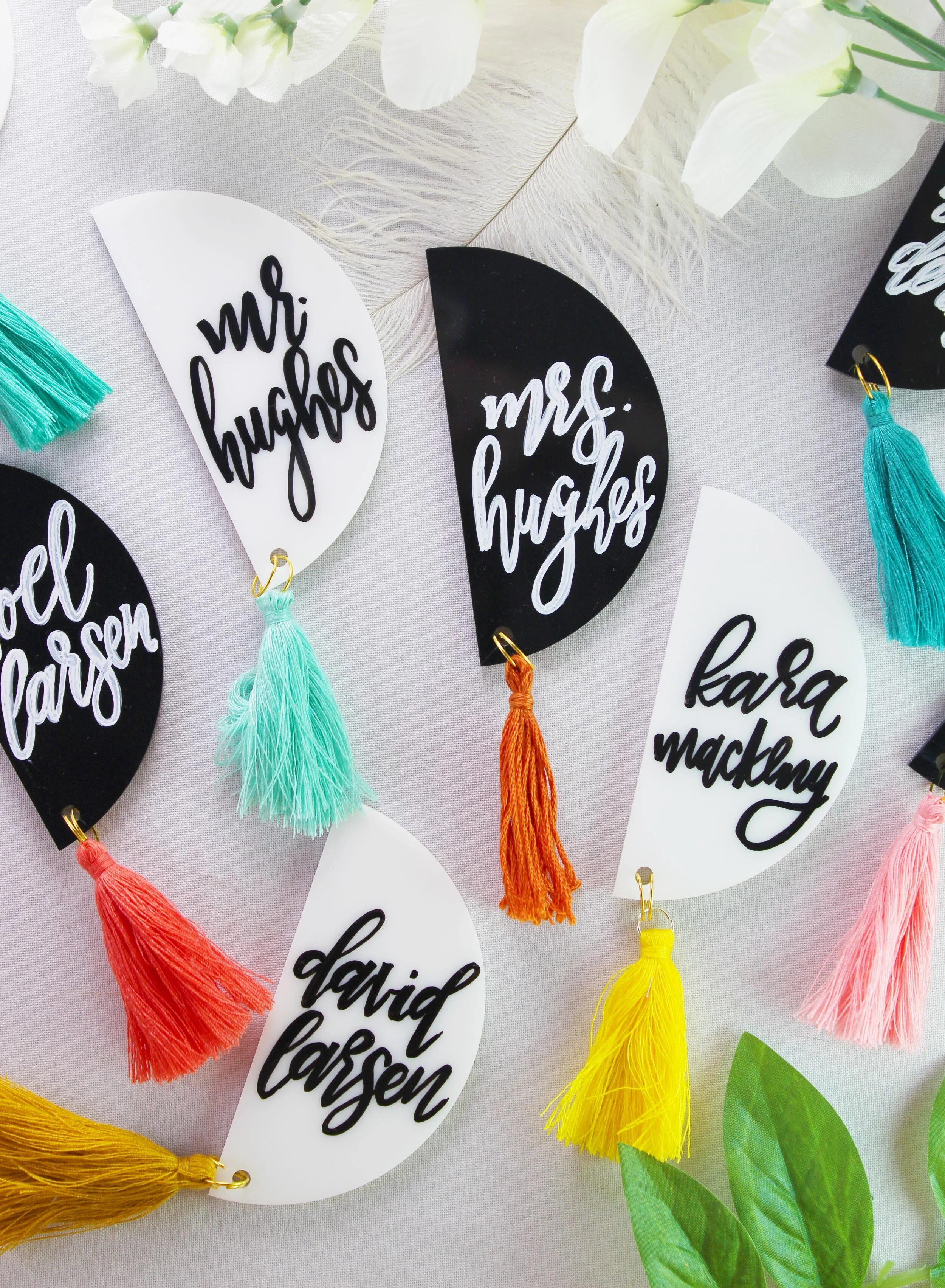
I was invited by sales manager, Sarah Ruth, to participate in this years Garrett Spring Soirée, a brunch event exclusivley for brides in the Chicago area! A timeless snack synonymous with Chicago itself, Garret Popcorn and Frango brands have so many delicious varieties of goodies that would be a great addition to both bridal and wedding events! I was so excited to get a chance to create one of a kind, calligraphy favors on their min tins.
Set-up in their corporate office, this fun event include the incredible brands Kendra Scott, Cecil’s Flowers, Tablescape Lines, DJ, and Roanoke restaurant, Pinestripes catering, and more. I had a great time meeting so many great couples and friends in the industry. With small displays of what the brand could offer from table mints to popcorn bars for your guests to make your mix. My favorite was their pairing bar of popcorn, chocolate and drinks —how fun!
Styled Shoot: Vintage Tuscany at Galleria Marchetti
I am thrilled to have been apart of this gorgeous, inspired shoot !Designed by the talented and kind Lillian Rose Events, the tuscan elements combined with charm and elegant details of Galleria Marchetti created for a romantic, old world feeling wedding here in the Midwest! All photos by Jasko Omerovic Photography. For all vendor involved check the list below!
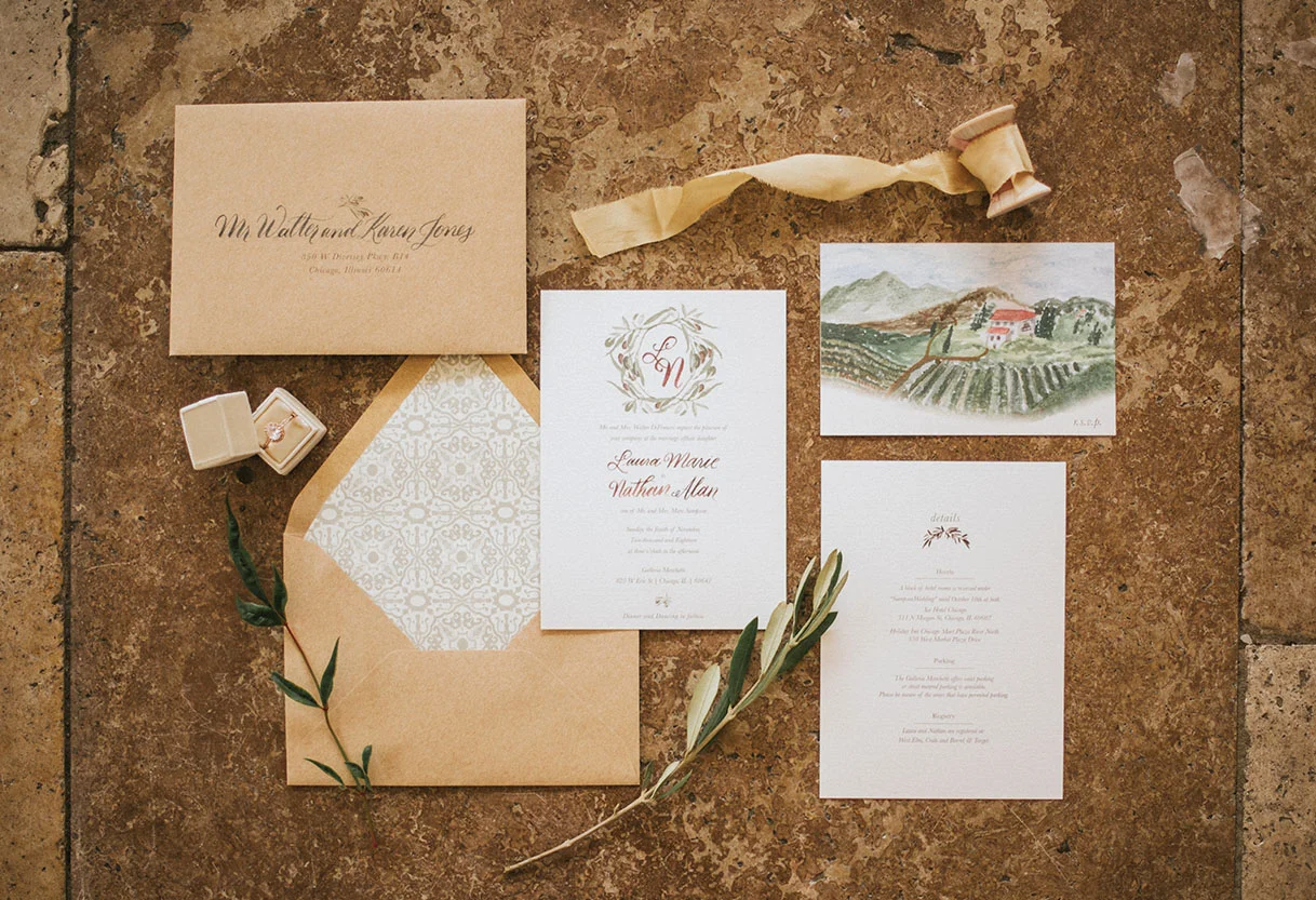
Inspired by the romantic fields and wineries of Italy, I chose to work with earth tones and simplistic elements. A custom monogram surrounded by olives adorned the main invitation (swoon!). The olives leaves are carried though out the rest of the wedding paper goods from the details card all the way to the wax seal bringing texture the the table menus.
My favorite two elements from the invitation suite quickly became the Italian tile inspired envelope liner and the lush, custom painted country side RSVP postcard. Both elements bring in more color to an other wise soft and romantic feeling invitation.
Each paper element, though slightly varied from one another, are all connected through the calligraphy. I used my Lily style to bring a romantic but modern movement to each element. Choosing a soft grey ink allowed each paper good to feel rustic and compliment the gorgeous tones of the vintage dishes, beautiful table linens and gorgeous muted toned florals.
To find more of this stunning shoot and a gorgeous video capturing the experience, check out the post from Chicago Style Weddings
Find the incredible and talented vendors here:
Venue: Galleria Marchetti, Photographer: Jasko Omerovic Photography, Videography: Newlyweds Cinema, Event Planner: Lillian Rose Events, Floral: Phillips Flowers, Décor & Rentals: Dish & Decor Vintage Rentals, Hair & Makeup: Meghana Prasad, Stationery: Lina Lulu Paperie, Linens: BBJ Linen, Bride’s Gown: Edith Élan via Dame Couture, Bride’s Shoes: James Ciccotti, Bride’s Accessories: Davie & Chio; Ti Adoro Jewelry; Jennifer Leigh Veil Design, Formalwear: The Groomsman Suit, Models: Naftali Kark & Stephanie Straka
Portfolio: Baby Virgil Adventure Shower
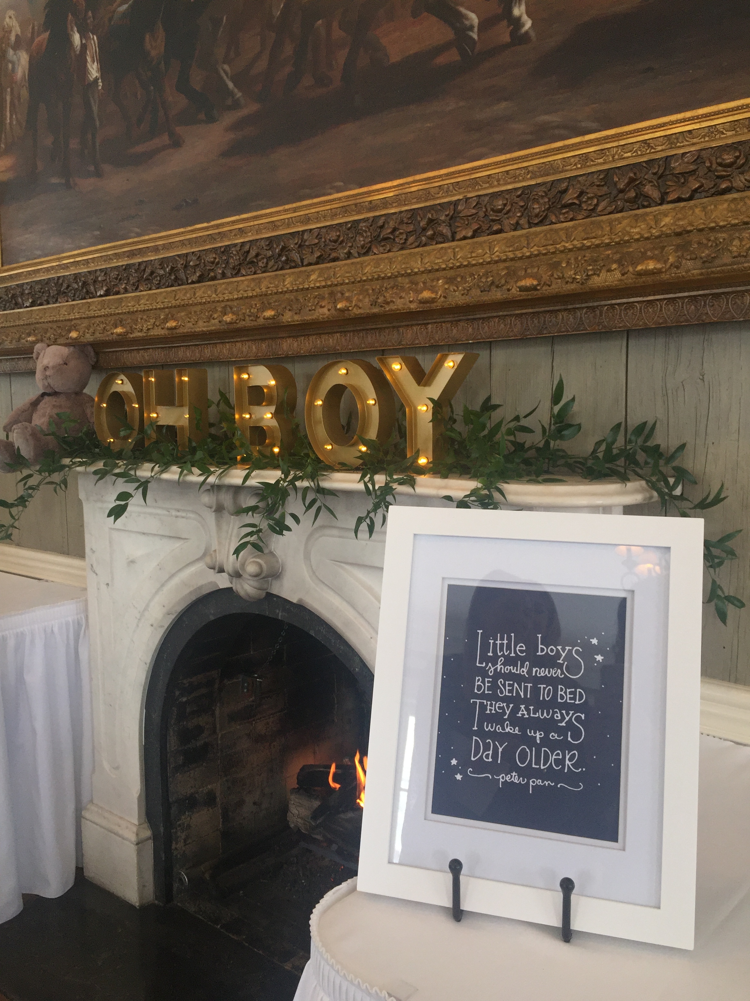
Have you seen a sweeter looking baby shower? I had the privilege of working with Lauren and her mom for her wedding a few years back and just loved getting to celebrate this next step with them as they welcome a little boy this Spring. The theme was bears and adventure with a classic twist! How cute are all the details!
I had so much fun working with Deb from the concept of the invites to all the day-of pieces. My favorite piece is the Peter Pan quote that will hang in the nursery. Congratulations to Taylor and Lauren as they celebrate their little boys arrival!
Modern Thanksgiving Table Inspiration
When thinking about Thanksgiving, it had me dreaming about the whole holiday season. I thought it would be fun to imagine a table that could transition from Thanksgiving day to a more universal table for the winter season.
To add dimension and a special touch, each napkin was wrapped in gold bakers twine with lavender and a watercolor leaf with the word "thankful".
I love the idea of mixing patterns and using the nontraditional fall color of blue to create a fun modern Thanksgiving table. This table and many of the elements could transition to a winter/Christmas table with some simple color and floral changes through out the season. (I'm thinking maybe wine colored tapers and adding glittery baubles among the pine cones).
To keep the warmth of Fall present and the table relevant to Thanksgiving, I included warm metallics like the gold chargers, flatware and the brass candle holders.
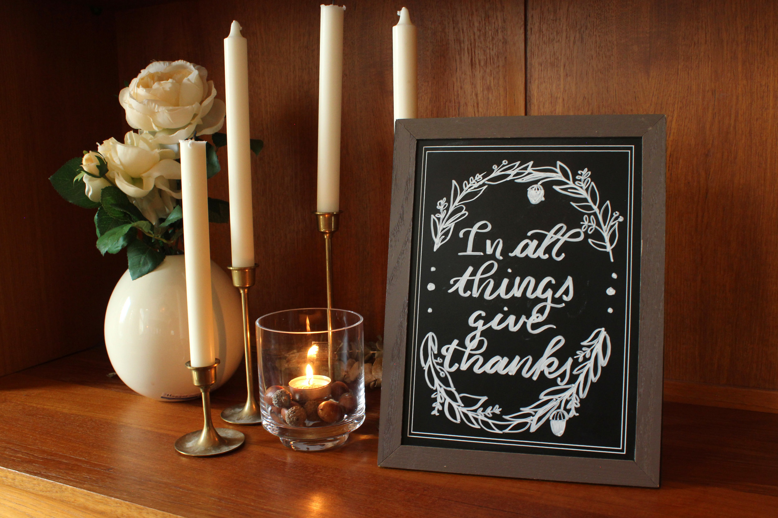
To include the theme throughout the room, I added a simple chalk-board sign to the sideboard pulling in the florals and pinecone. These signs are perfect to quickly change simple greetings, add a favorite holiday drink menu, or keep score for a family game after dinner!
Decoration:
Calligraphy: Lina Lulu Paperie | Dinner Plates | Bowls | Salad Plates | Silverware | Table Runner from T.J. Maxs | Place Mats (Similar) | Brass Candle Holders (Family Heirloom ) Simular Item | Blue Glass Candle Holders (Family Heirloom ) Similar Item | Pine Cones | Napkins,Target Dollar Section | Chalk Sign, Target Dollar Section | Wooden Server
Traditional Thanksgiving Table Inspiration
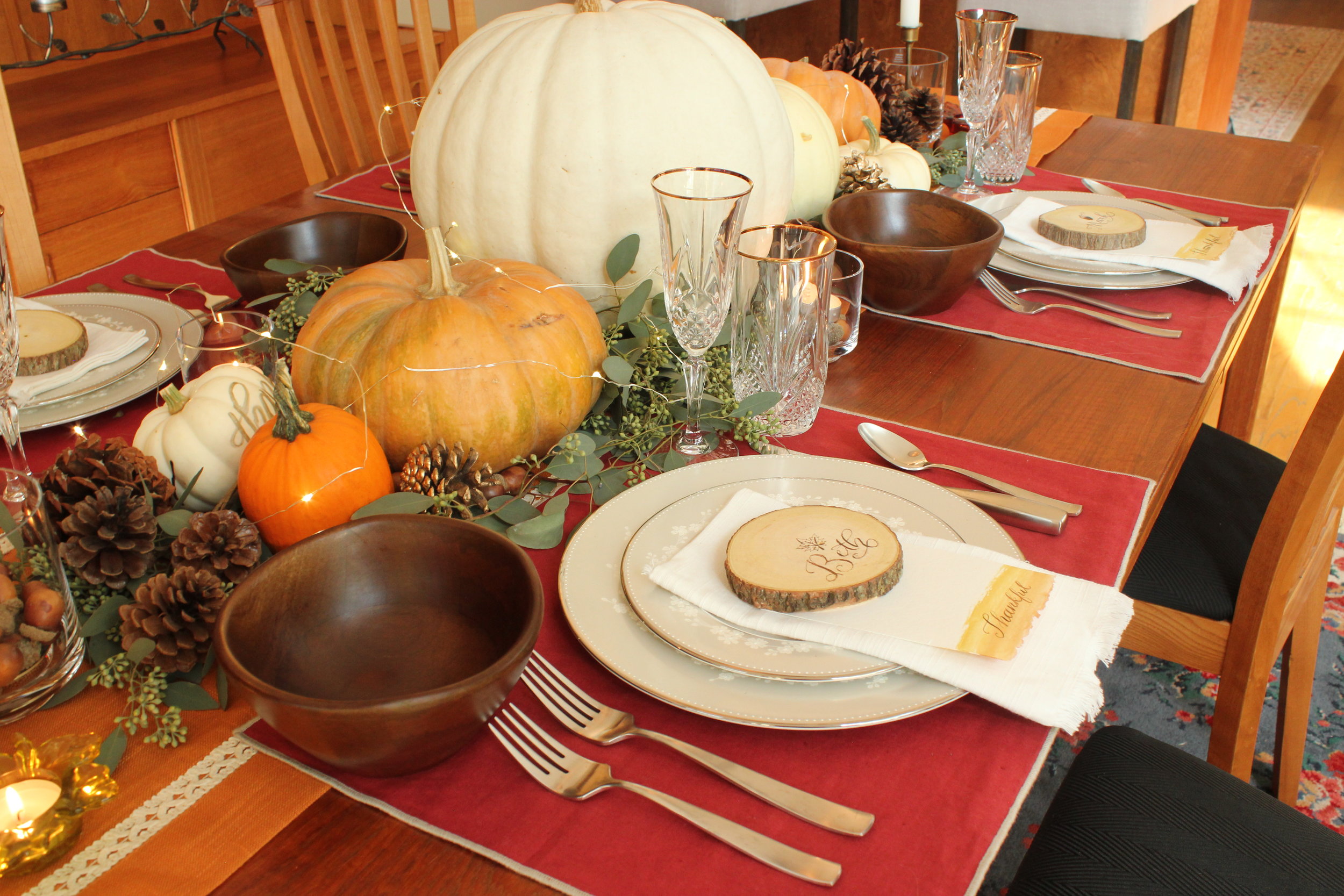
When I think of a traditional Thanksgiving, I think of warm Fall colors (like brown, red and orange), leaves and happy turkeys. Those thoughts became the inspiration for this traditional Thanksgiving table, including almost all my favorite fall items.
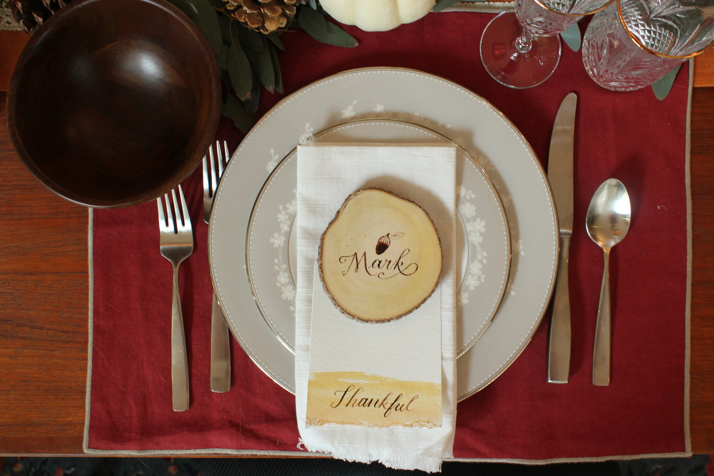
To add a special touch to each guests seat, I included a custom coaster doubling as a name card. Underneath the name card, I placed a peice of paper that each guest could jot down what they were thankful for as a keepsake and reminder for the year to come.
Filling the table with pumpkins gives a fun nod to the bounty of the first Thanksgiving pictures of the event often depicts. I chose silver plates and silverware to offset the warm tones reflected in the placemats, pumpkins, acorns and pinecones.
Calligraphy : Lina Lulu Paperie | Table Runner, TJ Maxs | Silver Ware | China Setting | Napkins, TJ Maxs | Wooden Coasters | Pine Cones | Acorns | Glass Candle Holders | Fairy Lights
Styled Shoot: Being Joy Photography at Venue 5126
I met Joy this summer at a local wedding gathering and instantly loved her spirit and vibe. I then proceeded to fall in love with her style and gorgeous photos! She invited me to be a part of an amazing team assembled to create a gorgeous boho inspired shoot at Venue 5126 in Oswego, Illinois.
Finding the right mix of modern, boho, and romantic was my aim as I created a simple but sophisticated wedding suite for this shoot. A combination of hand drawn botanicals, calligraphy and gold embossing become the perfect mix to produce a wild and tame feeling all in one.
The Incredible Vendor team included: Photography, Being Joy Photography | Venue and Props, Venue 5126. | Flowers, Ashland and Addison, RJPdesigns | Gowns, Victoria Sdoukos Couture. | Hair, Hair By Dorthi. | Make-Up, Alana G | Models, Gabija Guzauskaite and Whitman Johnson
Gradient Love
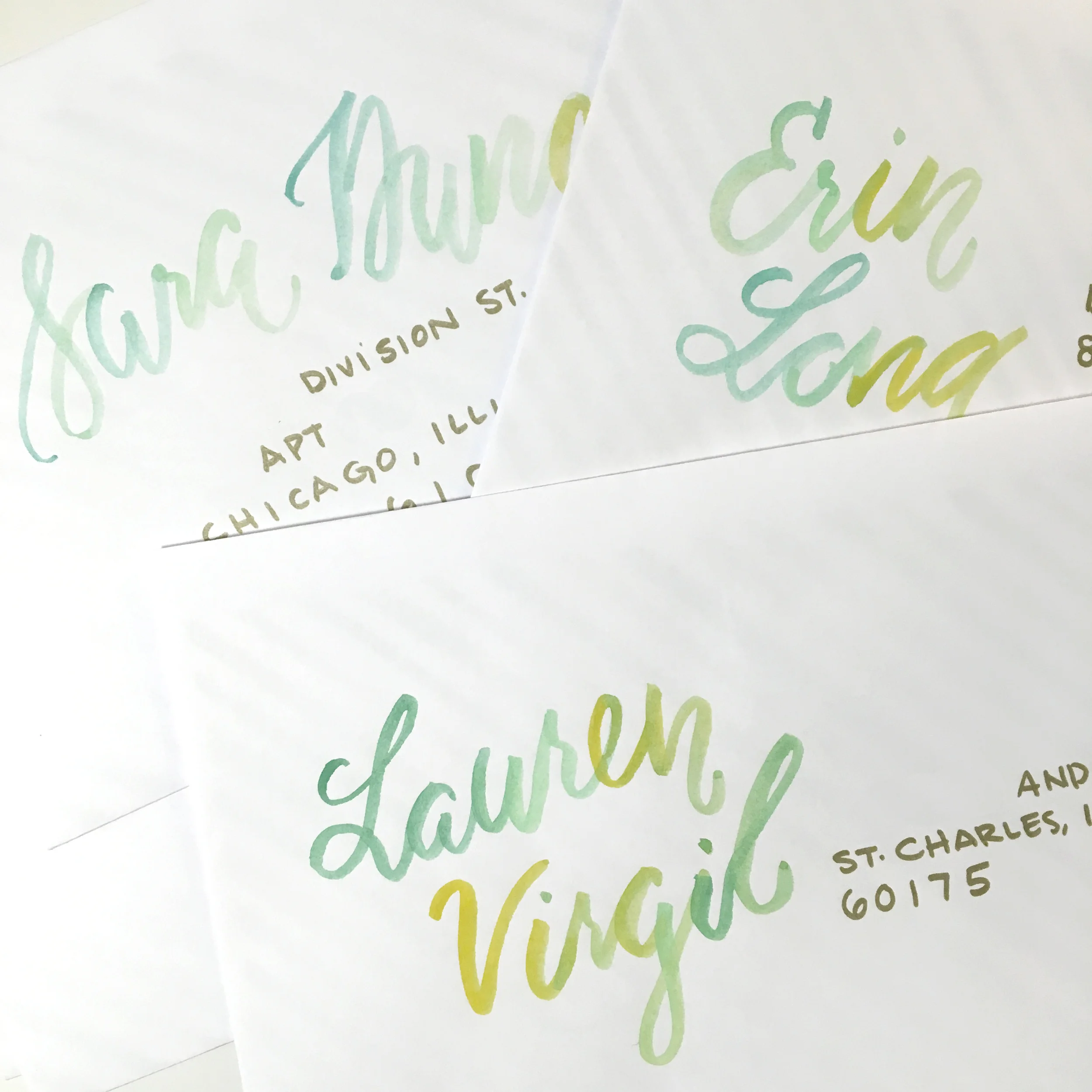
I had fun on a personal project for my sisters upcoming bridal shower with these gradient watercolor names and gold addresses. Don't you love those vintage floral stamps? Can't wait to show you what we have planned for the actual party!
Letters for Love Songs
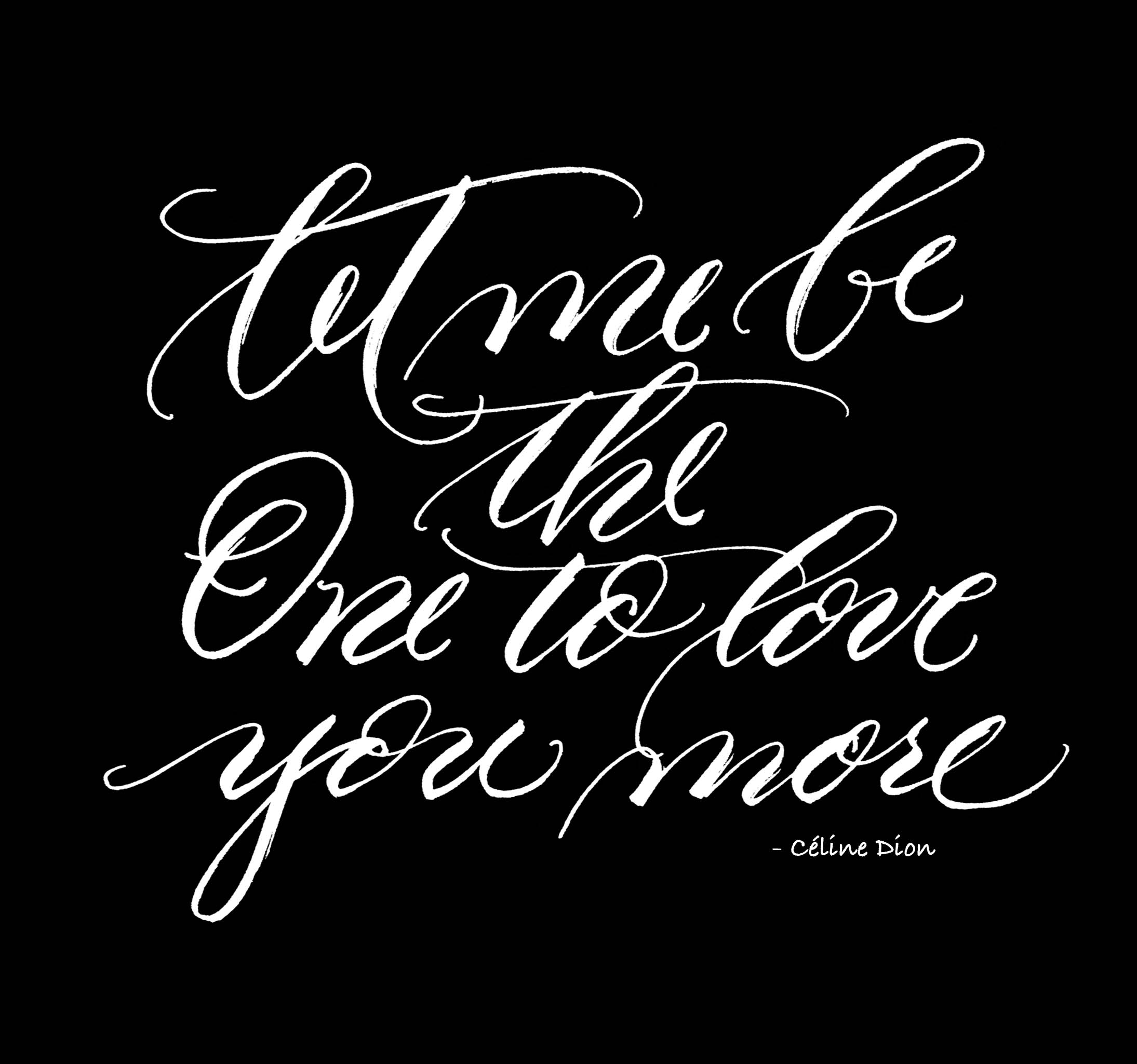
I have been doing a small challenge on my Instagram this month to post a love song lyric each day called #lettersforlovesongs. I compiled a list of my favorite love songs lyrics and have been giving myself 30 minutes to pick, sketch and (if need be) computerize the text. Some of them I feel so good about in person and then I photograph them and feel subpar—does that ever happen to you?
Despite the feeling of subpar work, I post it anyways as a challenge to myself not only to follow through on posting everyday, but to start getting my work out there and making bench marks for myself. Practice makes perfect—and I really do love practicing. It is just picking the lyrics that are hard! So many GREAT love songs out there.
You can hear the playlist of all the songs I have picked so far on Spotify, just click here. Remember to follow along on my Instagram and the hashtag #lettersforlovesongs
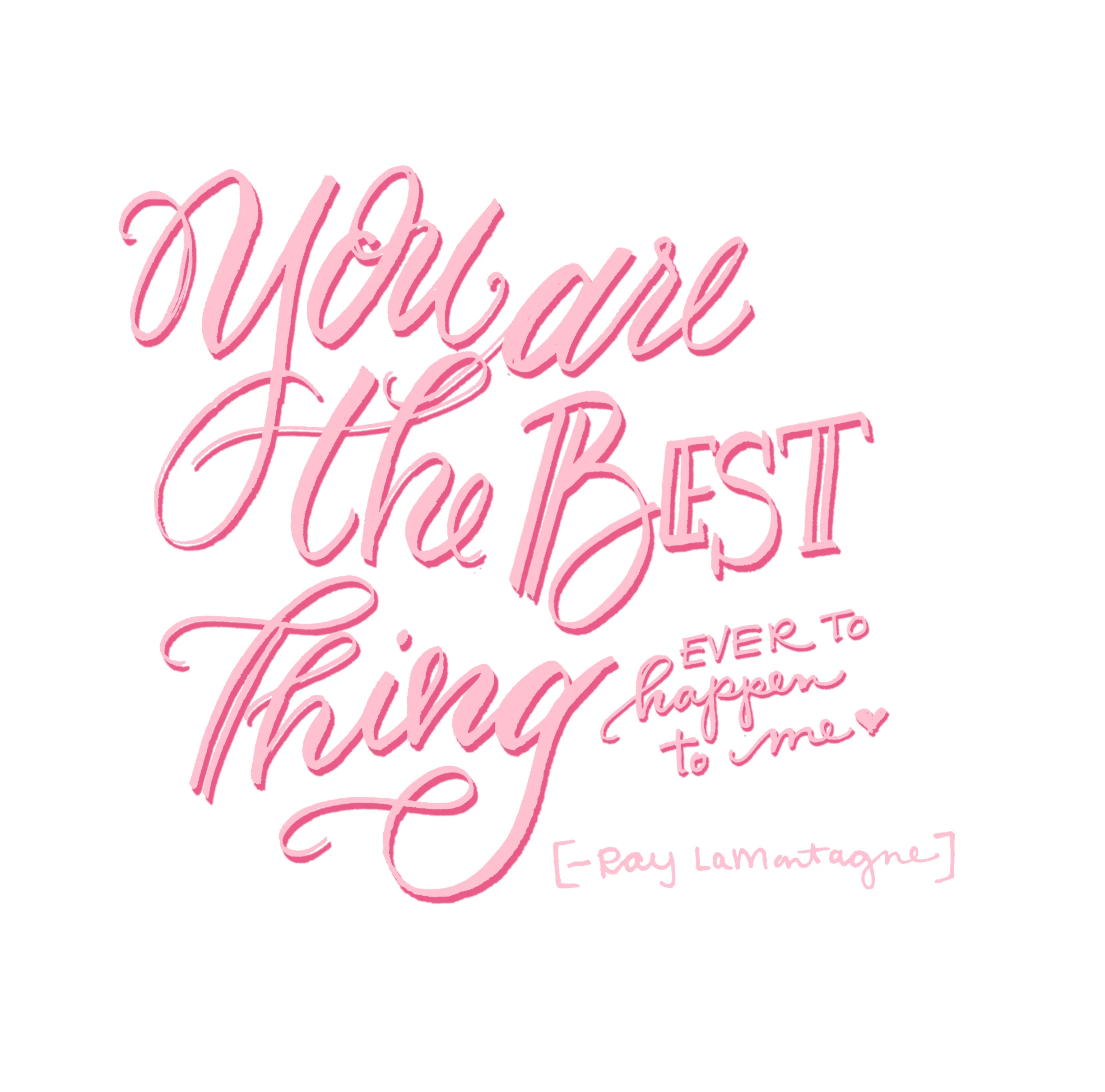
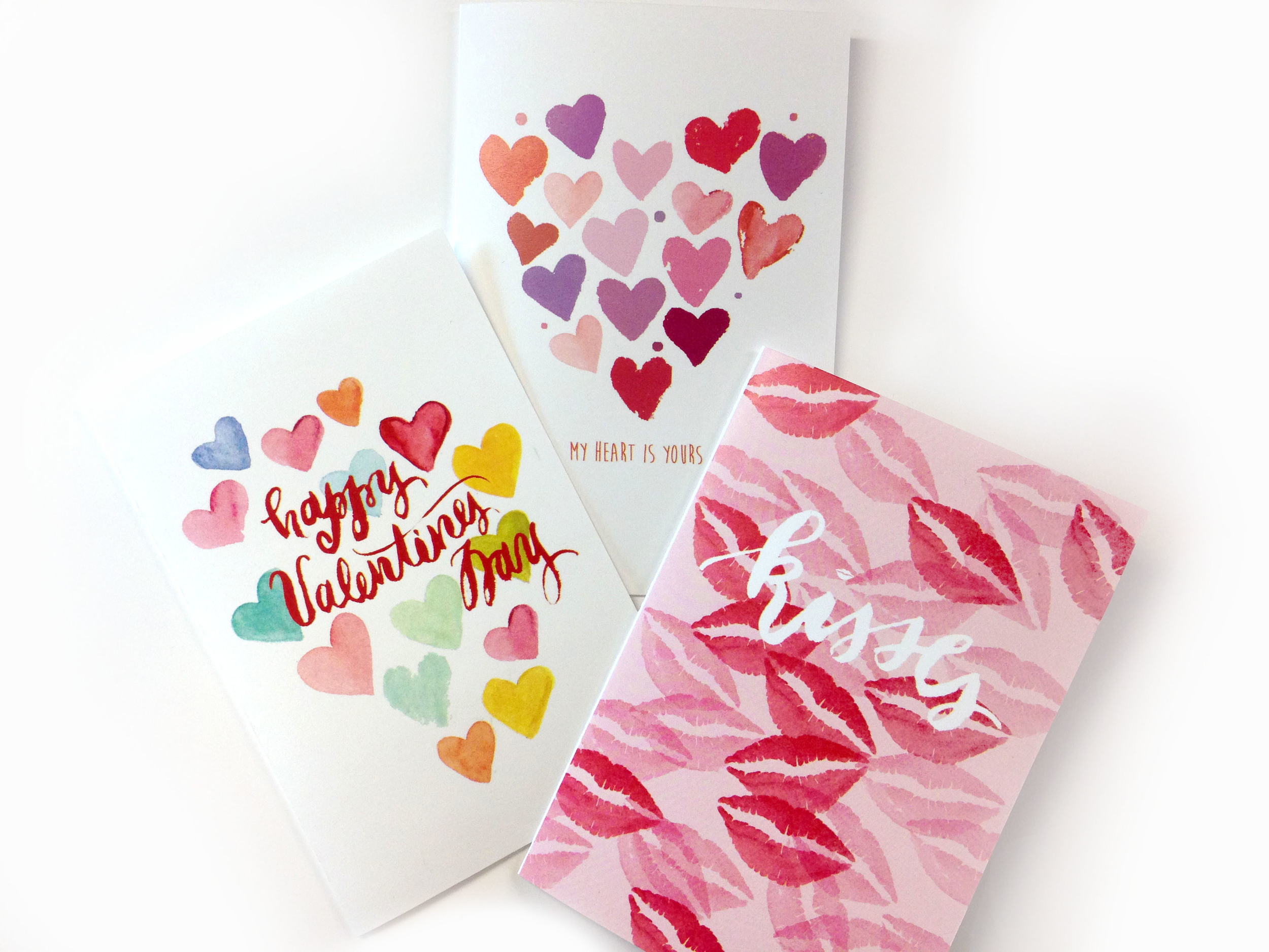
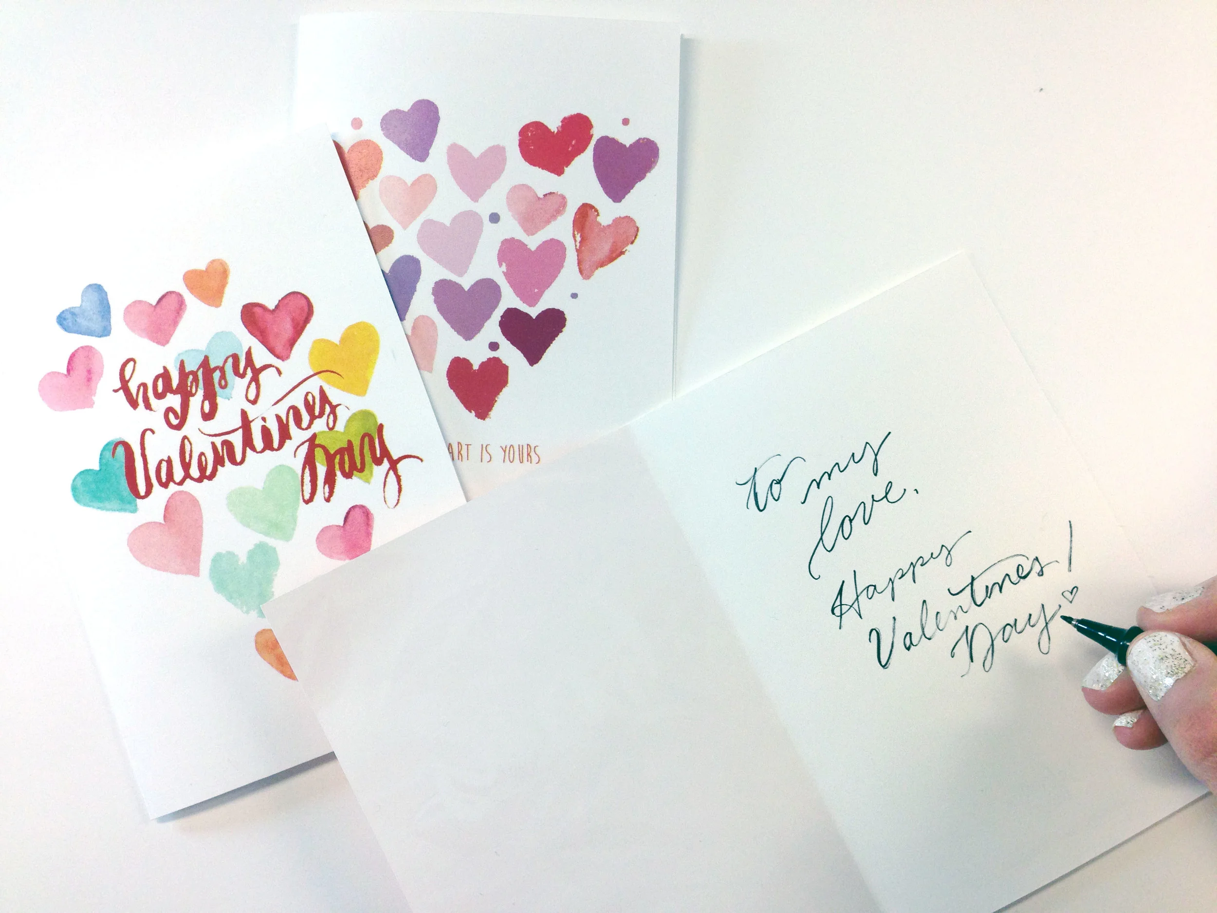
Valentines Day Card : Free Printable
Valentines Day is on Sunday! For you last minute beauties, like myself, I have three FREE cute printable cards. Valentines day is a fun excuse to tell the people in your life you love them—don't miss that opportunity Download the file here and print them at home!
Happy Valentines day loves!
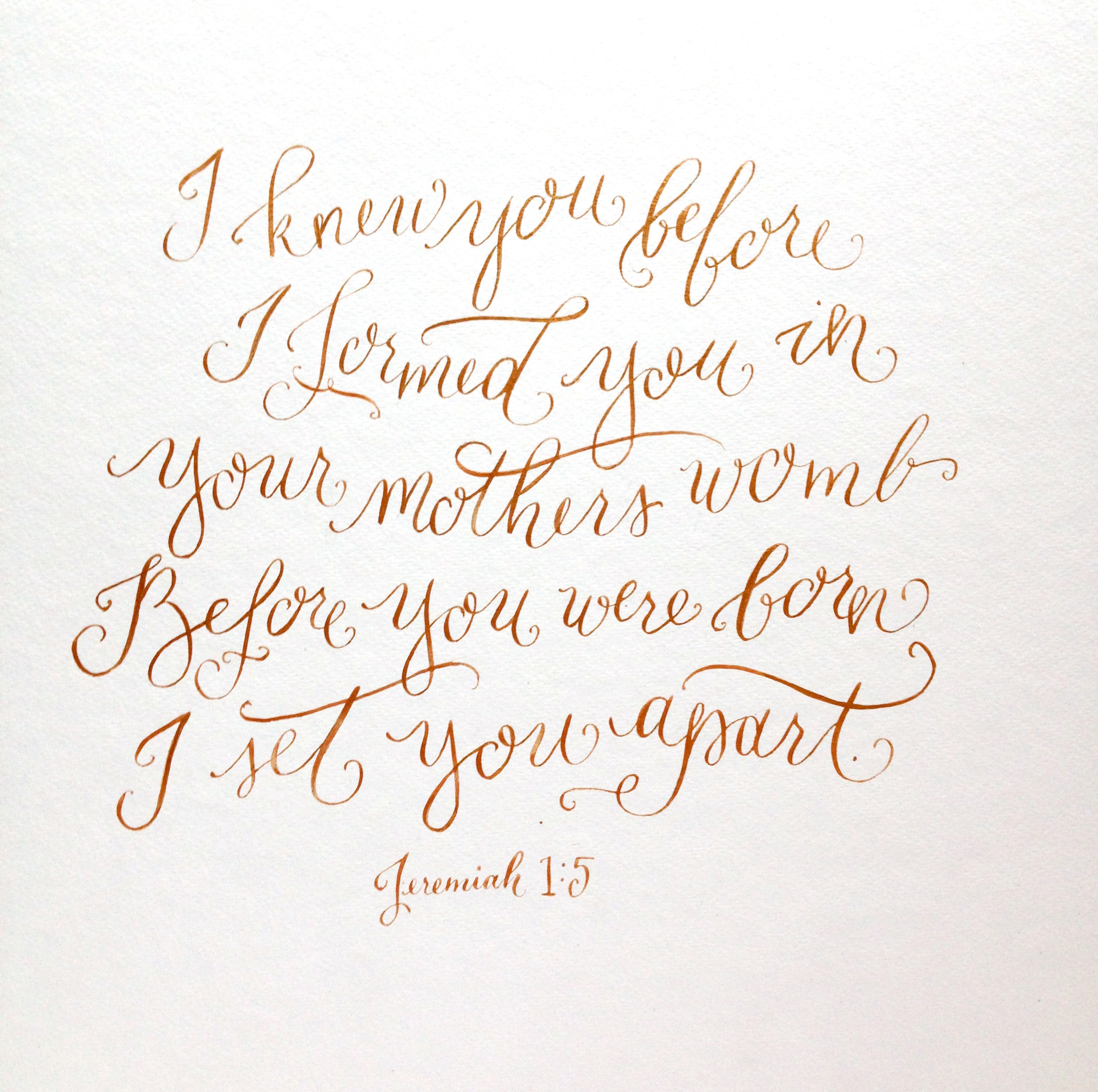
Portfolio: Nursery Calligraphy Art
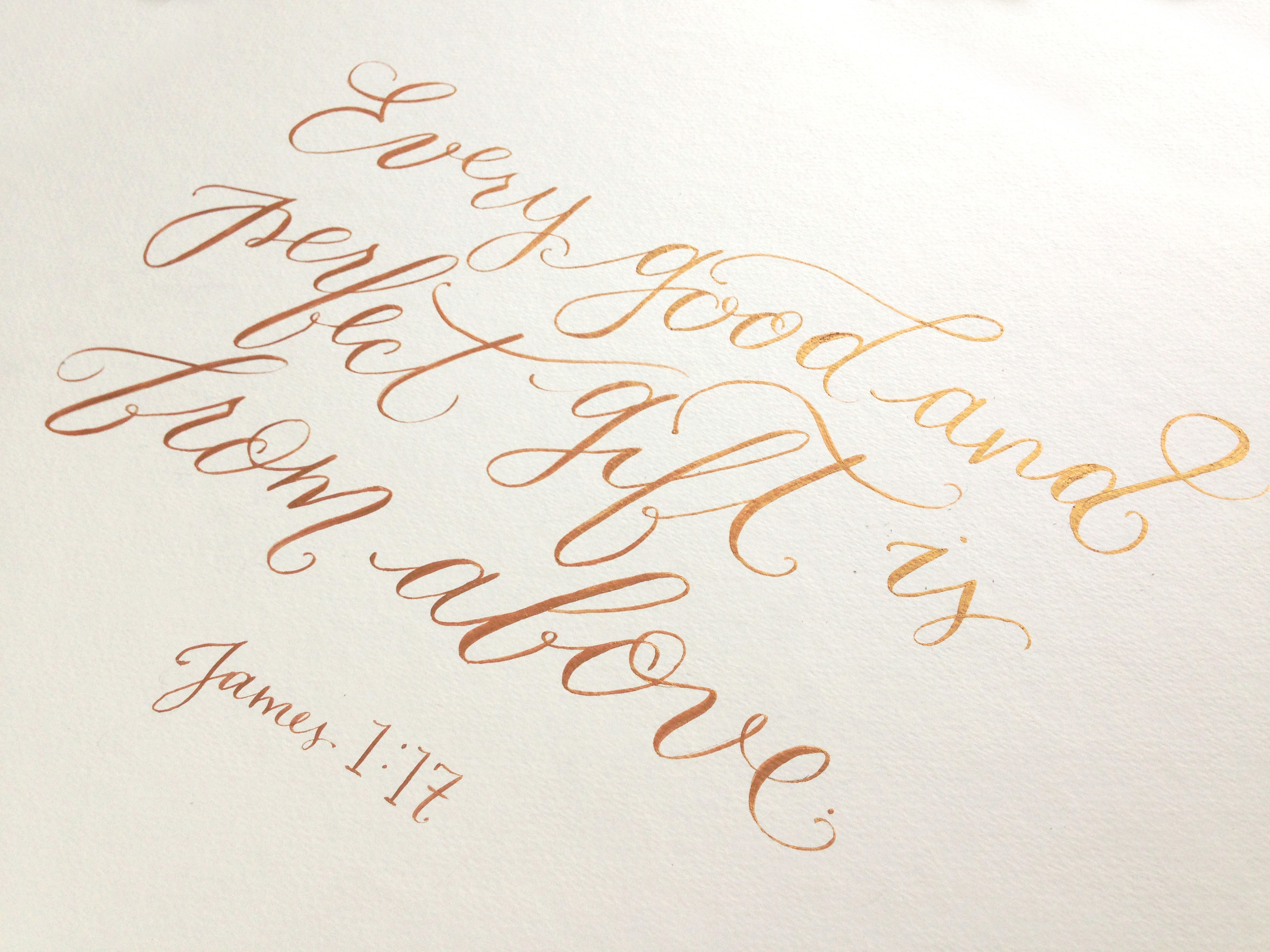
I loved getting to work on this set of verses for Mama-to-be, Kara, for her nursery. They were both 18" x 18" squares with a matte gold ink. I loved how they turned out and hope they will bless this new family for years to come.
Shop: Custom Event Calligraphy
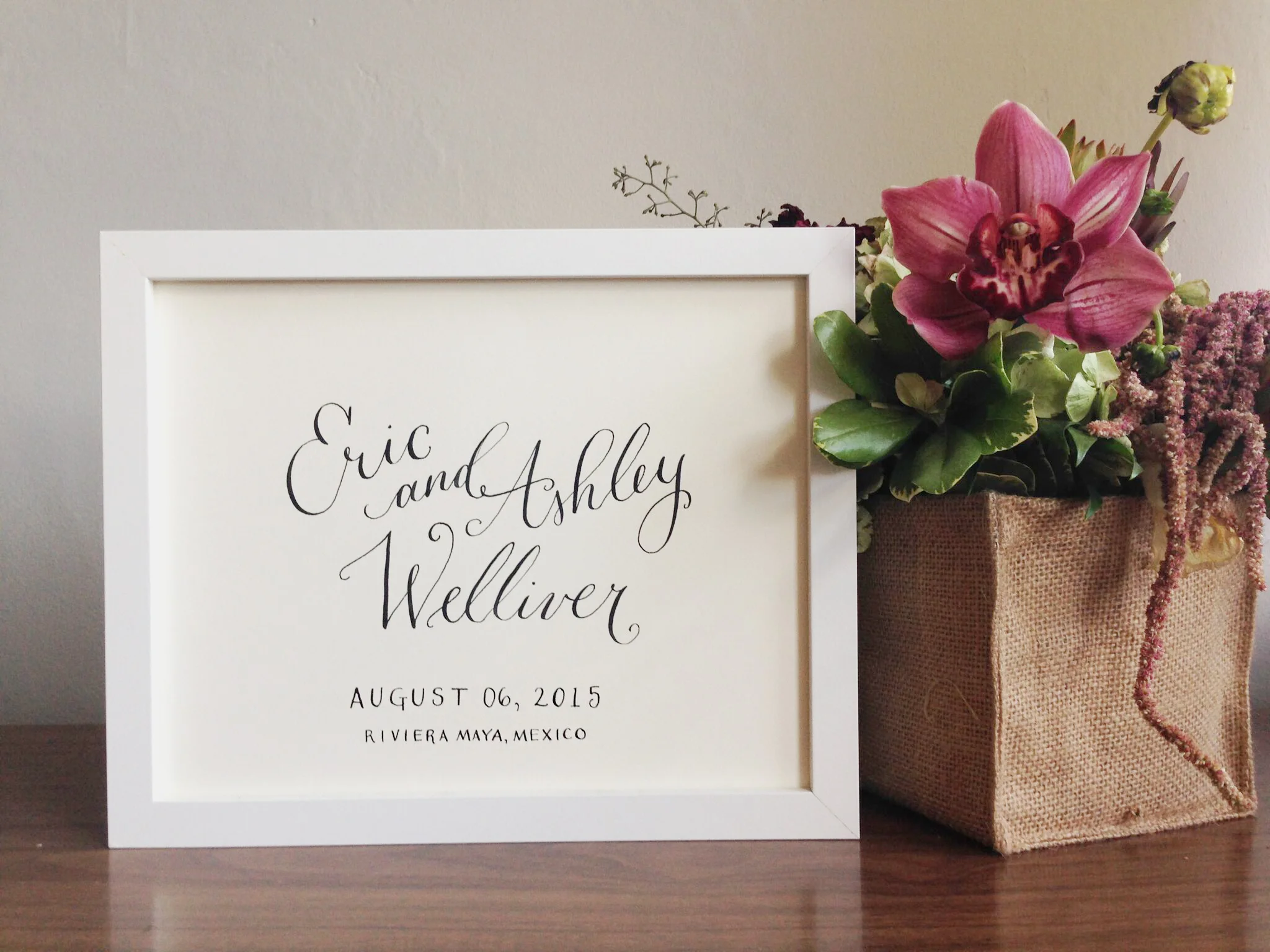
Now in the shop is a listing for personalized event calligraphy. Need guest book art, seating chart, or just a sweet way to help your loved ones remember their special day? Click on the listing in the shop and let me know what you are looking for. I look forward to working with you!
Portfolio: Olson Bridal Shower
Watercolor flowers done by Angie Makes
A few months ago I had the delight to work on these fun, oversized bridal shower invites. The party theme was a garden tea and the client was looking for something subtle but with a nod to the brides wedding colors. After a few different designs, we both settled on these graceful, watercolor flower invites. I really love how they turned out!
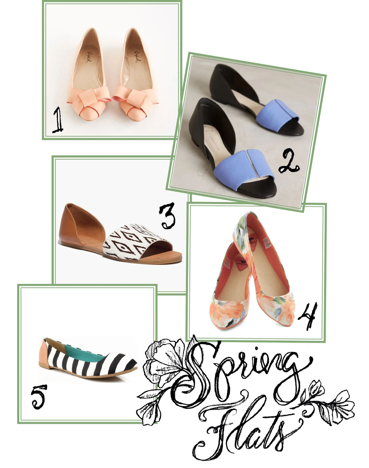
The Essentials: Spring Flats
Top to Bottom: 1 | 2 | 3 | 4 | 5
I couldn't wait for this snow to melt and slipped on my flats about a month ago! I was tired of my socks and boots and wanted my toes to be free of constriction and my feet to add a little more pop to my outfits.
I love flats. LOVE THEM. They have almost become a part of my uniform in a way. At one point in my life I had close to 40 pairs, just flats, in my closet. I now own about 10 pairs, and am always looking for more (but not too many).
Shoes are a great way to throw in bold color and patterns into even the most formal of outfits. I'm crushing hard on those MadeWell sandles (#3) and the floral flats on the bottom. Sigh...my birthday is only a few months away...
What shoe is your must have staple? Do share...
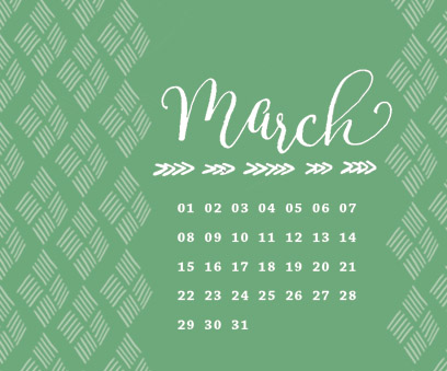
Welcome March & Desktop Wallpaper
March is here and the countdown to the first day of spring is on - March 21st can't come soon enough! Though the snow is pretty when it is falling - I'm ready for bright colors, sock free feet in flats, and little flowers popping up all around. Thank goodness Shamrock shakes are already here!
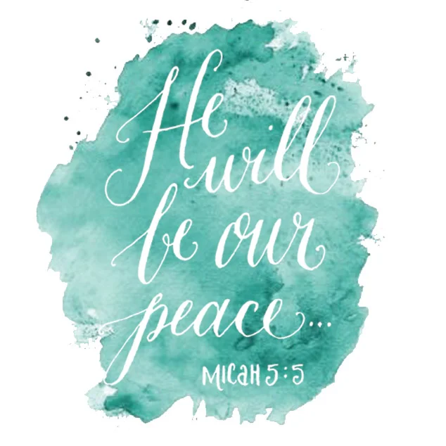
To celebrate the coming of the Spring I have created three different desktop and phone wall papers for you all! From a lovely quote by Longfellow, to a sweet reminder of His peace from the book of Micah, and then for the more orderly in the group a simple calendar.
Download one or rotate through all three!
Springtime Splendor : Desktop WallPaper | Phone Background
March Calendar : Desktop WallPaper | Phone Background
Micah : Desktop WallPaper | Phone Background
To download: click on the link above to the one you want, the image will open in its own window, and Save As or simply drag the image to your desktop. Then select system preferences and then desktop/screensaver.
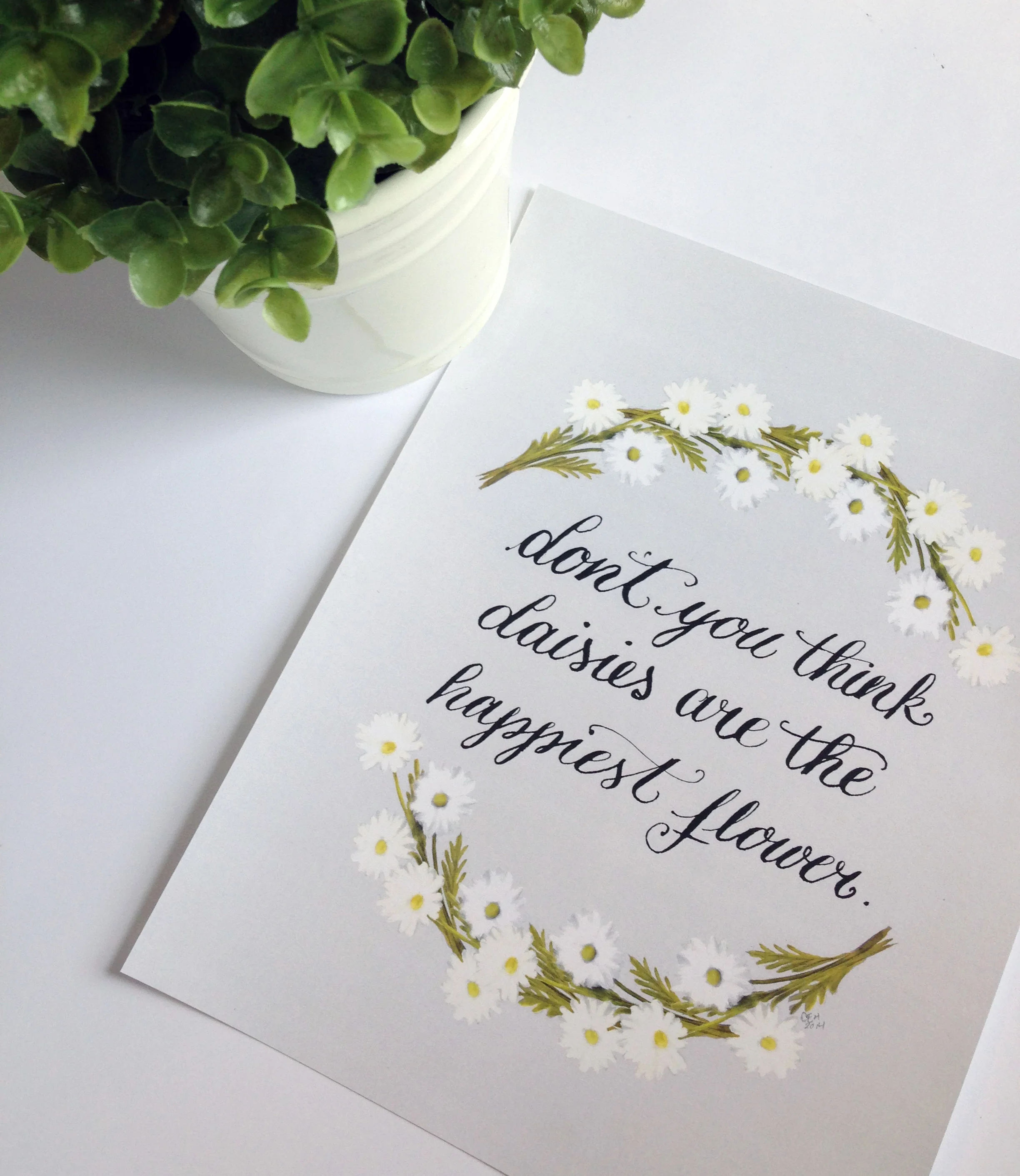
Portfolio: Daisy Print
I love flowers, and growing up I had a sweet spot for daisies. Not quite what Kathleen Kelly said in the film, You've Got Mail, but I have to still agree daisies are the happiest and friendliest flowers out there. I hope spring comes sooner than later around here...
