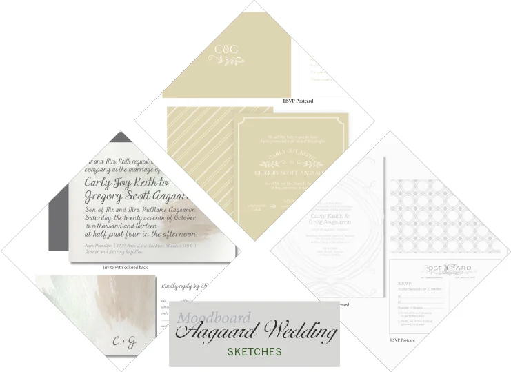
A few weeks back I shared this mood board with you from the lovely Aggaard wedding. You can see how the Mood board dictated the inspiration for the three comps I ended up showing the client. With details of a muted palette and a vintage but classic feel to the suits to match the rustic wedding she was planning, each suite captured a different mood we had talked about. The first having a contemporary look and a splash of watercolor to create color; the second being more straight cut classic, with modern vibes, and the third being a clean pallet of grey and white with a mix of patterns and vintage fonts. In the end we mixed and matched pieces from each set to create the final suite she had envisioned from the beginning. I can't wait to show you how it ended up!
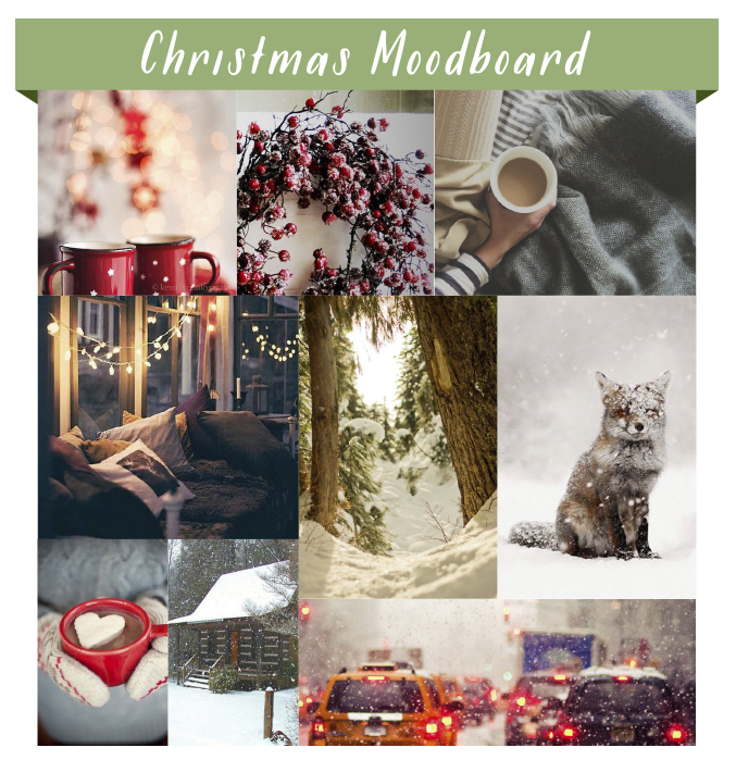
Moodboard: Christmas Season
Top: 1 / 2 / 3 Middle: 4 / 5 / 6 Bottom: 7 / 8 / 9
Though the snow today was not a totally unwelcomed (cold) surprise in Chicago, it feels as if it is officially been proclaimed winter! With later months come Thanksgiving, and of course the season of Christmas. I know it is somewhat scandalous to think about Christmas before the Thanksgiving turkey is even plucked for the table, but it is with snow that the warm feelings of Christmas and winter come sweeping in to my mind – and of course designing our Christmas/Holiday card! I pulled some photos I have seen that remind me of how Christmas season past have felt and looked like for me, and what I want to convey in our card this year. (Plus, how cute is that snow covered fox!) The large snowflakes, the cozy lights and coco, and the steady stream of red from decorations to car lights on their way to and fro. And how about that great typeface, Frosted by Molly Jaques. It felt like a perfect cherry on top to start thinking about this years holiday season.
Sketches and Suprises: Coming Soon
Over the last few days I have been inspired, but I am not quite ready to reveal the whole of my thoughts. I was just too excited not to capture a rough glimpse of what is to come!
Artist Admiration: Dear Hancock
My humor has always had two strong hitting points: 1. Literal takes of a phrase and 2. animals being personified in prints and drawings. The artists behind Dear Hancock nail both of these on the head for me. Among their stationary you find whimsical and quirky interpretations of the world around them. My favorites of their work include the literal desk calendar for 2013, big happy birthday truck card, and their bunny cards (seen above). You can find this fabulous chubby bunny feature on almost a dozen different of their greeting cards. Among my favorite : Ski Bunny, Dad Bunny, and my all time favorite, Love Bunny. Doesn't he just steal your heart?
I admire Dear Hancock for the variety of simple and whimsical stationary products they offer, while continuing to update and adding to popular concepts. To me, each piece tells a loving and somewhat goofy story of these two talented artists behind the brand, and the way they see the world.
Go take a look at their new look book or follow their blog !
Image by Dear Hancock, Lookbook 2013
Portfolio: Voss Wedding Program
Front Cover to Matt and Corrie's program.
A sweet friend of mine, Corrie, asked me this past summer if I could help her out with the programs for her wedding. Although I didn't design her (very cute) invites, I had the opportunity to help her continue the theme and design in her programs.
It was fun to find the perfect way to display this sweet and loving couple's personality and gratitude through a tri-fold, square program that features the bridal party at the heart of the inside. Their wedding colors of corral and navy blue as well as the mix of script and serif font were a strong theme that Corrie had planned through out the rest of the wedding and the reception.
See more details of this fun program here
Inside fold of Matt and Corrie's program


