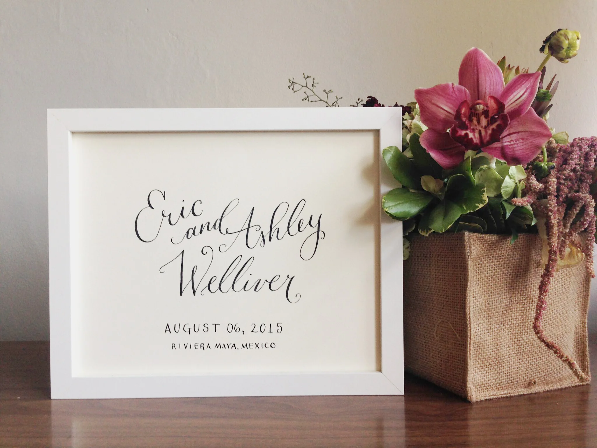
Now in the shop is a listing for personalized event calligraphy. Need guest book art, seating chart, or just a sweet way to help your loved ones remember their special day? Click on the listing in the shop and let me know what you are looking for. I look forward to working with you!
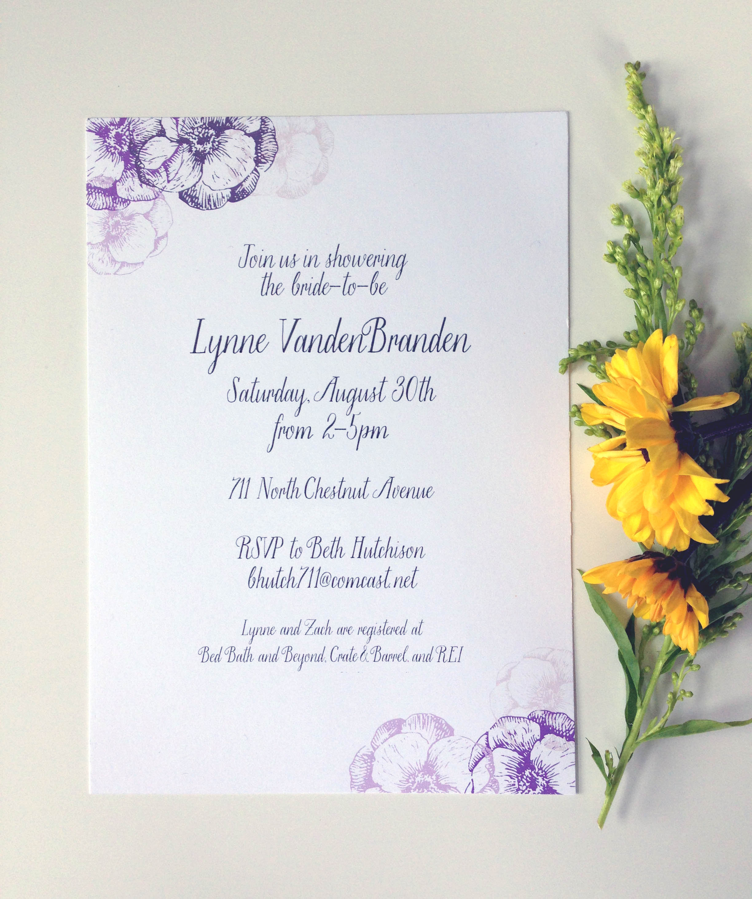
Portfolio: VandenBranden Bridal Shower
I did these lovely invites to honor a family friend back in the late summer. Set with a a color palette of purple, cream, and grey - I knew I wanted to keep the invite itself airy, feminine, and bright. I had been admiring the Saint Agnes font for sometime and knew that these sweet invites would be a perfect use for the elegant, but whimsical font. The combination of it all created a beautiful outcome, don't you think?
Saint Agnes is a part of the foundry Great Lake Lettering started by Molly Jacques and Dathan Boardman.
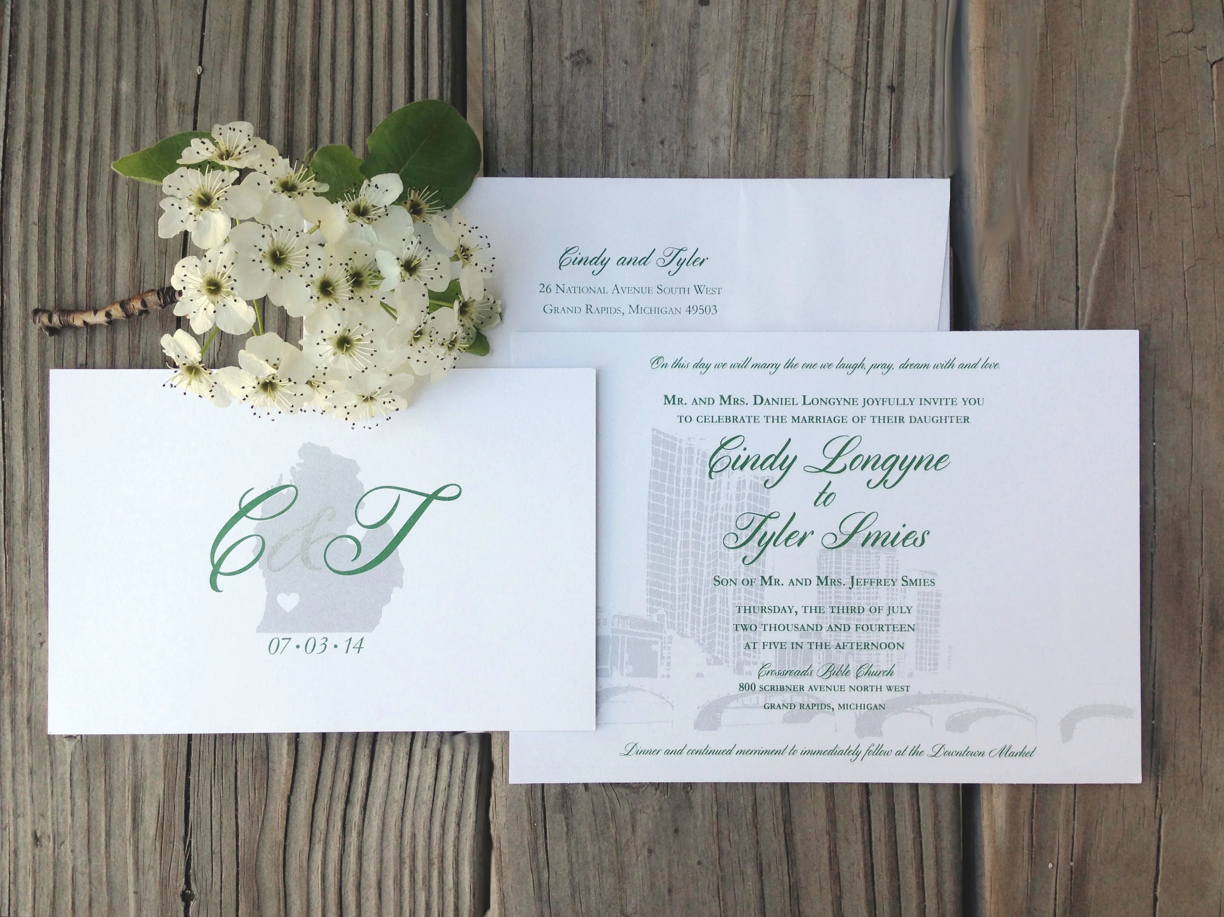
Portfolio: Longyne/Smies Wedding
A few months back I had the pleasure of illustrating a beautiful, city inspired wedding suite for Cindy, and husband-to-be, Tyler. You can see the mini moodboard here I created when beginning this project.
I loved hearing the passion that Cindy and Tyler have for the city of Grand Rapids, MI and how it has played a role in their relationship - and now in their wedding! We went with dark green and a grey metallic inks to bring out the scheme of their wedding. I love how the metallic ink shimmers and makes the city feel alive in the background.
Best of luck you two - I know the Lord has much in-store for you in marriage!
Portfolio: Aagaard Wedding | Invitation Suite
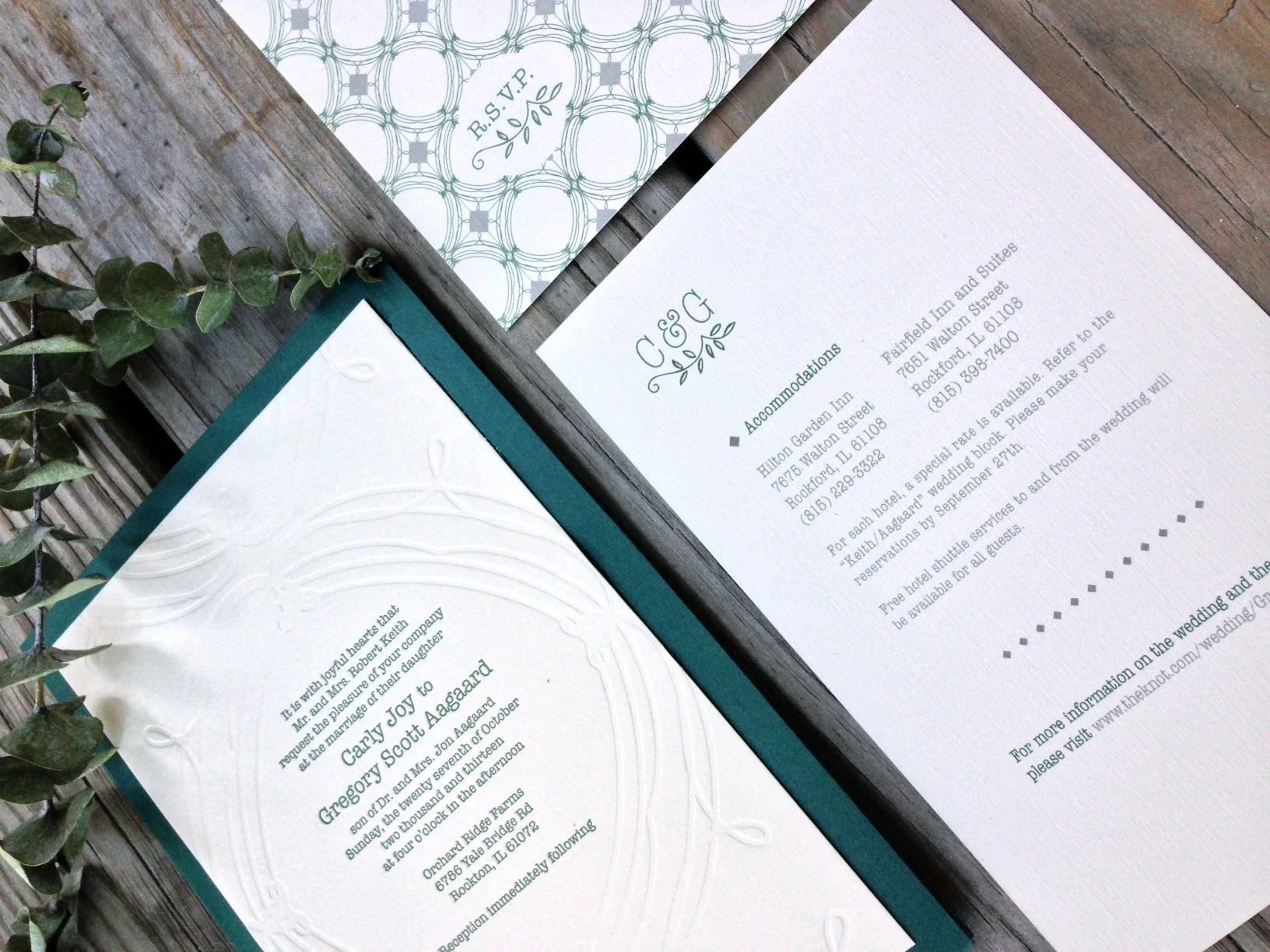
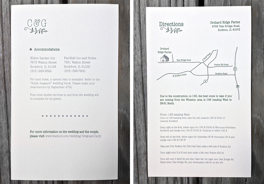
The bride was inspired by the mix of antique finds of her own and the bold mix of patterns seen at such stores like Anthropologie and J.Crew. With this in mind, we created a pattern and monogram that was repeated through out the suite.
The finish product was a sweet mix of hand-done elements - like the screen printed booklet cover, and the engraved invitation- with an elegant simplicity to allow the importance of the text to shine through. The mix of the subtle but bold nature of the pattern on each piece gave a modern feel to this classic style of invite.
Portfolio: Aagaard Wedding | Sketches
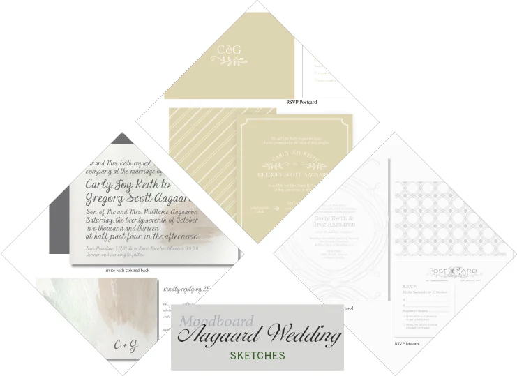
A few weeks back I shared this mood board with you from the lovely Aggaard wedding. You can see how the Mood board dictated the inspiration for the three comps I ended up showing the client. With details of a muted palette and a vintage but classic feel to the suits to match the rustic wedding she was planning, each suite captured a different mood we had talked about. The first having a contemporary look and a splash of watercolor to create color; the second being more straight cut classic, with modern vibes, and the third being a clean pallet of grey and white with a mix of patterns and vintage fonts. In the end we mixed and matched pieces from each set to create the final suite she had envisioned from the beginning. I can't wait to show you how it ended up!
Portfolio: Voss Wedding Program
Front Cover to Matt and Corrie's program.
A sweet friend of mine, Corrie, asked me this past summer if I could help her out with the programs for her wedding. Although I didn't design her (very cute) invites, I had the opportunity to help her continue the theme and design in her programs.
It was fun to find the perfect way to display this sweet and loving couple's personality and gratitude through a tri-fold, square program that features the bridal party at the heart of the inside. Their wedding colors of corral and navy blue as well as the mix of script and serif font were a strong theme that Corrie had planned through out the rest of the wedding and the reception.
See more details of this fun program here
Inside fold of Matt and Corrie's program
Portfolio: Aagaard Wedding | Moodboard
I wanted to share a little on a fun project I did a few months ago. The first part to any project is capturing the clients look and feel, i.e. mood, for what they have in mind for the end result. Some clients will have their entire vision already set and just need a designer to put together the details. For Carly, she had a great aesthetic eye, but needed a designer to create that finished product. She was fun to work with as she wanted a traditional invite, but with a unique twist. This allowed me to think outside the standard box, but keeping a classic touch.
Other details she sought out were looking for a muted palette featuring jewel tones, and a vintage but classic feel to the suit to match the rustic wedding she was planning. The moodboard above was just a small collection to help set the tone of the suite, and I can't wait to share what we ended up creating!
